A Week of Magic and Serenity in Impruneta, Tuscany

After the enchantment of Venice, we embarked on a journey that would take us to the heart of Tuscany, where rolling hills, vineyards, and olive groves paint a breathtaking picture of tranquility. Our destination was the Relais Villa Olmo, a former nunnery that has been transformed into a winery and olive oil resort.

The Land of Olive Groves and Diadema Wine

The Relais Villa Olmo is a place where history and nature intertwine seamlessly. Thousands of olive groves envelope the landscape of the valley behind the charming villa, creating a serene and picturesque setting. It's a testament to the age-old tradition of olive cultivation in Tuscany.

One of the highlights of our stay was the opportunity to sample the Diadema wine, the namesake of the estate. The wine carries with it the essence of this beautiful region, and every sip is a journey through the Tuscan terroir. We also had the pleasure of experiencing the flavors of their olive oils, each a testament to the quality and expertise that the estate is known for.

Breathtaking Views: Our Room with a View

Our room at the Relais Villa Olmo offered us something truly special – breathtaking views of the Tuscan landscape. The rolling hills, vineyards, and endless olive groves stretched out before us, painting a picture of tranquility and natural beauty.

Every morning, we were greeted with the sight of the sun's first rays kissing the landscape, casting a warm glow over the valley. It was a reminder that in Tuscany, time seems to slow down, allowing you to savor every moment.

A Week of Unforgettable Moments

Our week at the Relais Villa Olmo was a tapestry of unforgettable moments. We explored the vineyards and walked among the olive groves, immersing ourselves in the beauty of this land. We indulged in the flavors of Diadema wine and the estate's olive oils, savoring the essence of Tuscany with every taste.

But it was more than just the wine and the views. It was the serenity of the countryside, the warm hospitality of the staff, and the feeling of being far away from the hustle and bustle of daily life. It was a week of magic and serenity that left an indelible mark on our hearts.

As we bid farewell to the Relais Villa Olmo, we carried with us the memories of this enchanting week in Tuscany. It was a reminder that in the heart of Italy, you can find a place where time stands still, and the beauty of nature and tradition unfolds before your eyes. Grazie mille, Tuscany, for the magic and memories.

Venice in a Day: A Glimpse of Magic

Our whirlwind one-night journey through Venice was nothing short of enchanting. Despite the challenge of Google maps leading us astray into canals (a common mishap for newcomers), we managed to capture the essence of this remarkable city in just one night.

Navigating the Canals and a Gondola Traffic Jam

Venice is a labyrinth of winding canals and narrow alleyways, and it took us some time to get the hang of maneuvering through its intricate web of streets. We chuckled at the memory of a "traffic jam" of gondolas on one of the canals. It was a sight to behold, a reminder that in Venice, even the traffic jams have a certain charm.

Unfortunately, we missed out on a gondola ride due to a sudden rainstorm that hit later in the day. However, we made the most of the situation by taking a boat tour of the city. It was a unique perspective and allowed us to see Venice's beauty from a different angle.

Hotel Moresco: A Venetian Gem

Our home for the night was the charming Hotel Moresco, a boutique hotel located in the university area of the city, not far from the train station. The hotel's Venetian décor and the warm hospitality of the staff made our stay incredibly welcoming and relaxing. The attention to detail and the artistic touches throughout the hotel added to the magic of our Venice experience.

Views from the Room and Venetian Elegance

The view from our room at the Hotel Moresco was nothing short of breathtaking. It offered a glimpse of the timeless beauty that Venice is known for. The city's unique charm and character were on full display, even from our window.

We couldn't help but be captivated by the beautiful decorations and architectural details that adorned the city. Every corner we turned revealed a piece of Venice's rich history and artistic heritage.

Opera in Venice: A Night to Remember

Just minutes away from St. Mark's Square, we dined at La Caravella, savoring a delicious meal before a memorable evening at the opera. The Barber of Seville came to life at the Musica a Palazzo, an old palace where various acts are performed in different rooms. It was a unique and immersive way to experience opera in the heart of Venice, surrounded by history and culture.

Our one night in Venice was a whirlwind of beauty, art, history, and unique experiences. It was a testament to the city's ability to leave an indelible mark on your heart, even in the briefest of visits. Venice, you truly are a place of magic, and we can't wait to return for a longer enchanting stay. Arrivederci!

A Journey Through Florence's Timeless Beauty

Our visit to Florence was nothing short of magical. With a meticulously planned walking tour and a private visit to the iconic statue of David, we delved deep into the heart of this enchanting city, and it left an indelible mark on our souls.

A Glimpse into History and Art

Our journey began with a walking tour of Florence, expertly guided by Florence Town, a partner of the Relais Villa Olmo. This tour not only acquainted us with the city's rich history but also unveiled its magnificent architecture and artistic treasures.

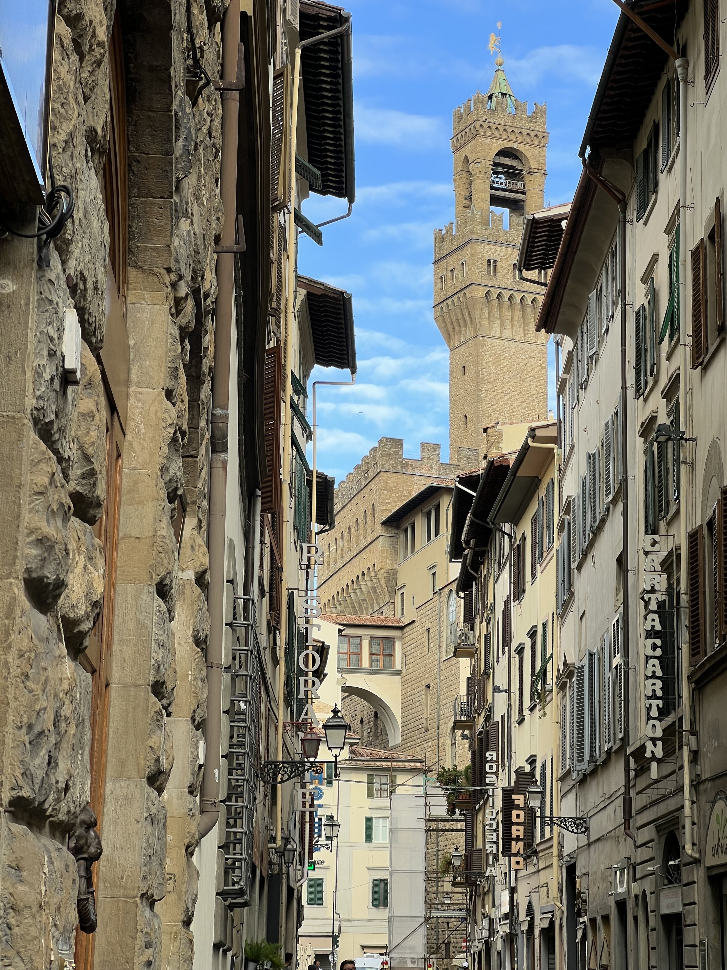
As we strolled through the cobblestone streets, we marveled at the intricate architecture that has stood the test of time. Each building seemed to whisper stories of the centuries that had passed. The streets themselves became a canvas of history, showcasing Florence's timeless allure.

From the Duomo to David

One of the highlights of our tour was the awe-inspiring Florence Duomo. Its majestic dome and intricate façade left us speechless. The grandeur of the cathedral, accompanied by its historical significance, was a sight to behold.

And then, there was David. The world-renowned statue crafted by Michelangelo. To stand in its presence, to admire the artistry and the sheer perfection of this masterpiece, was a moment of reverence. It was a connection to centuries of human creativity and genius.

Capturing Memories

Florence is a city that beckons you to capture moments, whether through photographs or in your heart. We couldn't resist taking pictures of the charming stone buildings, picturesque streets, and captivating art.

And of course, there was a visit to the oldest perfume store in Italy, Santa Maria Novella. It's a place that resonates with history dating back to 1221. With Christmas on the horizon, we found delightful gifts and couldn't resist indulging in some personal treats.

Indulgence in Gelato and Chocolate

Among the myriad of culinary delights Florence offers, we found ourselves indulging in gelato daily. The sheer variety of flavors and the artistry in its presentation were irresistible. And yes, there was that delightful chocolate dessert with a drizzle of olive oil, a combination that we simply couldn't get enough of.

Farewell from Michelangelo Piazza

Our last stop in Florence was at the Michelangelo Piazza, a place that offered a panoramic view of the city's rooftops, towers, and historic beauty. It was a fitting farewell to a city that had embraced us with its beauty and charm.

As we said "Ciao" to Florence, we knew we were leaving behind a piece of our hearts. The city's timeless allure had drawn us in, leaving us with memories to cherish and a desire to return to its enchanting streets. Until next time, Florence. Grazie mille for the memories!

Exploring the Flavors of Florence: A "Wanna Be Italian" Cooking Class Adventure

When you think of Florence, Italy, your mind may conjure images of Renaissance art, historic architecture, and charming cobblestone streets. But one of the highlights of our trip to this enchanting city was something a little different – a "Wanna Be Italian" cooking class that introduced us to the heart and soul of Italian cuisine.

A Culinary Adventure in Florence

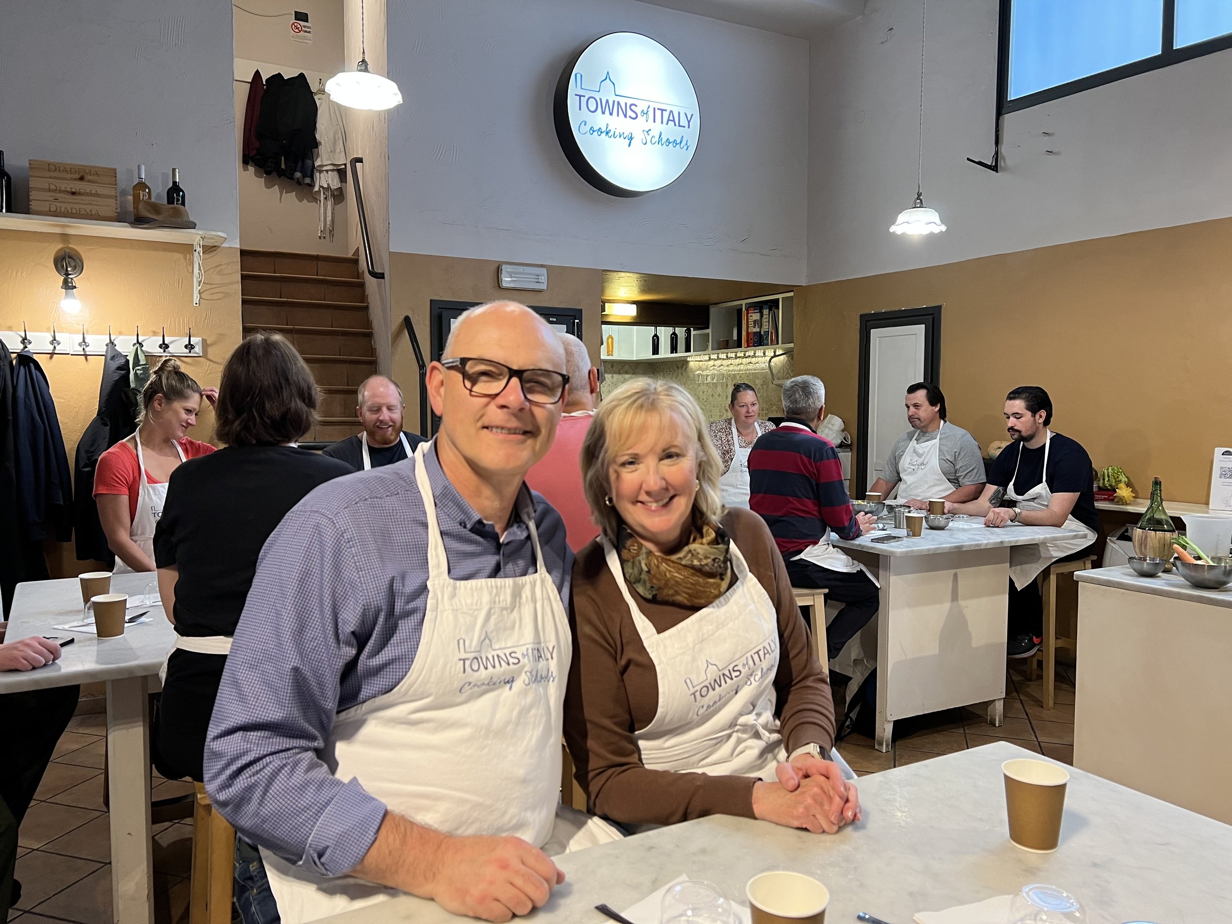
The "Wanna Be Italian" cooking class is not your average cooking experience. It's a journey that immerses you in the vibrant world of Florence's food culture. With a small group of fellow enthusiasts, we embarked on a culinary adventure that left a lasting impression.

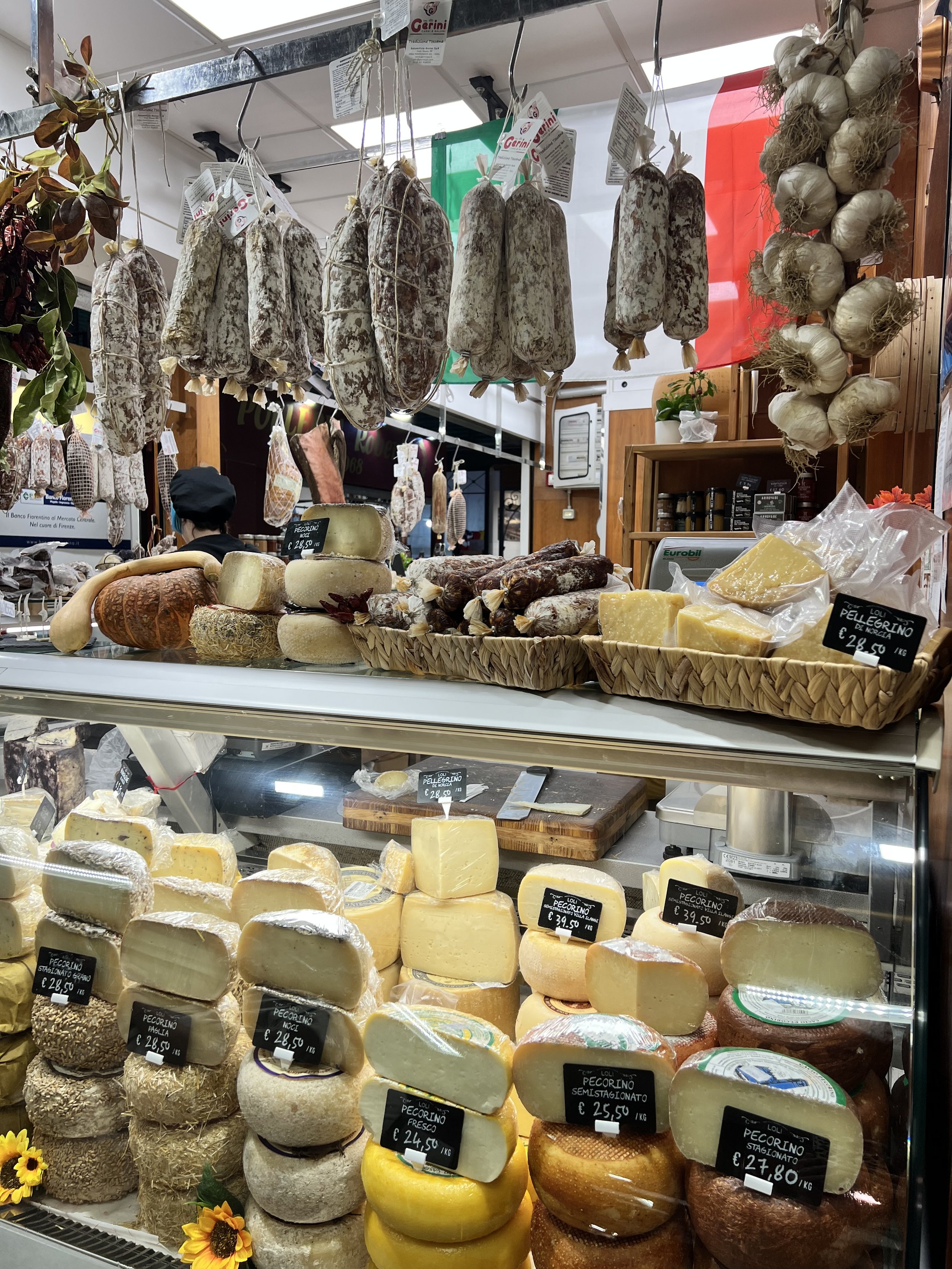
Our day started with a visit to the famous Florence food market. As we strolled through the market, we were immediately captivated by the sensory overload – colorful fruits and vegetables, aromatic herbs, artisanal cheeses, fresh meats, and an array of delectable pastries and bread. It was a feast for the eyes and the soul.

At one of the market's suppliers, we sampled some of the finest olive oil and pistachios, gaining a newfound appreciation for the subtleties of Italian flavors. The vendor's passion for their products was contagious, and it was evident that they took immense pride in their culinary heritage.

Making New Friends Over Food

One of the beautiful aspects of such experiences is the opportunity to connect with fellow travelers. By coincidence, we found ourselves at a table with four other food enthusiasts from Washington state. It didn't take long for us to strike up a conversation and bond over our shared love for food and travel.

As the cooking class got underway, we discovered that not only were we creating a delicious meal, but also lasting memories and friendships. It's the magic of travel – bringing people from different corners of the world together through the universal language of food.

Creating Culinary Masterpieces

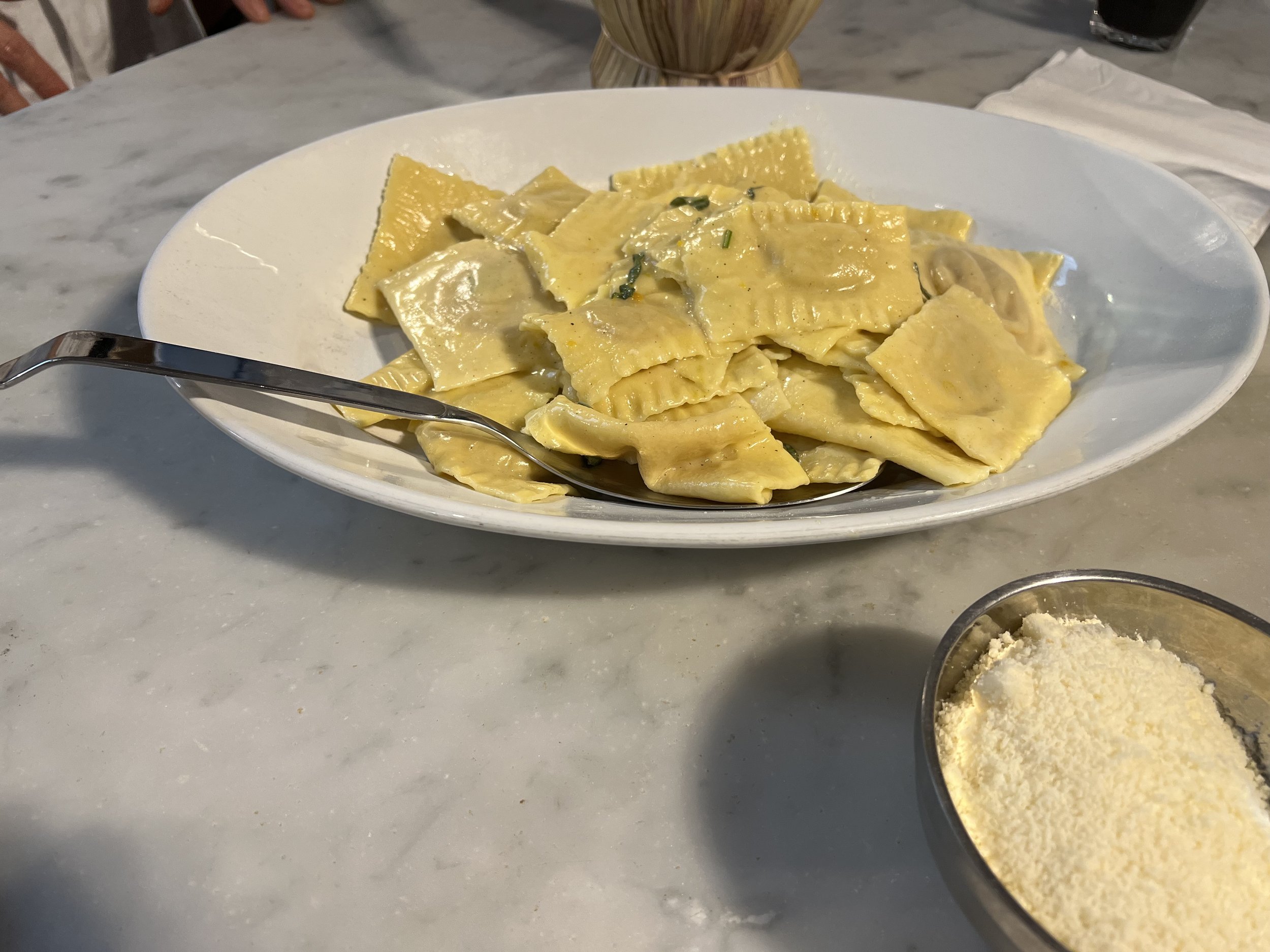
Under the guidance of our talented chef, we embarked on a culinary journey. We learned to craft pasta Bolognese, preparing the rich and savory sauce that is a staple of Italian cuisine. We delicately folded pumpkin ravioli, infusing them with the flavors of the season. And for dessert, we crafted a classic tiramisu, a sweet and creamy delight that epitomizes the sweet endings of Italian meals.

The class was a delightful fusion of education and hands-on experience. We learned the secrets of traditional Italian cooking, from the importance of using fresh, high-quality ingredients to the techniques that bring out the best in each dish.

Sharing the Memories

Our newfound friends from Washington state documented our day, capturing the laughter, the learning, and the delicious dishes we created together. You can explore the class images in this photo gallery.

As we look back on our "Wanna Be Italian" cooking class in Florence, it's not just the flavors and aromas that linger in our memories, but also the friendships we forged and the knowledge we gained. It was a reminder that travel is not just about seeing new places; it's about experiencing the culture, connecting with people, and creating moments that last a lifetime.

Florence, with its rich history and culinary traditions, has a way of leaving an indelible mark on your heart – and we left with full hearts and full bellies, ready to savor the taste of Italy wherever we go.

Kathy's Latest Project | Zen West Seattle Home

Nestled in the heart of West Seattle lies a beautiful water-view home designed by none other than Kathy Banak. Known for her impeccable taste and exquisite attention to detail, Kathy has crafted a sanctuary of zen-like features in every corner of this magnificent abode. From the master bath to the guest bath, basement bath, and laundry room, each space exudes an aura of calm and serenity. Let's take a closer look at how Kathy infused this home with a tranquil energy that truly sets it apart. Here’s what Kathy has to share!

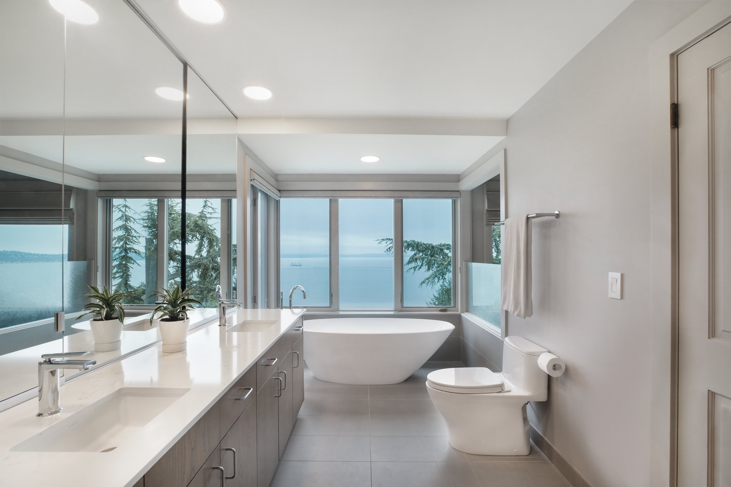
This West Seattle 1930’s home sits on a bluff overlooking Puget Sound and the homeowner wanted a scene and modern feel to her outdated master bathroom.  The existing vanity was in very good shape, so we decided to keep it and replace the tile countertop with a white quartz in addition to new faucets and sinks.  The large sliding mirrors are functional and in excellent condition, so we decided to also keep them. The new soaking tub and standing faucet replaced the dated built in jacuzzi tub to provide a fresh new focal point along with the amazing view.  The tone-on-tone neutral color scheme provides the foundation for the new 12x24 linen look tile running throughout the floor and shower walls.  Penny tiles in a trio-colored blend accent the shower floor for added interest.

This 1930’s ocean front home guest bathroom was original to the home and in need of a refresh.  The homeowner wanted to stay with the traditional style of the home’s architecture, and I felt that a classic and timeless white subway tile was the answer for the shower walls and decided on a darker grout color to keep the shower on trend.  The vanity was an online find and the soft blue grey color blends in beautifully with the soft blue wall color.  I choose wall sconces for the lighting, an oval mirror and timeless faucet to complement the classic look and feel of this inviting new guest bathroom.

The basement laundry room of this 1930’s ocean front Seattle home was original to the home and very dark and dingy.  So, I decided to bring the seaside landscape inside and selected custom turquoise colored cabinetry and white quartz countertops as the focal point of the room.  The Carrera marble LVT flooring, the light beige wall color and seascape artwork are the finishing touches for this new laundry room which now makes the homeowner smile every time she is in it!

5 Unusual Homes Across the US

2. Airplane Home - Hillsboro, OR. This home in Hillsboro,. OR sets the standard for unusual homes as it is definitely one of a kind. It was founded by a man that found this abandoned plane and completely remodeled and made it a beautiful home in a beautiful forest in Oregon.

Image Source: https://petroleumservicecompany.com/blog/tag/727

Image Source: https://petroleumservicecompany.com/blog/tag/727

2. Smith Mansion - Cody, Wyoming. This crazy home is supposed to be worked over a mine or by the hands of a lunatic or as an unreasonable joke, yet in all actuality it is basically crafted by a man who couldn't quit building.

Image Source: https://imgur.com/gallery/85lfy/comment/133022767?nc=1

Image Source: https://imgur.com/gallery/85lfy/comment/133022767?nc=1

3. Flinstone House - Hillsboro,. CA. DRIVERS HEADING NORTH TO SAN Francisco on Interstate 280 will see an exceptional home only east of the Eugene A. Doran Memorial Bridge. The house, energetically named by Bay Area occupants as The Flintstone House, is really an exploratory house underlying 1976 with rooms in which each surface is adjusted. Underneath its consumed orange (initially white) layer of paint is a huge number of concrete, rebar, mortar clay, wire work, and aeronautical inflatables.

Image Source: https://findery.com/AdventureScout/notes/flintstone-house

Image Source: https://findery.com/AdventureScout/notes/flintstone-house

4. Lichgate on High Road - Tallahassee, FL. Close to THE MAIN CAMPUS OF Florida State University and settled between understudy high rises lies a concealed three-section of land green space apparently from some other time and spot.

Image Source: https://www.atlasobscura.com/things-to-do/tallahassee-florida

Image Source: https://www.atlasobscura.com/things-to-do/tallahassee-florida

5. Hole n” the Rock - Monticello, UT. Voyagers ALONG U.S. Thruway 191 in Southeastern Utah are stunned to find this remarkable, 5,000 square foot home cut straightforwardly into a stone.

Albert Christensen started development of his stone home during the 1940s, burrowing, cutting, and impacting for a long time before moving his family in and opening a one of a kind burger joint for desert bystanders. Despite the fact that Albert passed on in the last part of the 50s, his better half Gladys kept on living in the stone and run the cafe for a long time. She kicked the bucket during the 70s, and both she and her better half are covered on the grounds of the stone they called home.

Hole in the Rock House.jpg

Getting Floral with Wallpaper!

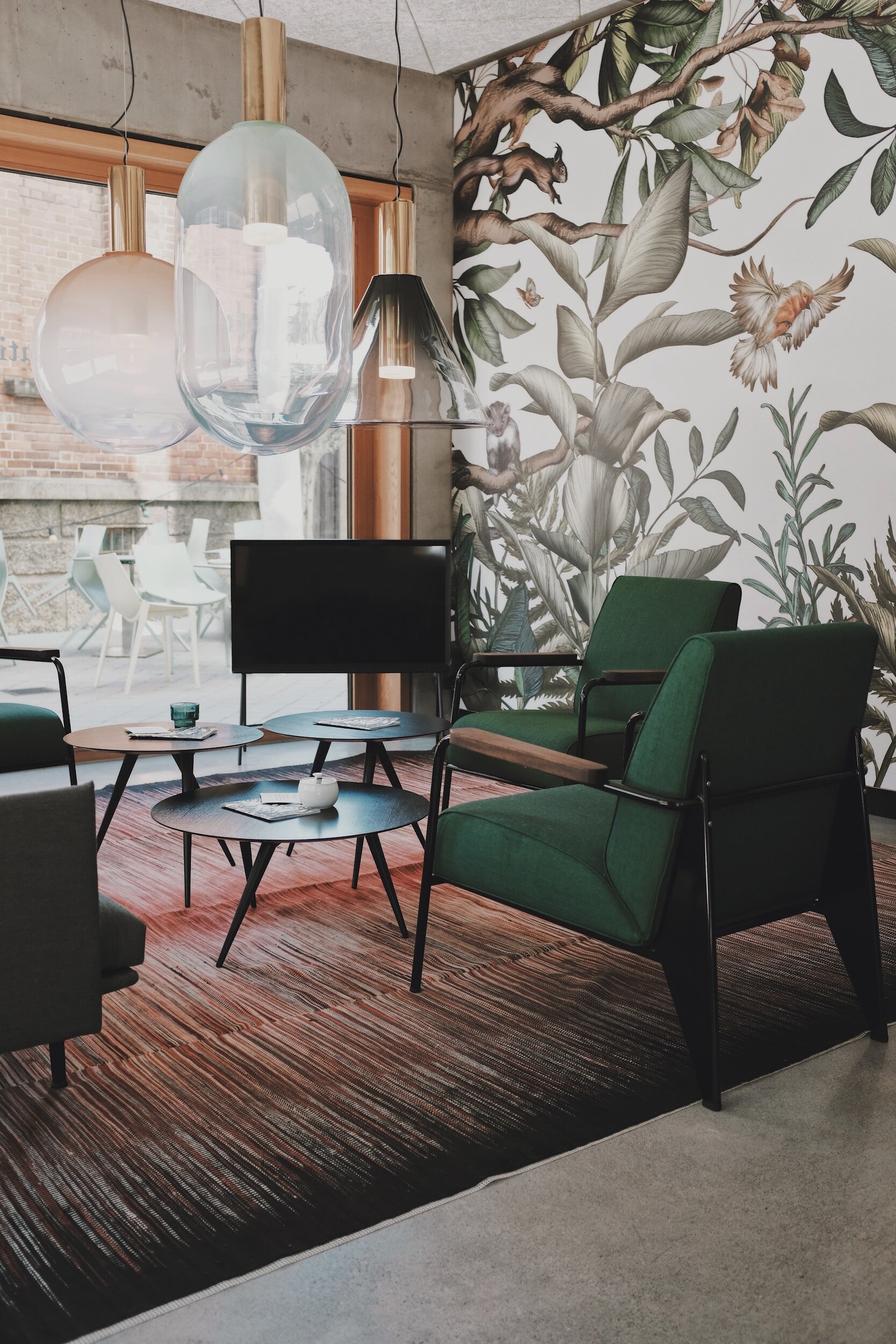
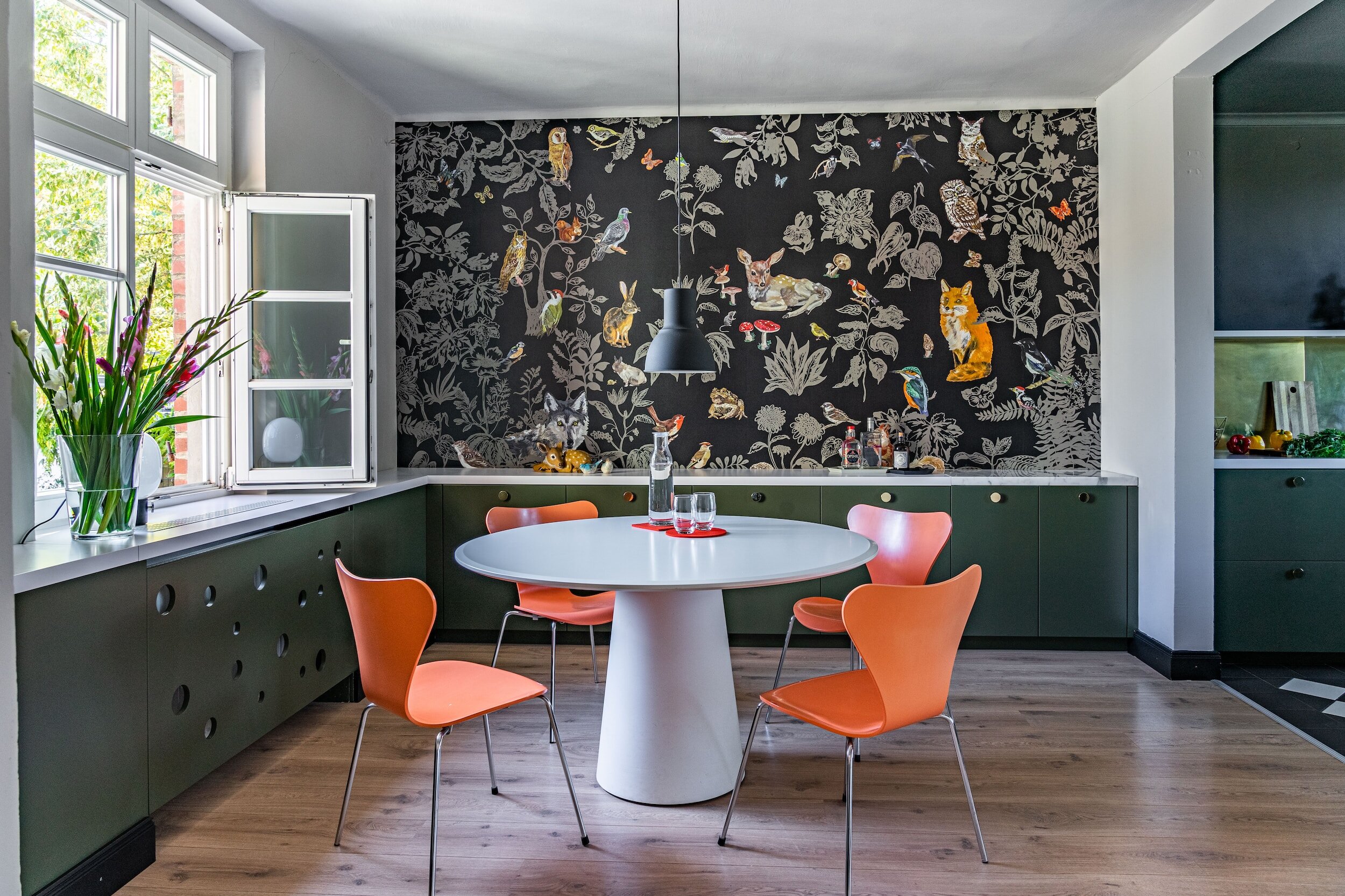
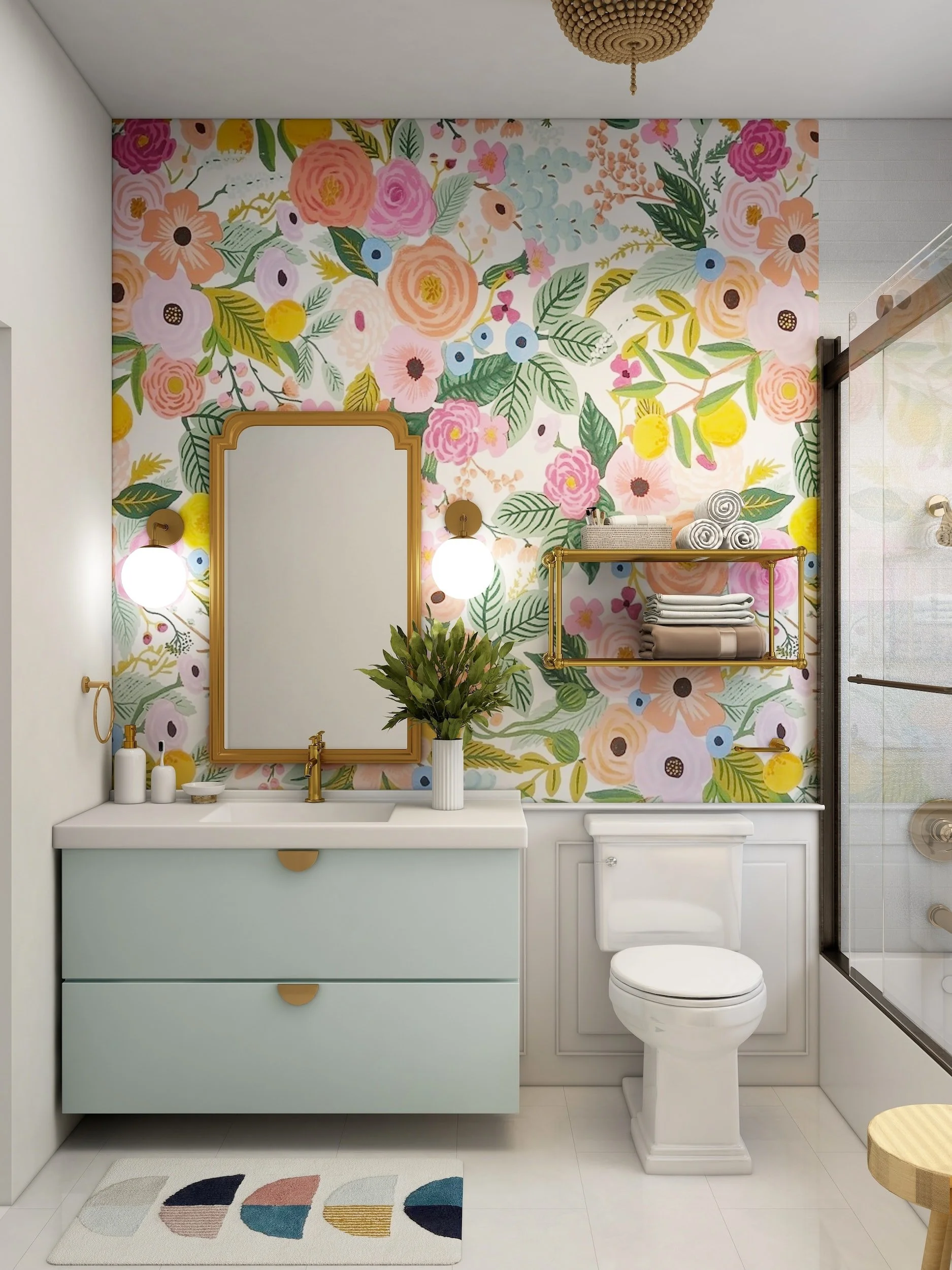
Floral wallpaper is the epitome of beauty. Its intricate patterns and designs captivate the eyes and mind, creating an atmosphere of sophistication and elegance. It’s the perfect blend of nature and artistry, showcasing the most vibrant and striking blooms, each telling a unique story!

A wall adorned with floral wallpaper transforms any space, bringing in warmth and charm, radiating positivity, and inviting you to linger for a little longer. From roses and lilies to daisies and cherry blossoms, the patterns on the walls burst with energy, joy, and optimism, captivating your heart with their brilliance.

The subtle variations of color in each bloom seem to merge into one, creating an ethereal aura that reflects the grace of nature. Every glance, every step is like walking through a blooming garden that enchants and delights your senses.

Floral wallpaper is not just about visual appeal. It transcends art, decorating spaces with style and meaning. Each design is unique and meaningful, mirroring the values, beliefs, and aesthetics of the owner.

Whether it’s a bold statement in the living room, a romantic accent in the bedroom, or a fresh twist in the bathroom, floral wallpaper elevates any interior with its versatility and style. Its charm and elegance can complement any decor style, from contemporary to traditional.

In conclusion, floral wallpaper is a breathtaking choice for decorating your home. It is the perfect embodiment of nature's beauty, representing grace, harmony, and vitality. The artful and exquisite designs inspire peace, calmness, and rejuvenation, making you feel refreshed and invigorated every time you gaze upon it. Its effortless charm is truly irresistible, and once you choose to embrace floral wallpaper, it becomes more than just decor; it becomes a beautiful memory etched into your life.

Less Is More in Home Decor!

As a society, we have grown accustomed to thinking that more is always better. This sentiment often extends to our homes, where we believe that having an abundance of decorative items will make our spaces feel cozy and welcoming. However, in reality, the opposite is often true: less is more when it comes to home decor.

When we cram our living spaces full of furniture, artwork, and knick-knacks, we run the risk of creating a cluttered and overwhelming environment. The eye doesn't know where to focus, and the room can feel cramped and stuffy. Conversely, when we strip away excess decorations and keep things simple, our homes can become tranquil and restful spaces that truly allow us to relax and unwind.

Of course, it can be difficult to know where to begin when it comes to minimizing our decor. Here are a few tips to get you started:

- Consider the functionality of each piece in the room. Is it adding value, or just taking up space? If you can't justify its presence, it may be time to say goodbye.

- Experiment with negative space. Sometimes leaving an empty corner or blank wall can create a beautiful sense of balance and calm in a room.

- Invest in quality over quantity. Instead of buying lots of cheap items, focus on purchasing a few high-quality pieces that truly spark joy and complement your space.

- Don't forget about the power of texture and color. By playing with different textures and hues in a minimalist space, you can create a layered and interesting look without adding extra clutter.

Ultimately, the less-is-more approach to home decor can have a significant impact on your well-being and the overall atmosphere of your space. So why not take a page from the minimalists and try simplifying your surroundings? You just might find that less truly is more.

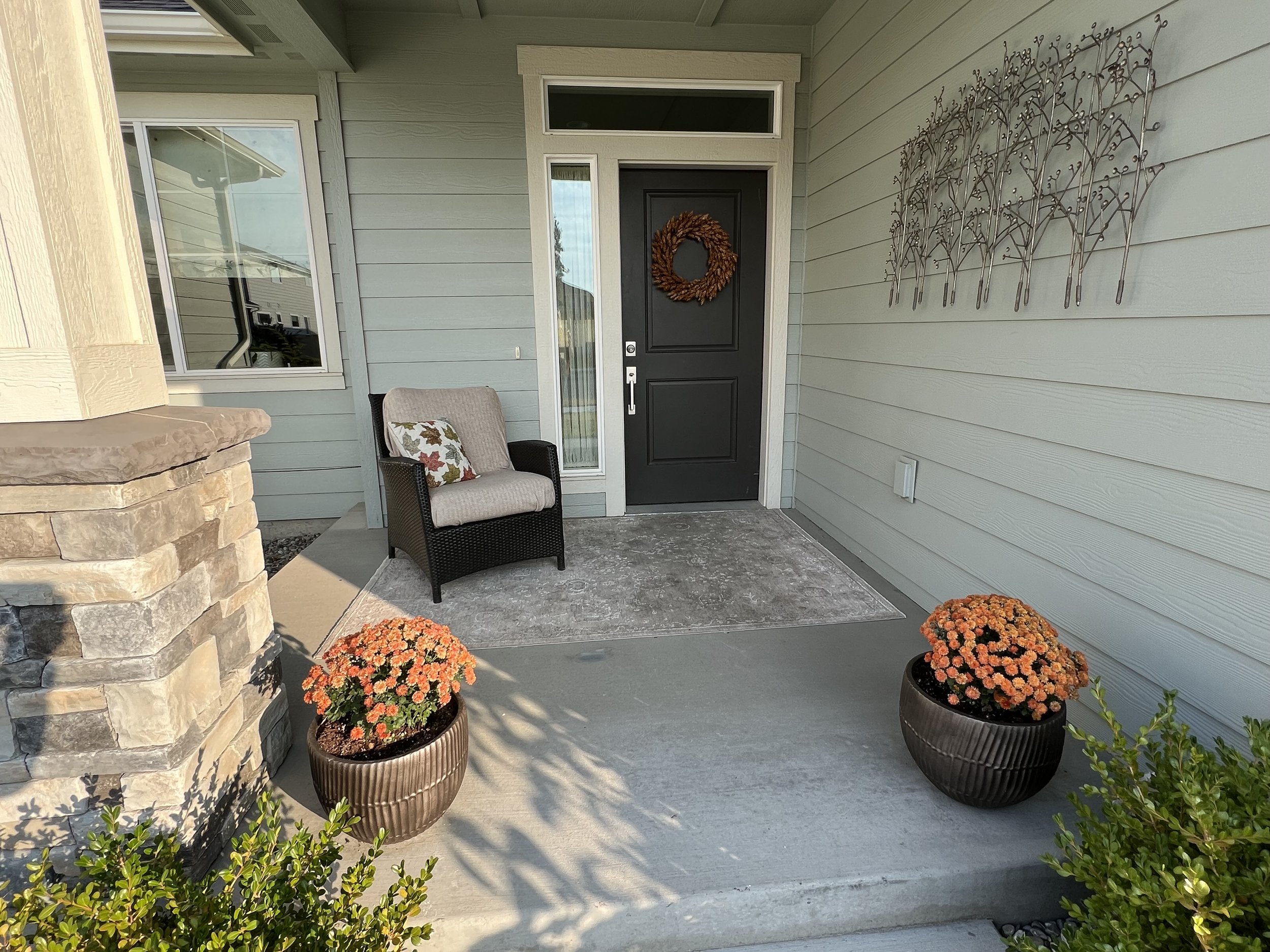
How Painting Your Front Door Can Make A World of Difference

Painting your front door is a small project that can make a big difference. It can completely transform the look of your home and increase its curb appeal. Whether you're looking to spruce up your home for your own enjoyment or trying to sell your property, painting your front door is an easy and cost-effective way to give your home a facelift.

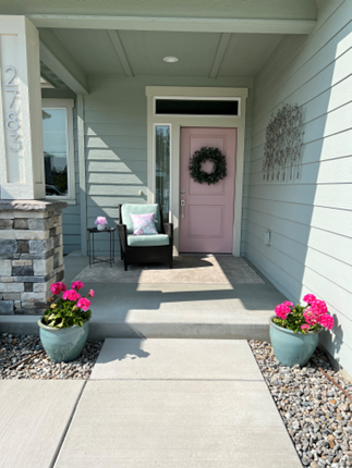
pictured: kathy banak’s front door pretty in pink!

Imagine driving down the street and seeing a row of similar houses. The only thing that sets them apart is the front door. One house has a bright and welcoming red door, another has a sleek and modern black door, while another has a charming and rustic wooden door. Which house do you think will stand out? Which house do you think will make a lasting impression? It's not the color of the siding or the shape of the windows, but the front door that sets each house apart.

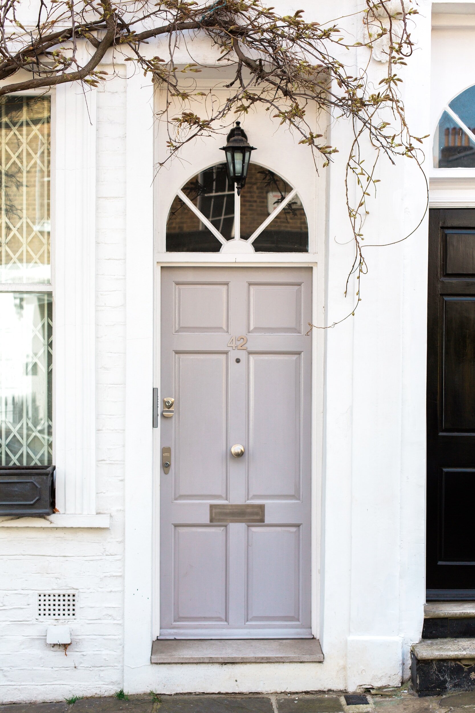
The color of your front door can also reflect your personality and style. If you're someone who loves bold colors, painting your front door a vibrant hue can be a fun and expressive way to showcase your personality. If you prefer more subtle tones, a soft grey or creamy white can create an understated and classic look. The possibilities are endless.

Not only can painting your front door add visual interest, but it can also increase your home's value. According to a survey by Zillow, homes with front doors painted black or charcoal gray can sell for up to $6,000 more than expected. That's a significant return on investment for such a small project.

In addition to the aesthetic benefits, painting your front door can also provide practical benefits. A fresh coat of paint can protect your door from weathering and extend its lifespan. It can also enhance your home's security by making your front door more visible to neighbors and passersby.

So if you're looking to update the look of your home, consider painting your front door. It's a simple project that can make a big difference in the overall appearance and value of your home.

Pretty in Pink! The Latest Design Craze

Are you looking to give your home a new and trendy makeover? Look no further than the latest interior design trend - pink! Pink has been making its way into homes throughout the world, and it's here to stay. In this article, we take a look at how to decorate your home with this beautiful color. From furniture pieces to accent walls and more, find out how to incorporate pink into your home in style!


Introduction to Interior Design Trend: Pink

If you're looking to add a touch of glamour to your home décor, consider incorporating the latest interior design trend: pink! Whether you opt for a subtle blush hue or a bold fuchsia, pink is sure to make a statement in any space. Not sure how to get started? Here are some tips on how to decorate your home with this trendy color:

1. Paint your walls: One of the easiest ways to add pink to your décor is by painting one or more walls in the hue of your choice. This will instantly brighten up any room and create a focal point for your overall design.

2. Incorporate pink accents: If you're not ready to commit to an entire wall of pink, consider adding smaller accents throughout your home instead. This could include throw pillows, rugs, artwork, and even small accent pieces like vases and candles.

3. Go for bold: If you really want to make a statement, go for bolder shades of pink like fuchsia or hot pink. These hues can be used sparingly as accents or incorporated more fully into your overall design scheme.

4. Balance with neutrals: Pink can be a very versatile color, but it's important to balance it with neutral tones so as not to overwhelm the space. Pairing pink with black, white, or gray will help create a more cohesive look.

Benefits of Decorating with Pink

When it comes to interior design, pink is having a moment. This popular color can be used in a variety of ways to create a fresh, stylish look in your home. Here are some of the benefits of decorating with pink:

Pink is versatile. It can be used as a statement color or as an accent.Whether you want to paint a wall pink or add some pink pillows to your sofa, there are endless possibilities.

Pink is cheerful and inviting. It’s the perfect color for creating a warm and welcoming space.

Pink can be gender-neutral. Pink is often associated with femininity, but it doesn’t have to be. Pink can work well in any room, regardless of the occupants’ genders.

Pink is timeless. Unlike some trends that come and go, pink has been popular for centuries and shows no signs of going out of style anytime soon.


Tips to Incorporate Pink in Your Room

If you're looking to add a touch of pink to your home décor, there are a few ways to do so without going overboard. Here are a few tips:

1. Use pink as an accent color: A little goes a long way when it comes to using pink as an accent color. Try adding a pop of pink with some throw pillows, artwork, or even a vase.


2. Go for blush tones: Blush tones are very popular right now and they can be incorporated into your décor in a variety of ways. From wall colors to furniture, there are plenty of ways to add blush tones into your home.

3. Mix and match: Don't be afraid to mix and match different shades of pink. You can create a unique and stylish look by pairing different shades together.

4. Add some texture: Texture is key when it comes to interior design trends. Adding some velvet or satin fabrics can really make your space pop.

5. Keep it simple: Sometimes less is more when it comes to décor trends. If you're not sure about going all-out with the trend, start small with just a few accent pieces here and there.

Decorating your home with the latest interior design trend of pink can be a great way to add some fun and unique flair to any space. Whether you choose to go all out or subtle, there are endless possibilities when it comes to decorating with pink. From adding pops of color through accent pieces or wallpaper, to embracing the full blush vibes in furniture and rugs, this is one trend that can truly transform any room into a masterpiece. So what are you waiting for? Get creative and start experimenting with ways to bring more pink into your living spaces!

Coastal Interior Design: Get the Look

Are you looking to bring the beauty of the ocean into your home? Coastal interior design is a perfect way to bring a touch of the shore into your living space. Whether you're looking to go all-in with an ocean themed decor or just add a few subtle hints of the coast, this blog post will show you how to get the look of coastal interior design in your own home. From selecting the right colors to choosing the perfect furniture and accessories, this post will help you create a tranquil and inviting atmosphere inspired by the sea.

Simple Color Palettes

When it comes to coastal interior design, it is all about keeping it simple. Neutral colors such as white, cream, taupe, and beige are perfect for creating a beachy feel. These shades are calming, airy, and bring a sense of peace to the room. Accent colors can be added with pops of blues, greens, and yellows for an extra touch of ocean vibes. Adding in dark accents such as navy or charcoal gray gives a modern twist to the look. Keeping your color palette neutral will help to create a unified space that still has personality and charm.

Natural Materials

When designing a coastal interior, one of the best ways to add a unique touch is to incorporate natural materials. Natural materials, like driftwood, seashells, sea glass and coral, all add a unique texture and charm to your space. Driftwood can be used to create shelving or furniture pieces that have a beachy vibe. Seashells can be collected and placed in glass vases or mason jars as decorative accents. Sea glass can be used to create colorful window treatments or wall hangings. Coral can be used to create beautiful statement pieces, such as lamps or sculpture. Adding natural elements to your coastal interior will add an element of beauty and interest to your space.
Textured Fabrics

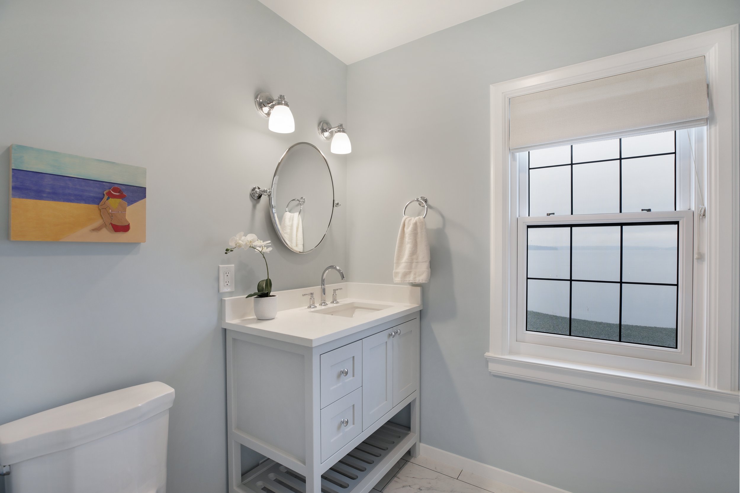
Adding a touch of texture to your coastal interior design can make all the difference in bringing your space to life. Textured fabrics are a great way to add visual interest and depth, and they’re also incredibly versatile. From light cottons and linens to heavier materials like velvet or denim, there are a variety of textiles you can incorporate into your decor. 

Cotton and linen are great options for upholstery pieces like sofas, chairs, and ottomans. These fabrics are light and airy, perfect for warm summer days and breezy evenings spent by the sea. For draperies, consider adding a heavier fabric like denim or velvet to create an inviting atmosphere that still keeps out the heat. 

When it comes to accessorizing, don’t be afraid to mix different textures. Try pairing a lightweight throw blanket with a more substantial pillow to create depth and contrast. Then add some throws made from chunky knits, woven rugs, or macrame wall hangings for an extra layer of texture. With these pieces, you can create a cozy atmosphere that is reminiscent of days spent relaxing on the beach.

Sea-Inspired Accents

If you want to bring a true coastal feel to your interior design, then adding some sea-inspired accents is the perfect way to do it. From starfish and coral to driftwood and shells, there are plenty of fun and creative ways to incorporate nautical elements into your space.

For a subtle but stylish look, consider using a few statement pieces. A large piece of driftwood makes an excellent centerpiece for a mantle or coffee table, while small shells or starfish can be used as table or shelf decorations. You can also go for something bolder, such as a large wall mural depicting a beach scene or a detailed model of a sailboat.

If you’re looking for something a little softer, try incorporating some textured fabrics. Sea-inspired throws or pillows with a hint of blue or white can make any room more inviting and calming. You could also use seagrass rugs for an earthy texture and fresh, ocean-like scent.

Finally, if you want to add some drama and depth, try incorporating lighting inspired by the sea. Seaweed-shaped chandeliers or lamps with a deep blue hue will certainly create an impact in any room.

No matter what type of sea-inspired accents you choose, they will give your interior design an instant coastal feel. So why not get creative and experiment with these ideas today?


Neutral Color Palettes Can Still "Pop!"

When you think of natural tones and interior design, you might picture a dull, builder's-beige home in the middle of a cookie-cutter suburb. All of the houses are identical, and there isn't a trace of personality to be found.

The truth is that, when done correctly, a color palette inspired by nature can be extremely appealing. Not only that, but inviting natural tones and textures into your space has real psychological benefits.

So, how do you make a natural-toned space that isn't boring? We've put together this guide to help you realize your neutral-home fantasies.

While technically nearly each coloration below the rainbow can be observed in nature, “natural tones” in the world of current indoors sketch & decor principally refer to impartial colorings and minimally-treated herbal substances like woods, rattans, leathers, and wools. Black, white, ivory, beige, grey, brown, ochre, and rust are all colorings that can be layered and blended besides lots threat of clashing or a format fake pas. Due to this flexibility and versatility of these colors, there’s little risk that these hues will go out of fashion or sense dated each time soon.

Although frequently omitted in favor of shiny pops of color, neutrals and herbal tones deserve their second in the spotlight, too. Here are some of the key advantages of adorning with herbal tones: Easy to mix and match: While you would possibly have had to carry a pattern of your present day sofa’s cloth to the paint save in the past, there’s little risk of deciding on clashing colorations when you deal with neutrals.

Longevity: That grey couch you make investments in this 12 months is not going to go out of fashion whenever soon. You can purchase it these days and experience assured that your preference will proceed to appear contemporary and updated for years to come. When you have a impartial backdrop such as this, you can change up your throw pillows and add-ons when you want a exchange — besides having to change the current couch you’ve already fallen in love with.

Uncluttered: Even if you fill your area with lots of outsized furniture, accessories, and artwork, herbal tones will maintain it from searching and feeling cluttered. When you format a room with a impartial palette, your eye is capable to take in the house except being distracted and overwhelmed with endless focal factors and visible clutter.

WARM HUES VS. COOL TONES Although it’s valid that 99% of organic tones will agree, there’s entity to recognize if you be going to take your room to a designer level. All shades are top-secret as either warm or cool, and experienced that is that can help you improve selections when it meets expectations forming your ideal room.

Warm normal tones, to a degree unsophisticated browns, smooth ivory, deep beiges, rich terracottas, and burnished color yellows increase ease and instant hominess to a scope when secondhand together.

When plotting your unrefined-muted in color scope, believe the type of impression you’re believing to stimulate. Feel free to join and equal warm and cool tones for a sense of contrast and balance, or charge individual color “hotness” palette to focal point your design aims.

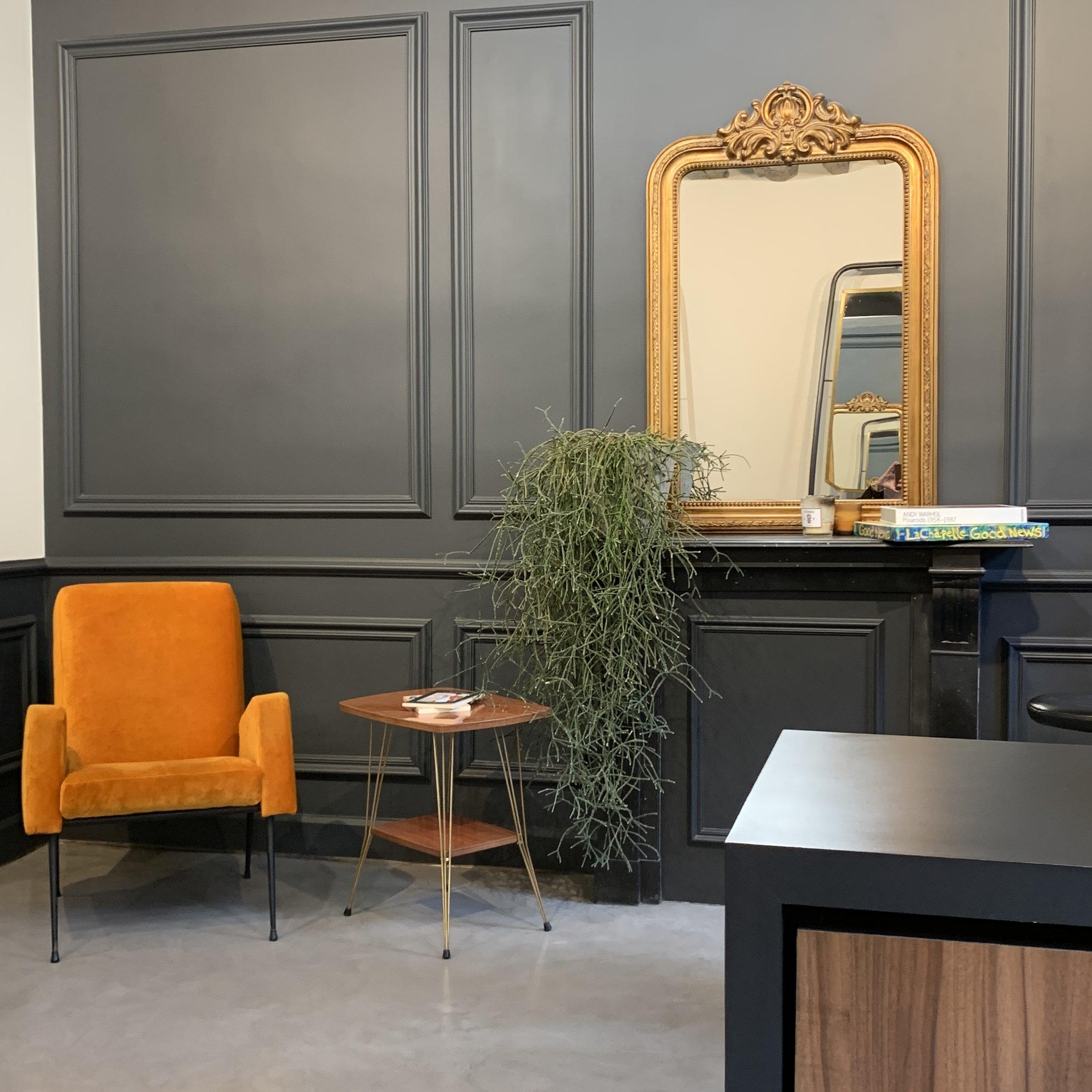
Decorating with Mirrors: Tips and Tricks to Get Started

Decorating with mirrors is a great way to add character and style to any room in the home. Mirrors can be used to brighten dark spaces, create the illusion of a larger room, or simply to give a room an extra decorative touch. In this blog post, we'll explore some tips and tricks to help you get started with decorating with mirrors. From choosing the right style of mirror to creating a cohesive look, you'll learn everything you need to know to get the most out of decorating with mirrors.


The Basics of Decorating with Mirrors

Decorating with mirrors is an easy way to add style and visual interest to any room in your home. Mirrors can reflect light, making the space appear brighter and larger. They also serve as a great focal point and add a touch of elegance to a room. Whether you’re looking for a subtle addition or an eye-catching accent piece, mirrors can be a great option for updating your space. 

Before you start decorating with mirrors, it’s important to understand the basics of mirror placement and size. If you’re just getting started, it’s best to focus on one area of the room at a time. The size of the mirror should be in proportion to the size of the space. For example, if you have a large wall, you should opt for a large mirror that will fill the space without overwhelming it. However, if you have a smaller wall, you should choose a smaller mirror to keep the room from feeling cluttered. 

In terms of placement, mirrors can be hung horizontally or vertically, depending on the shape of the wall and the look you’re going for. Horizontally placed mirrors create an expansive feeling while vertical mirrors tend to create a more dramatic effect. Consider how much natural light the space receives when deciding which direction to hang the mirror. 

When selecting a mirror for a room, consider both function and style. Mirrored furniture can bring a unique aesthetic to a room and can also help to reflect light throughout the space. For walls, look for frames that match the overall décor of the room. If you’re aiming for a more traditional look, consider ornate frames with intricate detailing. If you’re looking for something more modern, opt for sleek and minimalist frames. 
No matter how you decide to decorate with mirrors, it’s important to remember that they can make any room feel larger and more inviting. With the right placement and styling, you can easily transform any room in your home with just one simple addition.

Where to Place Mirrors in Your Home

Mirrors are incredibly versatile and can be used in many different places around your home. From making a small space seem bigger to adding a decorative touch, mirrors can make all the difference in a room. Here are some of the best places to add mirrors in your home:

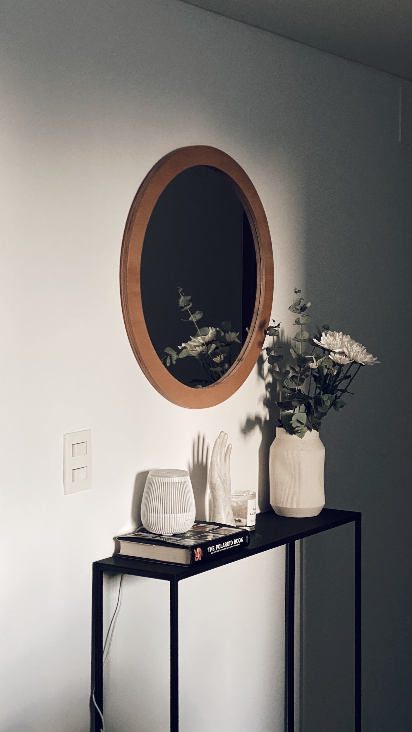
1. Entryway – Adding a mirror near your front door is a great way to make a grand entrance. Place it high enough so that you can see yourself from head to toe as you enter.

2. Hallways – Make a long hallway appear more spacious by adding a wall of mirrors. Or use a large mirror in an accent color to bring more light and life into the area.
3. Living Room – A large floor-to-ceiling mirror can be used to make the room feel more open and airy. It’s also great for reflecting natural light, giving the living room an overall brighter look.

4. Bedroom – Place a full-length mirror near the bed or closet for convenience and extra light. You can also add several smaller mirrors in different shapes and sizes on the walls for a more eclectic and decorative look.

5. Dining Room – For an elegant touch, hang a large mirror on the wall opposite the dining table. This will make the room feel more inviting and provide an interesting focal point for dinner conversations.

By adding mirrors to these key areas of your home, you can create a truly stunning interior space. Not only do they help make the home look bigger and brighter, but they can also add a unique decorative touch that sets your home apart from the rest.

If you’re looking for a great way to add visual interest to your space while creating the illusion of a larger area, decorating with mirrors is an excellent choice. Mirrors reflect light and create the illusion of depth, making it look like a room is bigger than it actually is. Here are some tips for how to use mirrors to create the illusion of space: 

- Place a large mirror opposite a window. This will reflect natural light throughout the space, making it appear more open and airy.

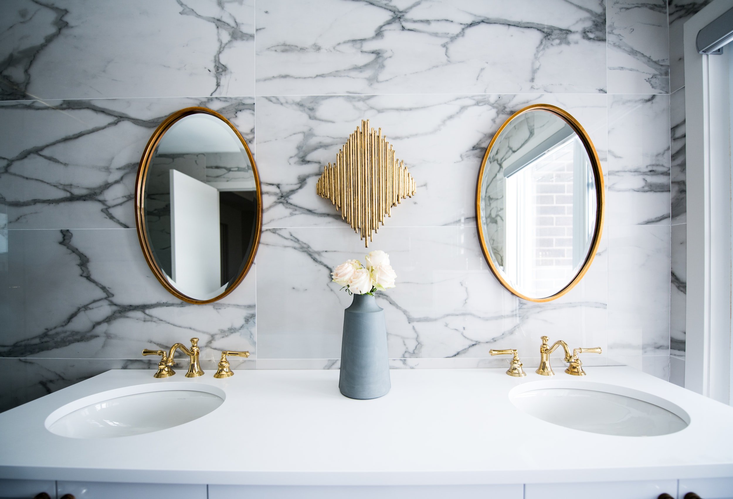
- Hang two matching mirrors on opposite walls. When placed in this manner, the reflected images create an optical illusion that makes a room appear wider.

- Position a long, narrow mirror horizontally on a wall or lean it against a wall in a corner. Doing so adds length to the room and creates the appearance of more space.

- Utilize multiple small mirrors placed in different parts of the room. This creates interesting shapes and reflections and helps to draw the eye around the space, making it feel larger.

By following these tips, you can easily use mirrors to create the illusion of space in any room. With a little creativity and some carefully chosen pieces, you can transform your home with the power of reflection!


From Washington to Idaho: Kathy's New Home Remodel!

There were several reasons why my husband Rick and I decided to relocate from central Washington to Coeur D’ Alene Idaho this past January of 2022 and we are both very glad we made the move to this stunningly beautiful area. After several months of researching builders and the real estate market, we decided to purchase a three-year-old home in a wonderful part of Coeur D’ Alene. The builder grade home has great bones and just needed to be transformed into our vision for our new home. We both wanted a more modern feel and changed the following elements over the past six months to achieve our overall goal. Come on in to see our transformation!

Paint & Flooring Remodel

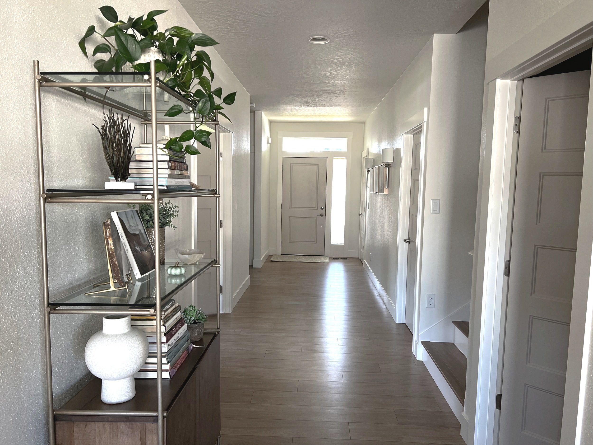
I’ve always considered paint colors and flooring to be a strong foundation and an important element to build upon when remodeling. I transformed the taupe and white paint colors that were throughout the entire home into a warm color palette of cream, tan, brown, green, and blue palette, and I gave the ceilings definition by painting them an off-white color. I removed all the bedroom and stair carpet selected a warm beige solid color Evoke laminate plank flooring and installed it directly over a luxury vinyl plank that was a multi-colored stripe pattern. I also installed a luxury vinyl tile over the LVP in the master bathroom and closet. The new laminate flooring and the new paint color palette provided me with a great launching off place for all my other material selections. My new console table will arrive early in 2023 and will be placed under the wall sconces. The animal print Stanton carpet runner in the hall and up the stairs gives the space some personality and provides a warm and inviting feel to our entry.

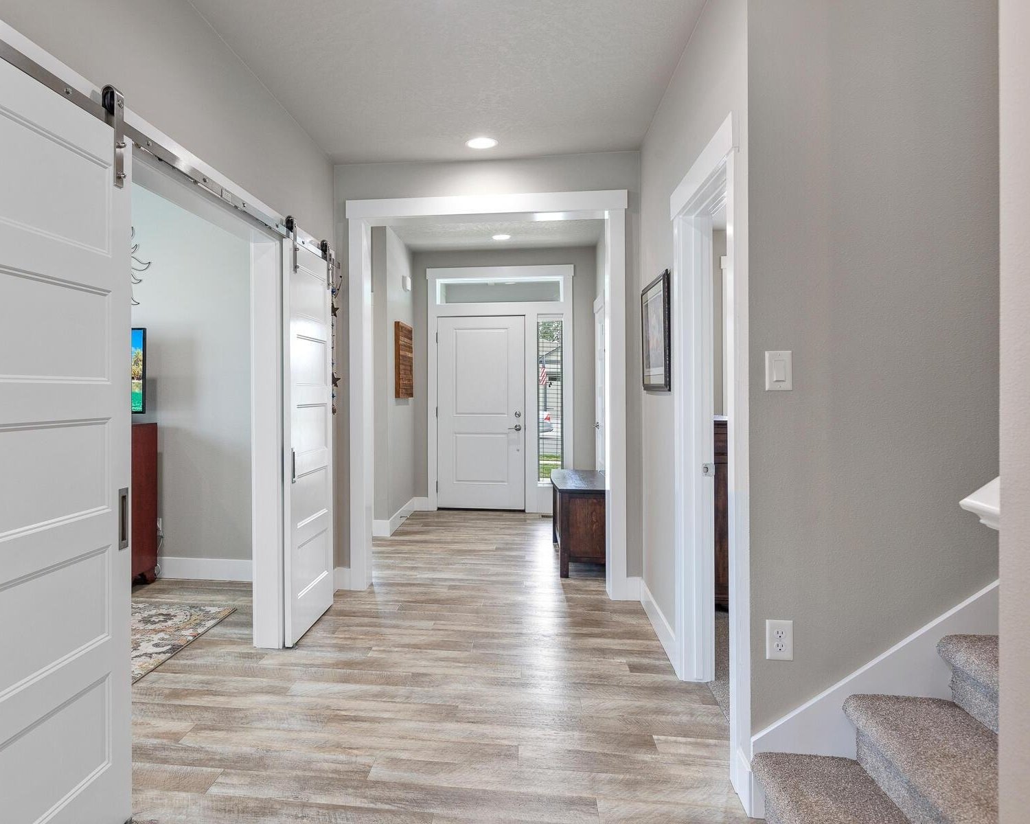
We removed the entry hall casings and heavy barn doors which immediately provided a lighter feel to our home’s entrance. I painted the baseboards, door trims and window casings the same paint color as the walls to create a seamless flow. By having everything the same paint color, one’s eye doesn’t get distracted by a different paint color and in turn creates better flow. Additionally, by painting bath or laundry vanities the same color as the wall color, it will make the space feel larger and flow better.

Kitchen & Pantry Remodel

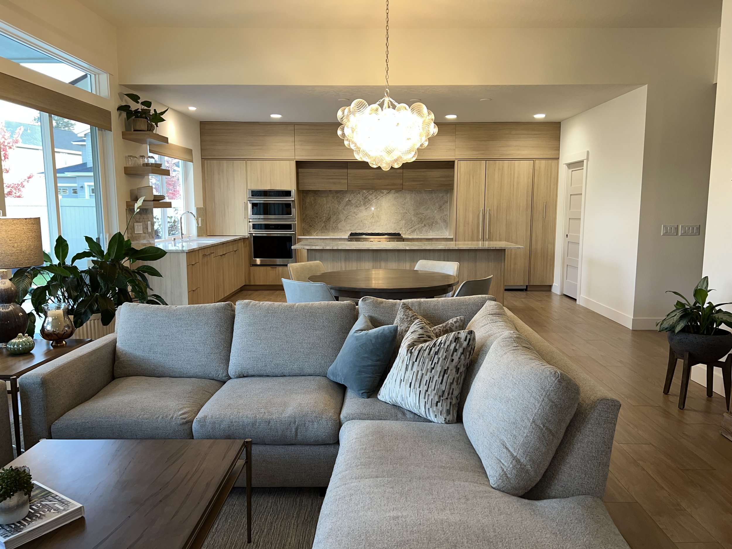
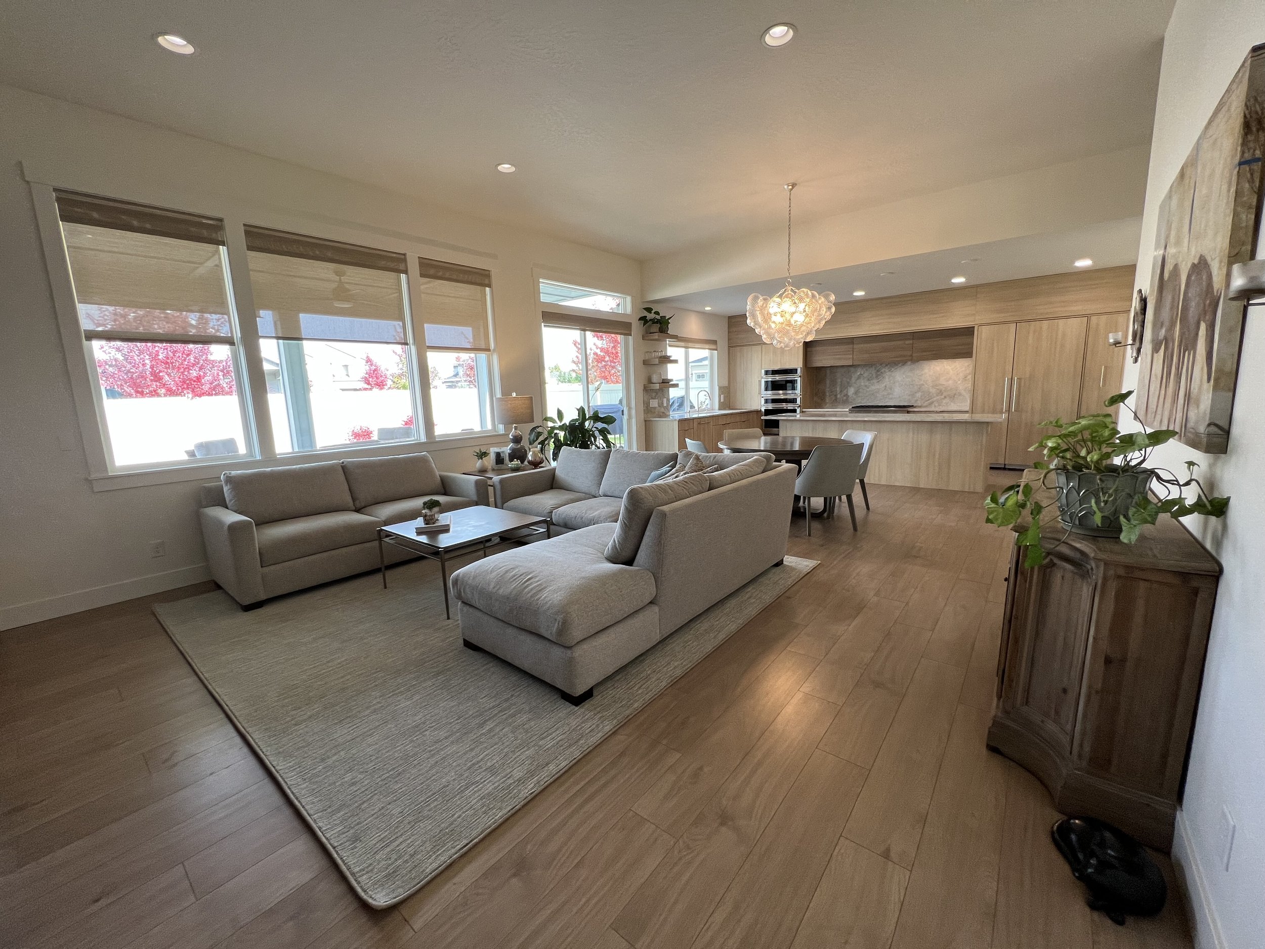
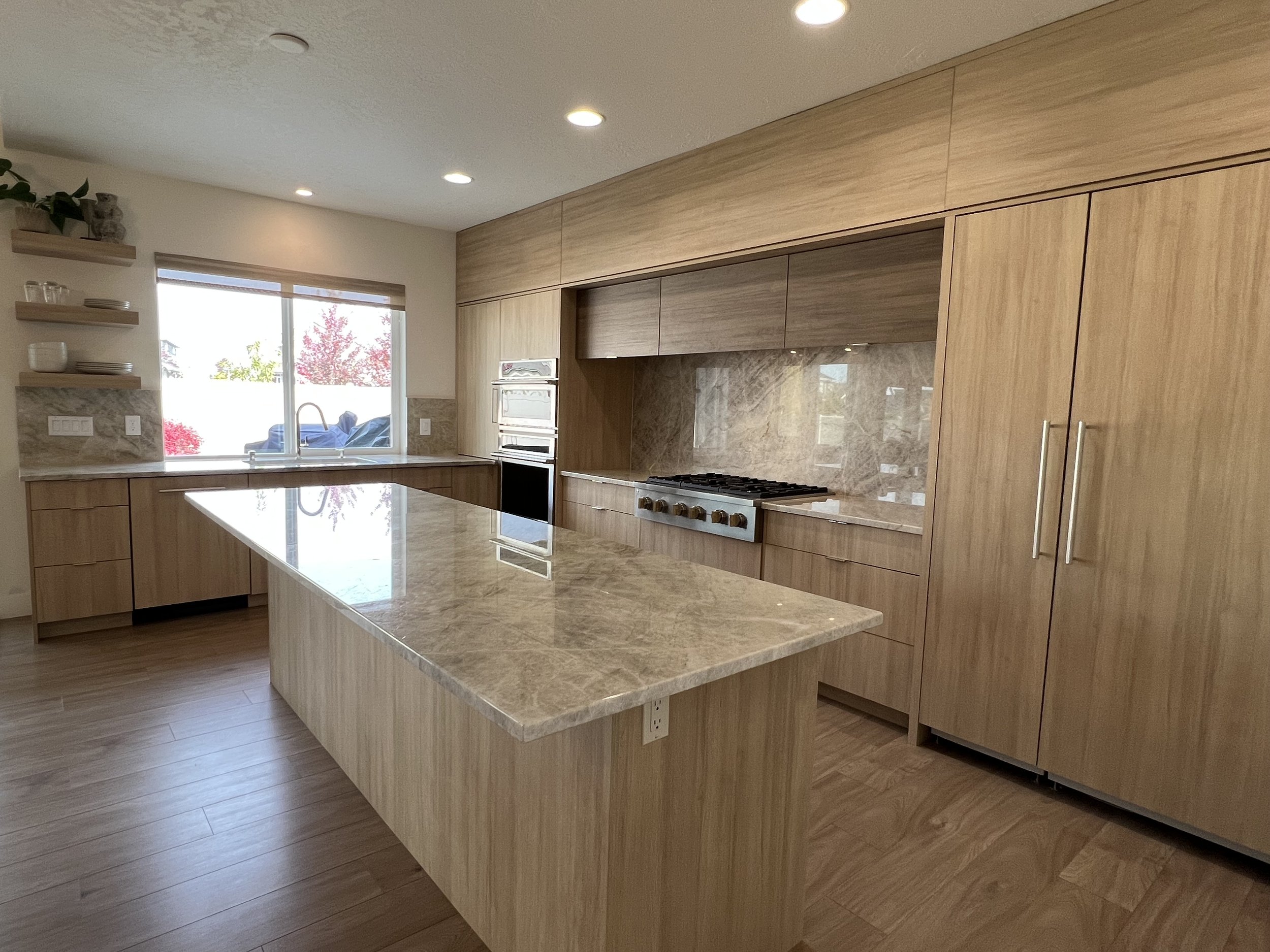
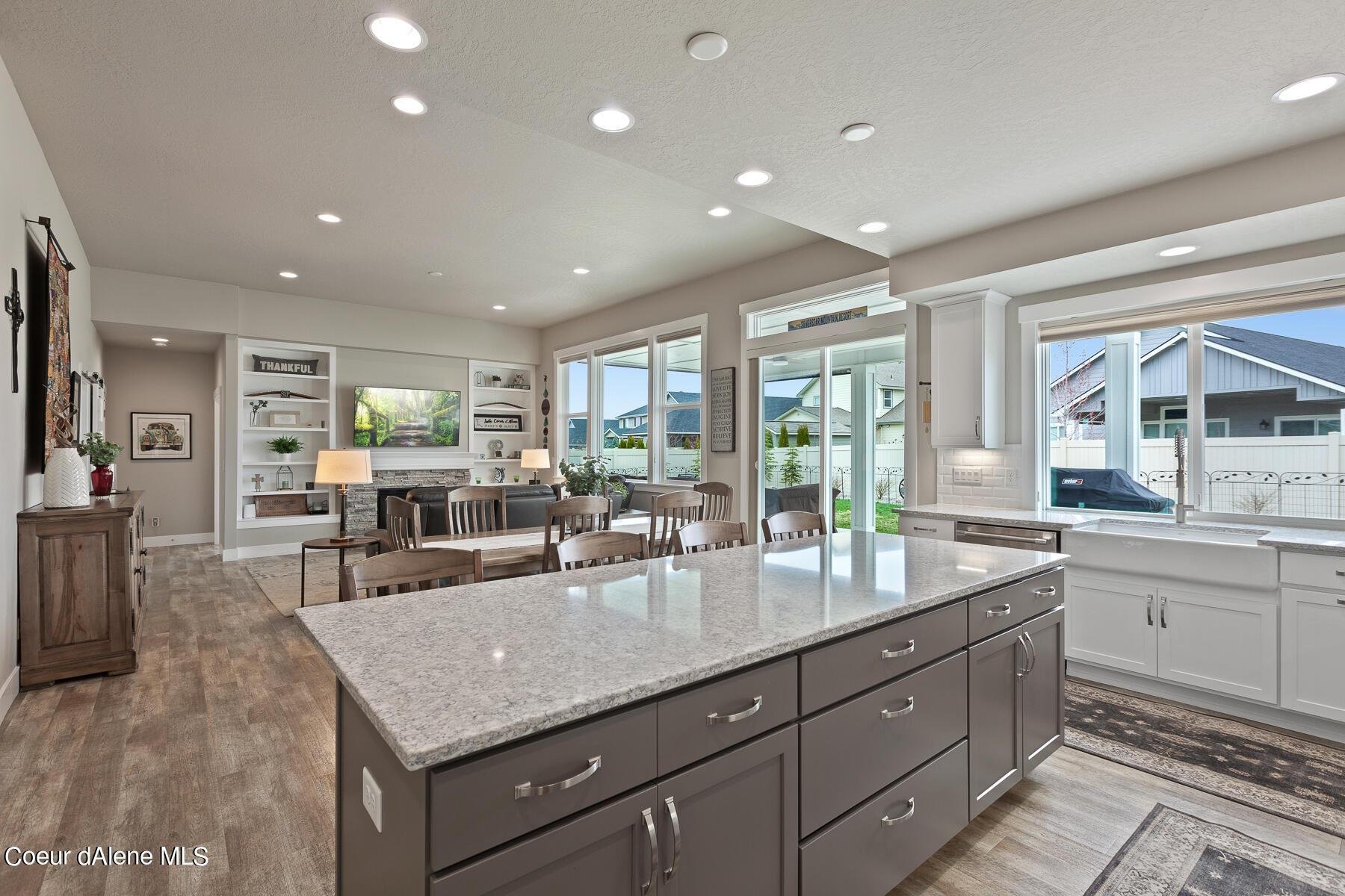
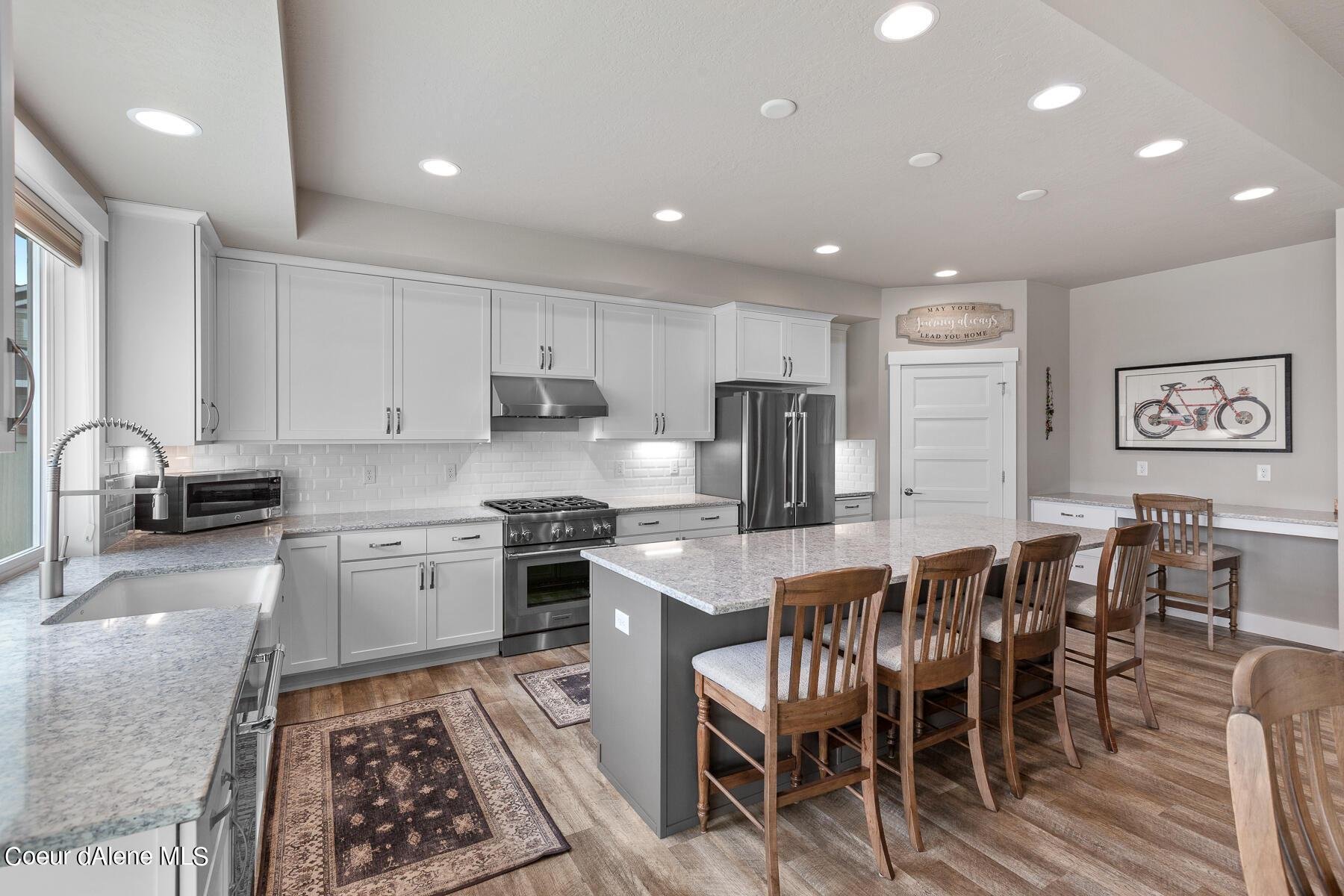
The two-tone flat panel cabinets, by Advanced Cabinets, create a modern look for our new kitchen. The brown colored cabinets over the cooktop bring interest to the workspace and its great storage for all our oils and vinegar. I made the great room feel cohesive by bringing the warm blonde and brown cabinet colors on the opposite fireplace wall. I selected a Taj Mahl quartzite countertop material for both the countertops and backsplash both for its natural beauty and its complementary warm color palette. I choose a Rohl polished nickel sleek modern faucet, a large Kohler one bowl cast iron sink and polished nickel cabinet tab pulls to gives the kitchen a clean, warm, and inviting feel. New upholstered Jessica Charles counter stools will find their home by the island in January!

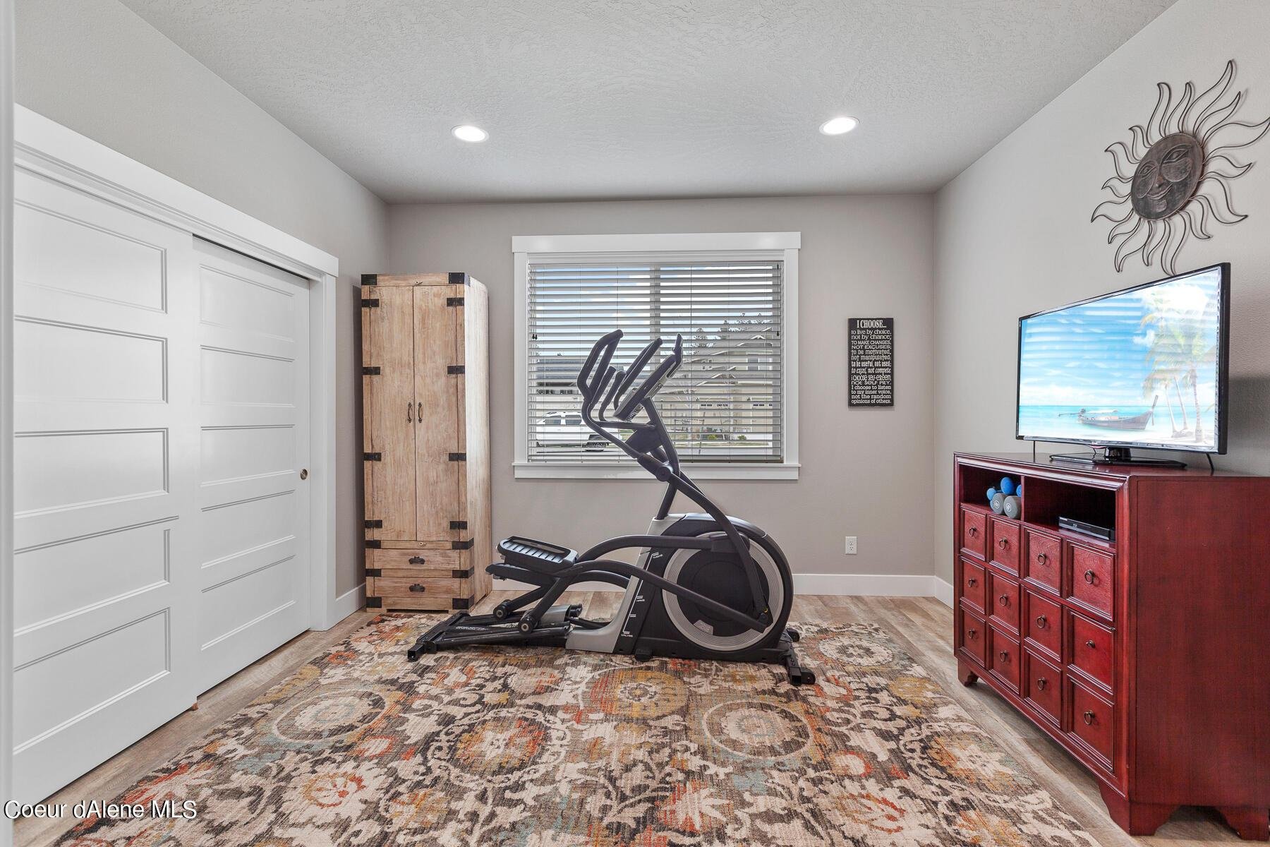
In addition to not wanting a white kitchen for our new home, we also didn’t want a corner pantry in the space. We opted to remove the kitchen desk and closet from the adjacent workout flex room to create a large walk-in pantry. The pantry is now 12’ x 5’ size and perfect for our 2 Perlick wine refrigerators and plenty of additional storage space. I’ve always wanted to have a slat wall to house all my party platters and I am thrilled how my visual storage turned out!

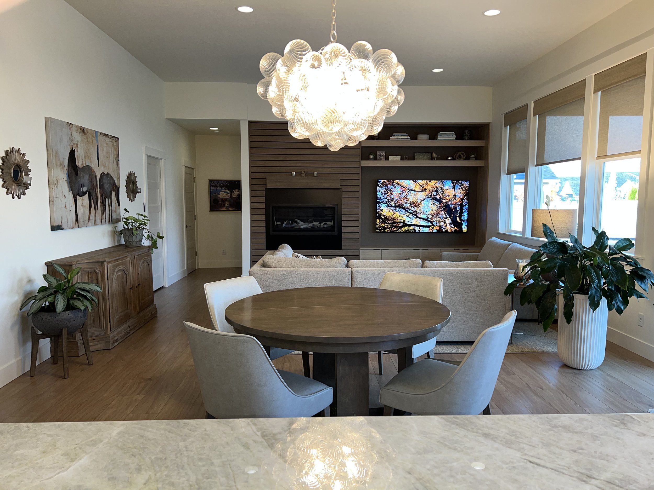
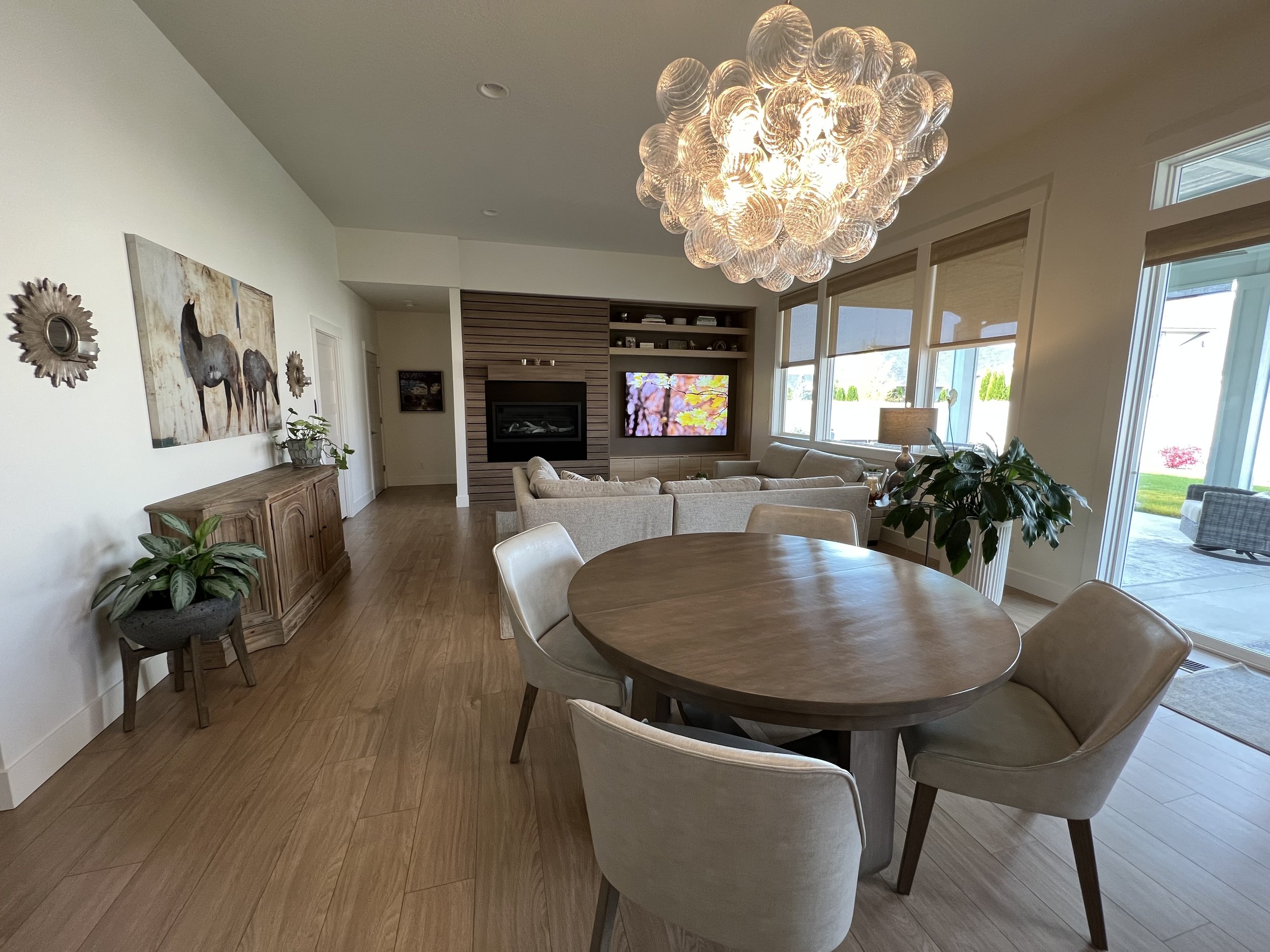
I love our floating shelves on the left side of the sink which is perfect for all our daily dishes and glassware. The large deep cabinets and custom knife, utensil and spice drawers make our new kitchen very functional and perfect for all our cooking and gatherings will plan to have for many years to come! We removed a row of recessed can lights in the kitchen that felt like an airport runway and took away from my Circa Lighting Talia glass ball chandelier which I wanted it to be the focal point of the space. It is centered on the front door and provides interest and whimsy to our home, and it makes me smile every time I see it! The jury is still out as to whether we get island pendants and currently I am loving the openness of our space and feel that island pendants have been overused for some time. Depending on the size of a kitchen, you often don’t need them if you have sufficient recessed can or other task lighting.

Living Room Fireplace Wall Remodel

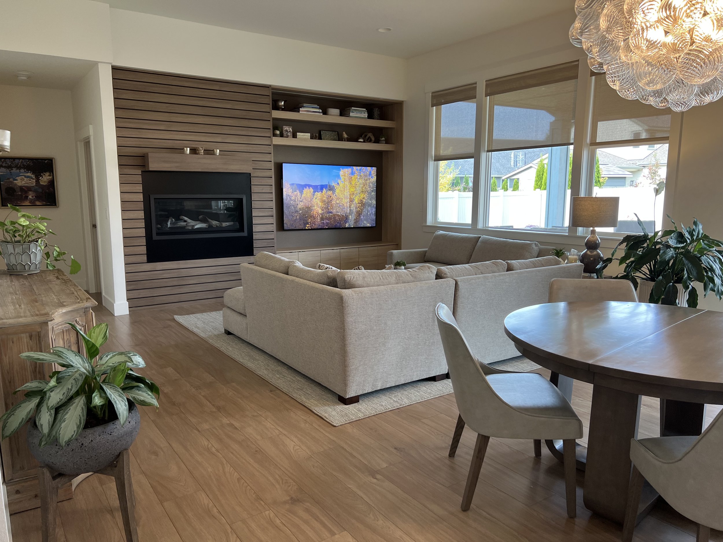
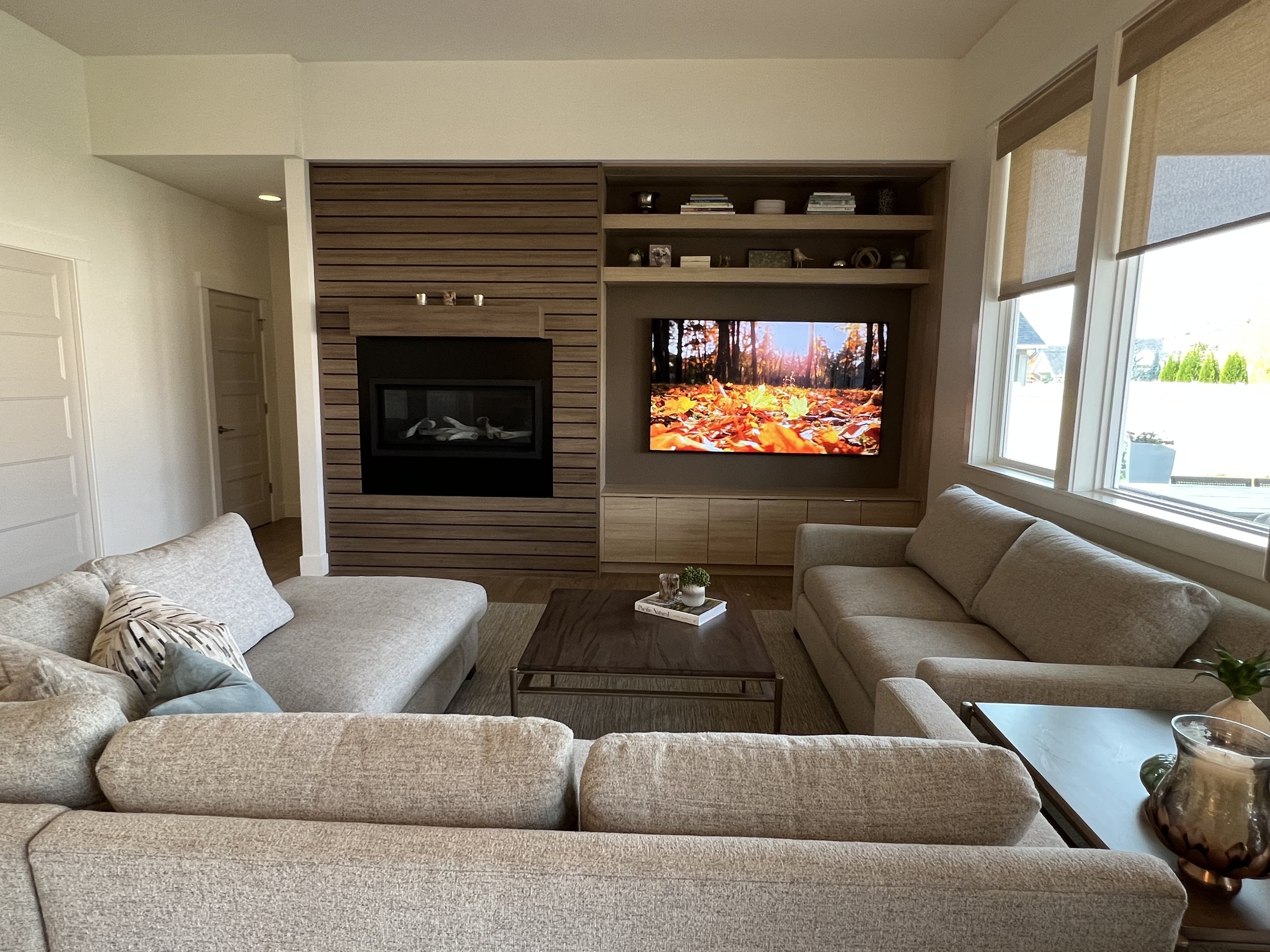
The builder grade look of the fireplace installed on the floor wasn’t going to achieve the modern direction we wanted, so we chose a liner fireplace with birch logs and raised the unit high enough on the wall so I could have a mantel over it. The fireplace slat wall was an idea I came up with again to provide a clean and modern look for the wall. Base cabinets below and open shelves above the 70” TV balance out the wall and provide interest and warmth to the entire room. This wall is my favorite feature of our remodel and I love how it has turned out!

Master Bedroom Remodel

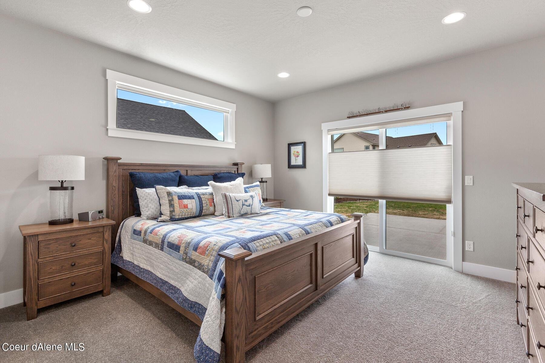
The master is a smaller size than we’ve had in former bedrooms, and I wanted to achieve a cozy feel in the space. By removing the window above the bed wall, it provides us the space to have our large king size bed on it. Many don’t consider removing windows or doors to add functionality to a space and I hope now you will consider it.

I am a huge fan of custom draperies, and I used a Pindler fabric that is a similar color tone as the wall paint color to give the illusion of a larger room. Especially in a bedroom I frequently use a blackout lining for the room darkening effect. A new Fabrica area rug and beautiful Circa Lighting lamps complete the look of our new cozy and comfortable master bedroom.

Master Closet Remodel

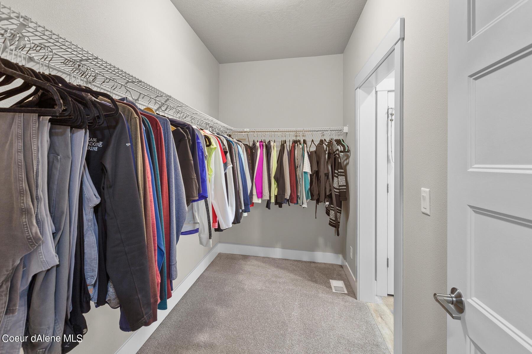
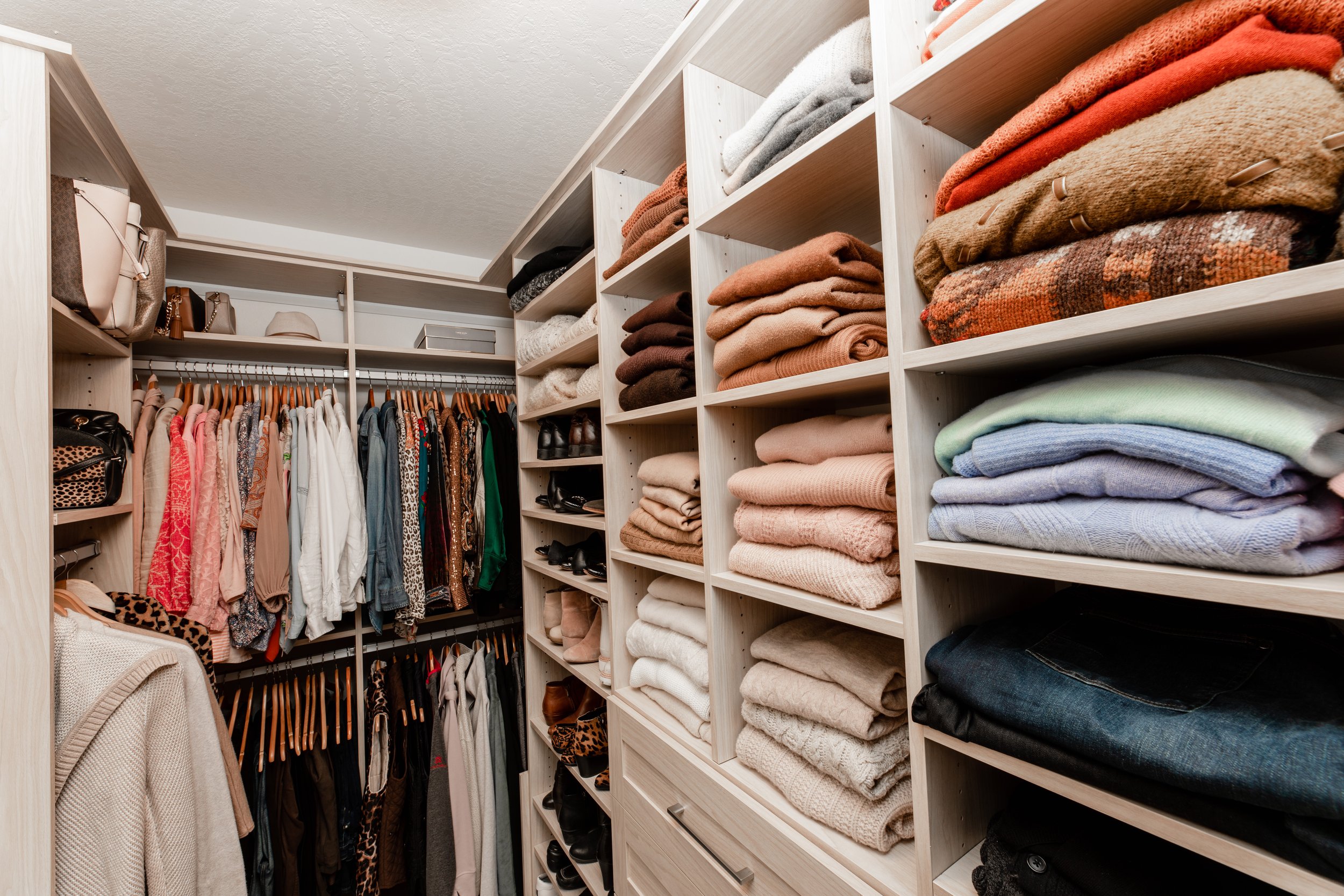
I often say that having a built-in closet is like flying first class, in that once you have one in your home it is very hard to go back to the builder grade wire racks. We invested in a floor to ceiling master closet that finally can store all our clothes! Built in drawers, hamper, jewelry trays, tie and belt racks were included to add to our functional and beautiful new master closet.

Laundry/Mudroom Remodel

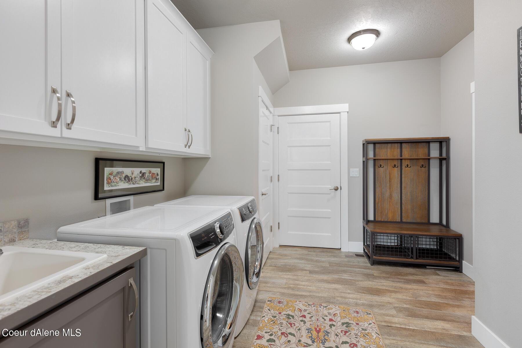
The laundry/mudroom door leads to the garage and is adjacent to the master closet. There was a door leading into master closet which didn’t make sense to me at all especially since I was wondering where to put all my shoes! The first thing we did was to remove the door that led from the laundry mudroom into the master closet so to gain more hanging space in the master closet. It also provided us a full wall to have a custom built-in wall with cubbies and a bench. By removing the upper cabinets over the washer dryer, I added a wall-to-wall shelf that is reachable for me and will house decorative baskets full of supplies. Larger Circa Lighting ceiling light fixtures, an undermount composite off white sink and a quartz slab installed over the washer dryer make this space a lot more functional and we are thrilled with the outcome!

Guest Bedroom & Bath Transformation

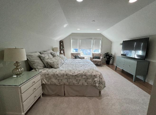
Since we use the main floor bedrooms as offices, we turned the 2nd floor space into our guest suite. I choose a seafoam green paint color and placed two sitting chairs at the end of the room to anchor it in front of the three windows. And now it’s perfect spot to curl up with a good book. I continued the laminate flooring into the 2 nd floor bedroom and bathroom and installed a custom area rug to create warmth in the bedroom space. All of the furniture pieces came our former home and I feel they all fit nicely in the room. My husband Rick says I created a hotel room in our new guest bedroom!

Powder Room & Guest Bathroom Transformations

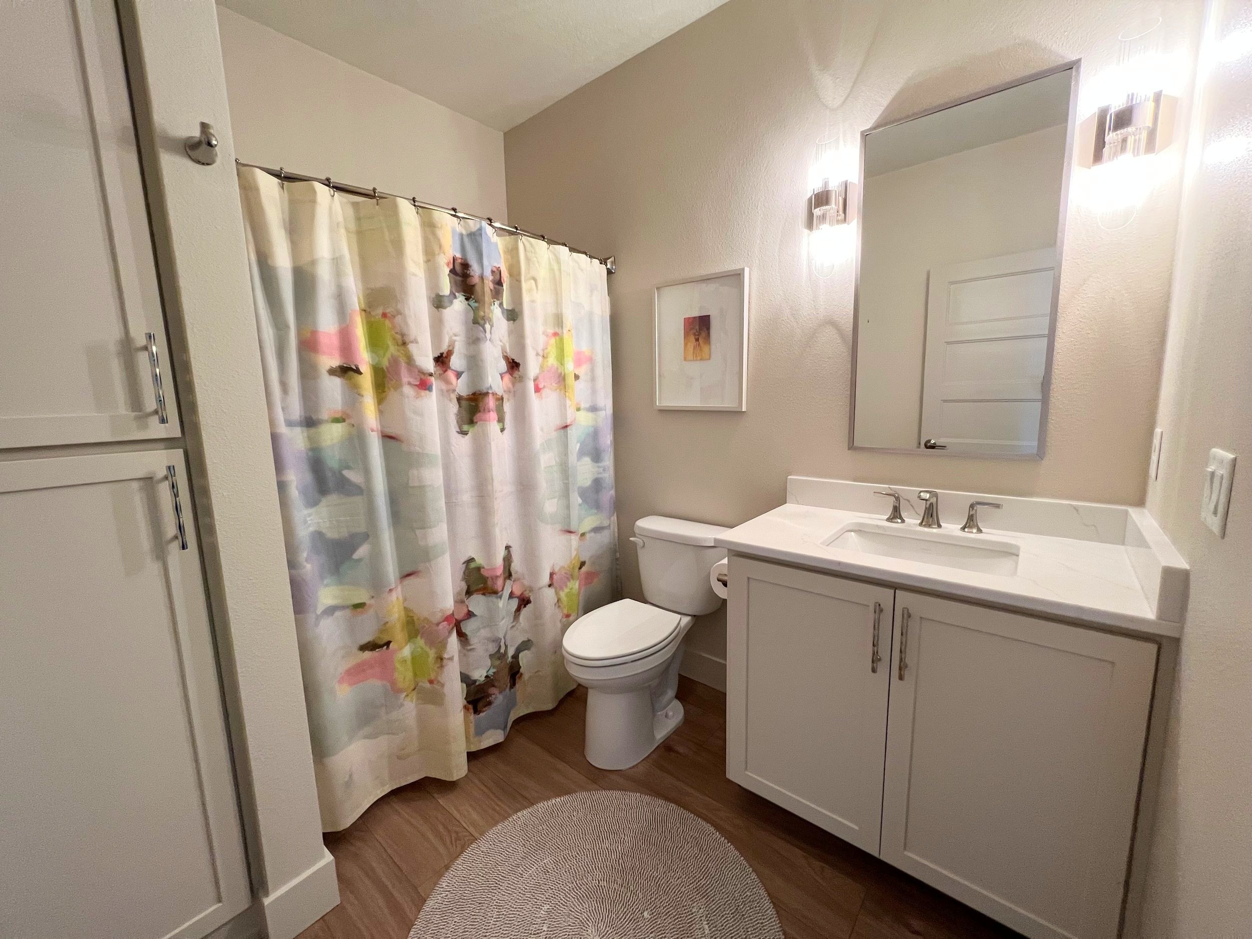
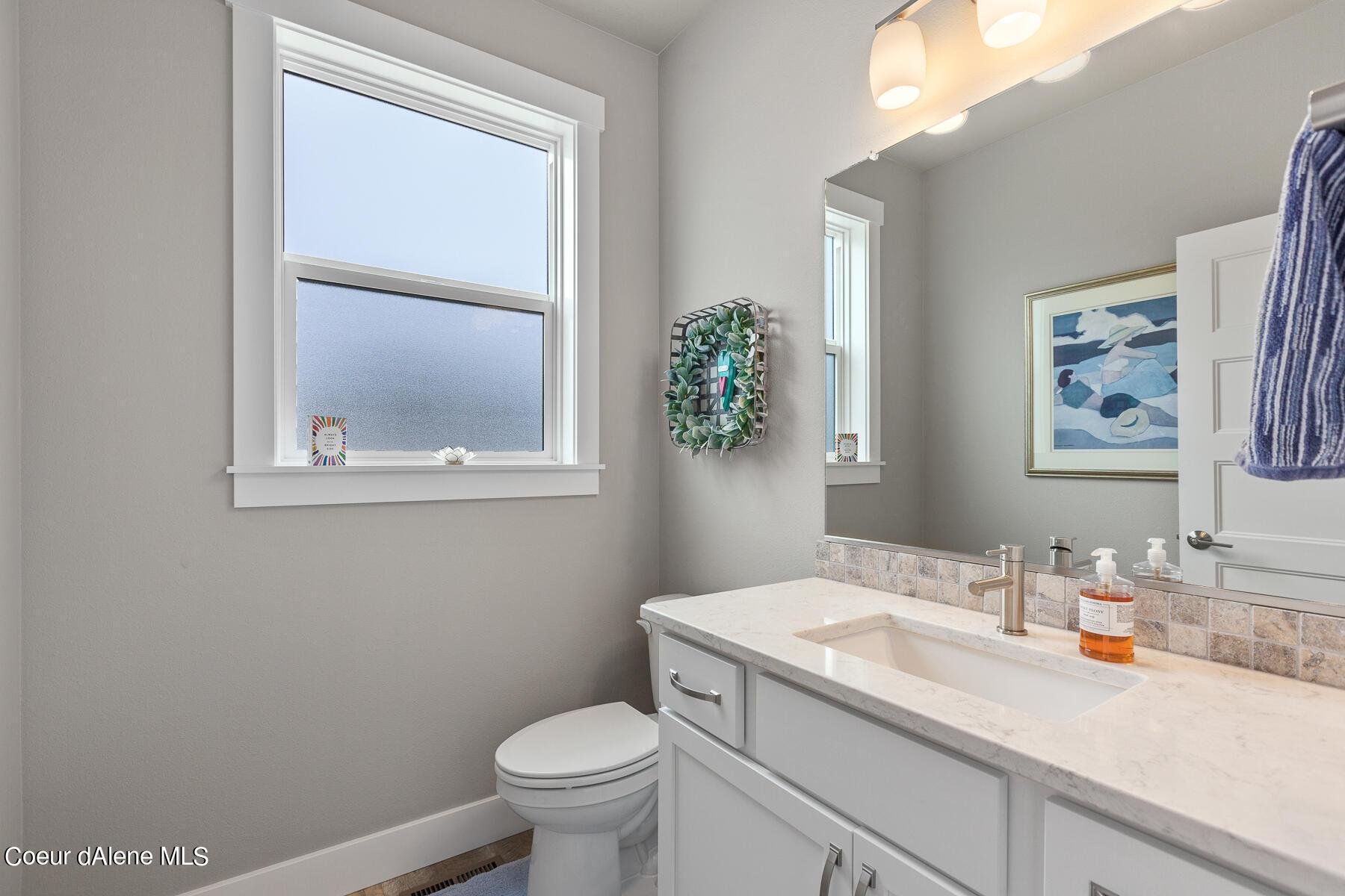
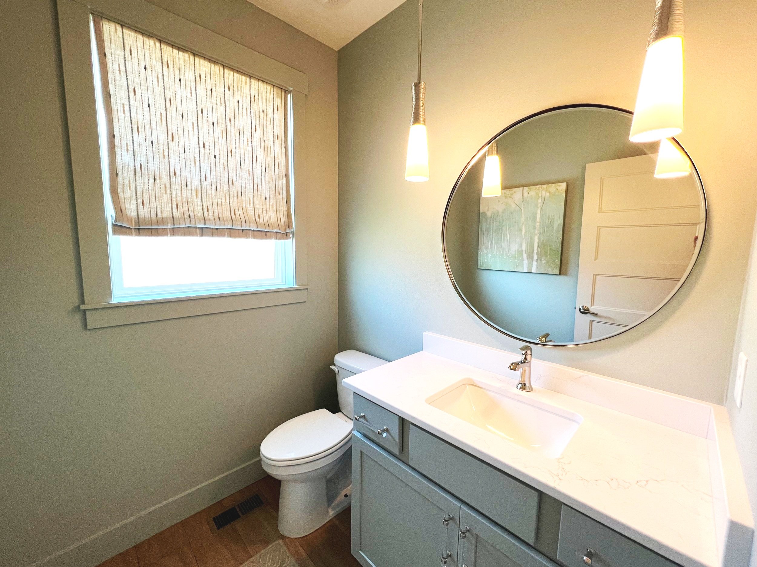
Once these rooms were painted, I wanted to create their own personalities and I replaced the countertops, faucets, lighting, mirrors and cabinet hardware to achieve my goal. I stayed with the polished nickel finish for the lighting and cabinet hardware and added fun shower curtains and area rugs to complete the look. That’s all you need to create your own sanctuaries!

Workout Flex Room Remodel

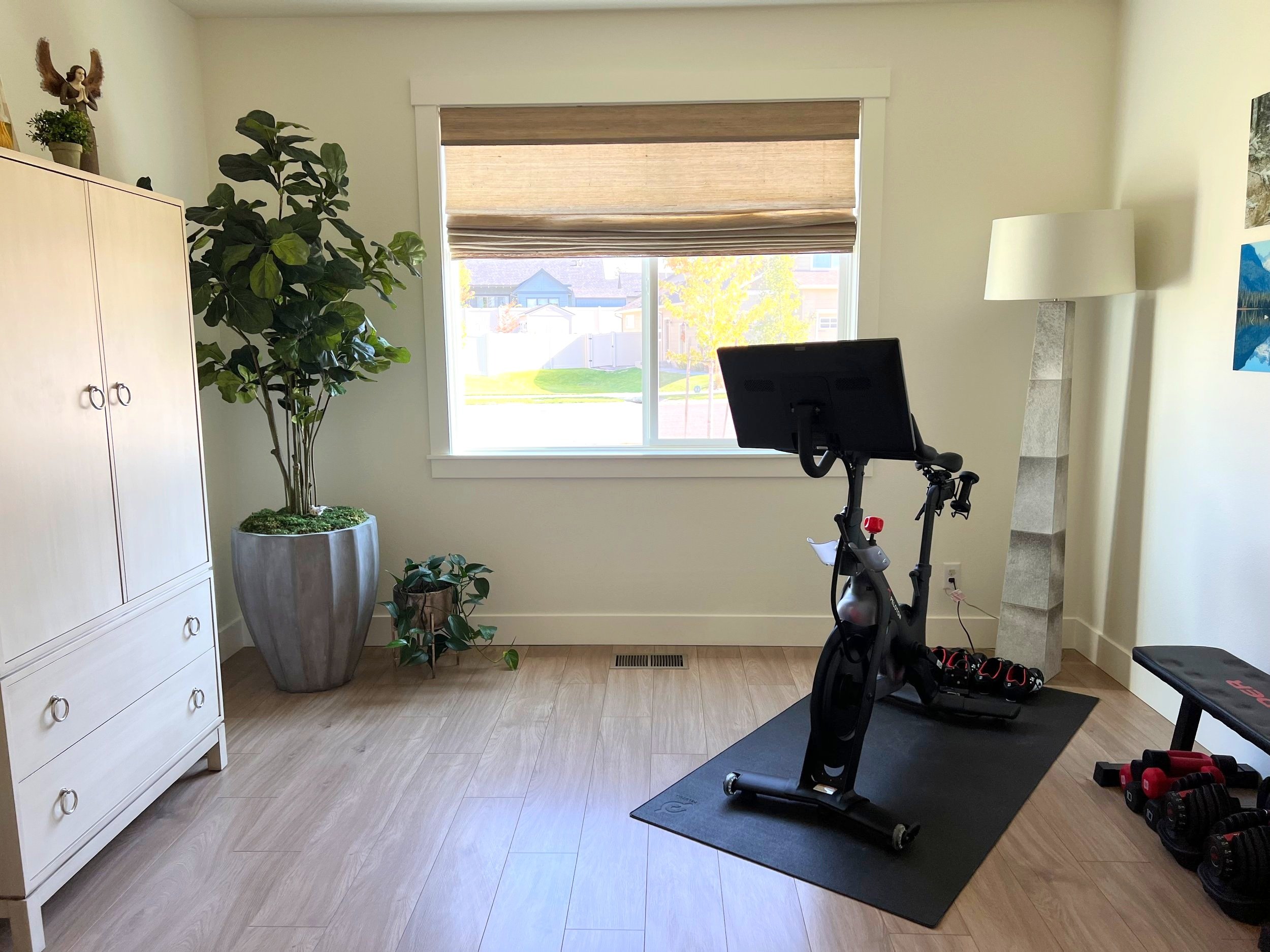
I love the idea of including a workout flex space in a home and our new flex room houses our Pelton bike, weights, mats and has room for an armoire that was in our former master bedroom. I use it now for hiding our work out equipment and some of my business files. We removed the closet in the former space for our new pantry.

Window Coverings

In addition to loving custom draperies, I also love custom window coverings. By adding a fabric window covering to a room you immediately create warmth and interest. I installed custom roman shades in the powder room, my office and a sheer fabric panel on the front door side window. In the other rooms I finished them with Horizon Window Fashions woven weave roman shade in a color like the wall paint colors. The kitchen, dining and living room windows all face north and are very tall so I knew I wanted to be motorized and I choose a Horizons Window Fashions sunshade in they are the same color as the new laminate flooring. Window coverings are often left to the end of a project and it’s important to select and budget for them during the initial phase as they play a key role in completing any space.

What’s Next?

Phase II of our new home remodel is scheduled for 2023 with our master bath remodel as we simply ran out of steam to do it in Phase I. The master bath will be cosmetic with new shower tiles, and a new vanity countertop, faucets, and lighting. We both have separate offices, formerly bedrooms, that will also be finished in 2023. Let the transformation continue!

Creating A Stunning Fall Table Setting

With the arrival of fall comes the most stunning tablescapes, so it’s the perfect time to set a beautiful table! In fact, some may even argue that fall decor can be more fun than its summertime cousin since you can get creative with different textures and colors to create an eye-catching tablescape sure to impress your family and friends. Here are some simple tips on how to create a stunning fall table setting that’s sure to wow your guests this season!

One of the best ways to decorate your table for fall is with plants. Not only do they add color and life to your table, but they can also help purify the air. To create a stunning fall table setting, start by placing a large plant in the center of the table. Then, surround the plant with smaller plants and candles. Add some fall-themed accents, like gourds or leaves, to complete the look.

One of the best things about decorating for fall is that there are so many wonderful accent pieces that you can find just about anywhere. Here are a few of our favorites:

 • Tapers: They're such an easy way to add a bit of light and drama to your table setting and they come in all different colors!

• Pressed leaves: Take some on walks through the woods or pick them up in the yard, they make great additions on top of flowers or place cards.

• Acorns: These are great as part of centerpieces or as simple accents on dishes.

• Pinecones: They're not only adorable, but also smell amazing! You can use them as part of your centerpiece or even as vases for fresh flowers.

There's something about the warm colors and rustic vibes of fall that make us want to cozy up at home. And what better way to do that than by setting a beautiful table? Here are some farmhouse-style pieces that will give your dining room the perfect fall look:

1. A set of dishes with a warm, earthy color palette. Think hues of orange, red, and brown.

2. A set of antique silverware. The patina on this type of silverware makes it an elegant addition to any table setting.

3. Patterned cloth napkins or tea towels for a touch of personality in an otherwise simple space. 4. A set of glasses (we love these turquoise ones!) to balance out the earthy tones and bring in a little fun too! 

5. Candles in coordinating scents like pumpkin spice or apple cider - they'll keep your guests feeling festive all night long! 

6. Rustic wood chargers to add some character - they're especially nice if you're hosting a fall wedding! 7

7. Finally, we can't forget the centerpiece!


Interior Design | What's Happening Now

At first glance, the world of interior design may seem like one giant quagmire of trends and fads, with countless ways to decorate your home from wall to wall in whatever style happens to be popular at the moment. Don’t worry – the good news is that there are plenty of timeless interior design ideas you can use to create a look that works for your home and your personality, no matter what happens to be trendy right now! Read on to learn more about what’s trending in interior design and how you can incorporate it into your next project!

One of the hottest trends in interior design right now is retro mid-century modern. This style harkens back to the design of the 1950s and 1960s, with bold geometric shapes and clean lines. 

This popular style combines vintage finds with a distressed look. The overall effect is warm and inviting, perfect for any home. The key to achieving the shabby chic look is to mix and match different pieces, textures, and colors. This gives your space a unique and personal feel.

One of the hottest trends in interior design right now is minimalist decor. This style is all about clean lines, simple shapes, and a lack of clutter. If you're looking to give your home a fresh, modern look, then minimalism is the way to go. 

Right now, monochromatic colors are trending in interior design. This color scheme uses different shades of the same color to create a cohesive look. Monochromatic colors can be used to create a variety of looks, from sleek and modern to warm and inviting. If you're looking to give your home a fresh new look, consider using monochromatic colors. Another big trend in interior design right now is contemporary style interiors. This look is all about clean lines, neutral colors, and a minimalistic approach. If you're looking to give your home a fresh, modern makeover, then this is the style for you. To achieve the contemporary look, start by decluttering your space and getting rid of any unnecessary items. Then, focus on using clean lines and neutral colors throughout your décor. Finally, add in some minimalist pieces to complete the look.


Horizons Window Fashions Partnership

I am happy to announce I have partnered with Horizon Window Fashions! If you’re seeking assistance with any aspect of your Interior Design, including window treatments, I am happy to assist you! Horizons has a beautiful selection of any kind of window fashion you can think of. And their customer service is impeccable to book! You can see the link for Horizons here.

Life in North Idaho

Life took a positive turn for me and my husband Rick this year when we unexpectedly sold our home in Eastern WA and moved to beautiful Coeur D’ Alene Idaho.  We intended to relocate to the area upon retiring in several year’s yet the stars aligned for it to happen in January of 2022.  After several months of searching for the right location and home, we finally purchased our new home in May and I’ve been busy remodeling it into our dream home.  

My passion for design and to transform client homes is still within my soul.  My design tools have evolved, and video conferencing is a new way for me to meet clients and to experience a home environment while guiding the project to completion.  I continue to utilize my resources at the Seattle Design Center and have been working with several suppliers here in North Idaho for my current projects.  

I am currently marketing my design expertise in the North Idaho and Eastern Washington markets and look forward to partnering with you to create your own Authentic Home.

Best always,

Kathy

Revamping Your Kitchen

If you're a homeowner, I'm sure you've considered upgrading your kitchen at one point or another. If you've had your home for a while, you might be thinking that the kitchen is starting to seem a little shabby, or maybe you've just moved in and want to modify it to suit your own style, or you might be thinking about selling it. Whatever the motivation for the renovation, renovating your kitchen will add value to your home and improve the quality of life for those who live there. In fact, renovatng your kitchen is the single most worthwhile task you can undertake. Especially if you want to increase the value of your home.

Remodeling Your Kitchen? Keep these Ideas in Mind!

Are you planning a kitchen renovation? Remember to keep these suggestions in mind!

It is determined by the type of home and the amount of money available to the owner, as well as how much you spend on kitchen renovations. The reason for this is because each street has a maximum perceived worth per home. If you spend a fortune on your home and it is located in a trееt of homes in the wrong part of town, you may not make any money at all, but you will sell your home more quickly. Ask any real estate agent, and they'll tell you stories about homeowners who were unhappy with the real estate agent's recommended selling price after spending thousands of dollars fixing up their home. Look at it this way: if you have a hundred properties on your street and the average selling price is $100,000, you are very unlikely to get $125,000. When it comes to rеfurbishing to sell, keep that in mind.

The standard of living. If you intend to stay in your home, a kitchen remodel is the most up-lifting renovation you can make. Most families spend a lot of time in the kitchen, which is another reason why a renovation will be greatly appreciated.

Reface Your Cabinets with new ones іn a lighter color and to repaint or repaper thе wallѕ аnd ceilіngs wіth a lіghter color. A designer’ѕ tip tо bооѕt the amount of light in a room, іs to paint the window reveals white so that more sun lіght іs reflected back іn to thе room.. Another two tips are to re-emulsion the ceіlіng whіte as it stains quіckly and to have a white floor-covering. You wіll be amazed, these last three tips make a lot of dіfference to the brightnеѕѕ of a kіtchen.

3. Switch Out Your Hardware. You will be delighted at what a big difference such a little change can make to a kitchen. If your kitchen cabinets have older knobs that look dated, go down to your local hardware store and find some that are more modern, or have a timeless classic look.

4. Unclutter the Knick Knacks. Kitchens are the number one space in the home that collect clutter the fastest. We tend to keep random items in a junk drawer, clutter our counters with appliances, and use our kitchen counters as catch-alls for our mail, keys, and other belongings. We often use our refrigerators to showcase our utility bills and other random items. By clearing off your surface spaces, your kitchen will feel fresh, open, and clean. Uncluttering your home in general is a great way to clear your mind as well!


5. Reduce Noise. And by noise, I don’t mean sound. If your tile backsplash currently is multi-colored or has a busy pattern, this can create a sense of visual chaos to your space. Replace your kitchen’s patterned surfaces with simple, neutral lines and your space will appear larger and cleaner.

Image Source: CliqStudios, Online

Image Source: CliqStudios, Online

Idaho Scenic Spots: Beautiful Places Worth Seeing

With its wide variety of landscapes and ecosystems, it’s no wonder that Idaho has been named the Gem State as well as the well known Potato State. With this beautiful state full of natural wonders, it’s not hard to see why Idaho attracts millions of tourists each year, many who come to see these Idaho Scenic Spots!

Craters of the Moon National Monument

This national monument is a great place to explore if you're interested in geology or history. The lava flows and cinder cones are remnants of ancient volcanic activity, and the caves are popular with spelunkers. If you visit during the winter, you might even be able to go ice climbing!

City of Rocks State Park

The City of Rocks is a unique geologic formation near the border of Idaho and Utah. The city is actually an ancient valley that was filled with lava and then eroded over time, leaving behind these amazing rock formations. The City of Rocks is a great place to hike, rock climb, or just explore. And if you're lucky, you might even see some bighorn sheep!

image source | trip advisor

Rivers Edge Trail

The River’s Edge Trail is one of the most beautiful places in Idaho. It follows the Boise River through Ada County and offers amazing views of the river, the city, and the surrounding mountains. The trail is perfect for hiking, biking, or just walking and enjoying the scenery. There are also several spots along the trail where you can stop and fish or swim in the river.

Bonneville Hot Springs Resort

Situated on the banks of the Snake River, this resort features natural hot springs, lodging, and dining. The hot springs are said to have healing properties, and the resort offers a variety of treatments. Visitors can also enjoy hiking, biking, and fishing in the nearby mountains. Located south of Twin Falls, Bonneville Hot Springs Resort is one of the most popular destinations in all of Idaho.

Twin Falls

Located between green hills and high desert, Twin Falls is a picturesque town in south-central Idaho. The Snake River flows through the center of town, and there are several parks and hiking trails along the river. Shoshone Falls, one of the largest waterfalls in the country, is just a short drive from Twin Falls. And if you're looking for even more beauty, head to Sawtooth National Forest where you can find towering mountains, pristine lakes, and abundant wildlife.