Ultra Violet: 2018 Pantone Color of the Year
/Rich and pensive, Ultra Violet is reminiscent of existential energy, the mystery of what the future holds, and the new discoveries of the past and present. It reminds us of the night sky, dark but endless, full of mystery.
Why Pantone Chose this Color
With everything happening in our world at the present moment, Pantone color researchers thought it necessary to remind ourselves of our sheer presence on earth and the vast endlessness of our atmosphere. Ultra Violet is cosmic, rich, and timeless.
Our Favorite Ultra Voilet Uses in Interior Design
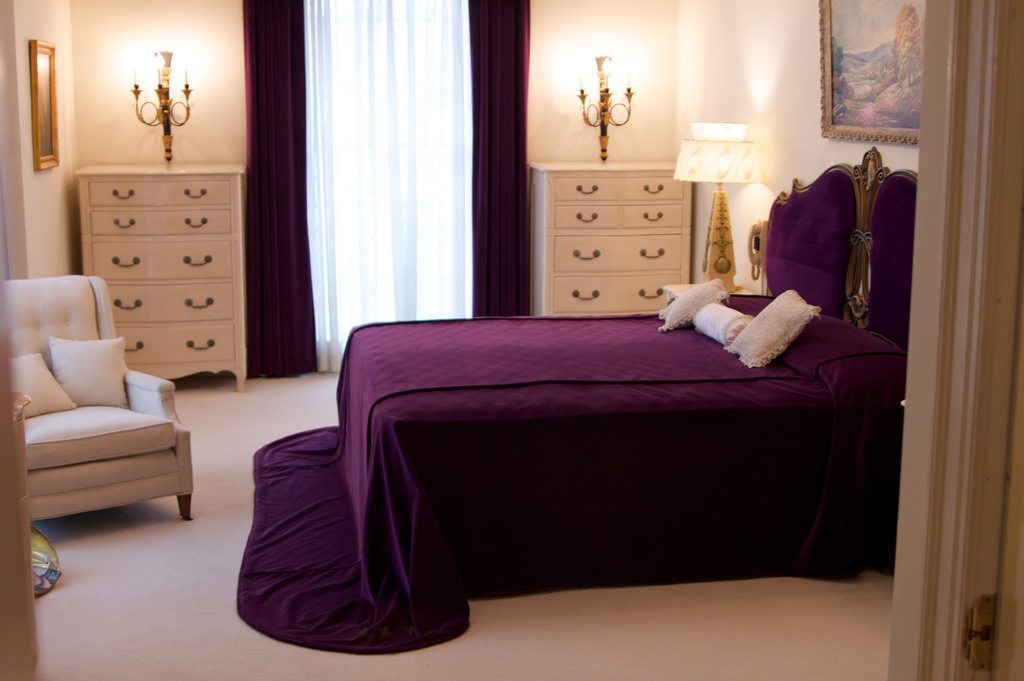
1. Using rich purples make a bold statement as an accent. This gorgeous bedding truly brings forth a timeless, rich look to this elegant bedroom. Rich purples tend to pop when placed in an otherwise neutral color scheme.
2. Even the tiniest purple accents in a space can make a very bold statement. This otherwise very white bathroom stands out with just the pop of color of its hand towel.
3. Ultra Voilet in Commercial Design. There's no doubt the guests who visit this elegant restaurant will never forget the gorgeous, sophisticated upholstery on the dining chairs. What a statement!
Ultra Violet in Fashion
Reminiscent of the Victorian Era followed by the 1920's rich purples always manage to make a fashion comeback. We are seeing this beautiful hue in every aspect of the runway, from hair color to couture. The beauty of this otherwise considered feminine color is that it truly works for both genders and truly makes a haute statement!

