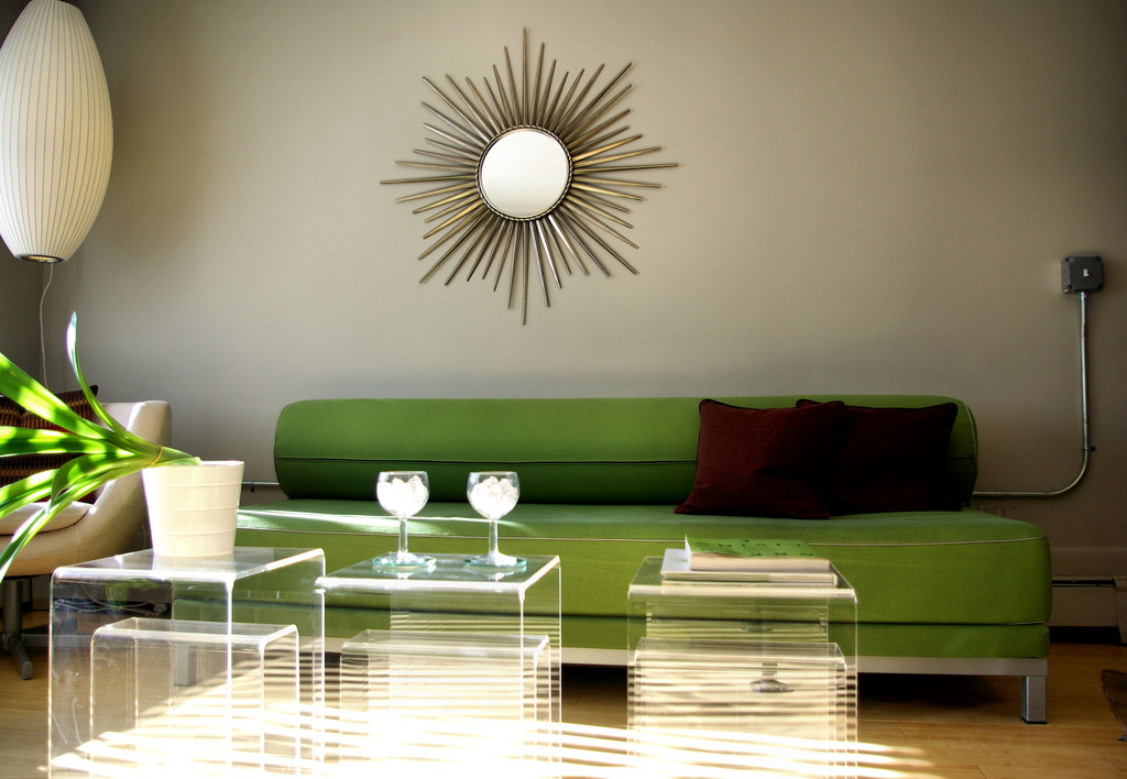
Gallery Walls: Get the Look

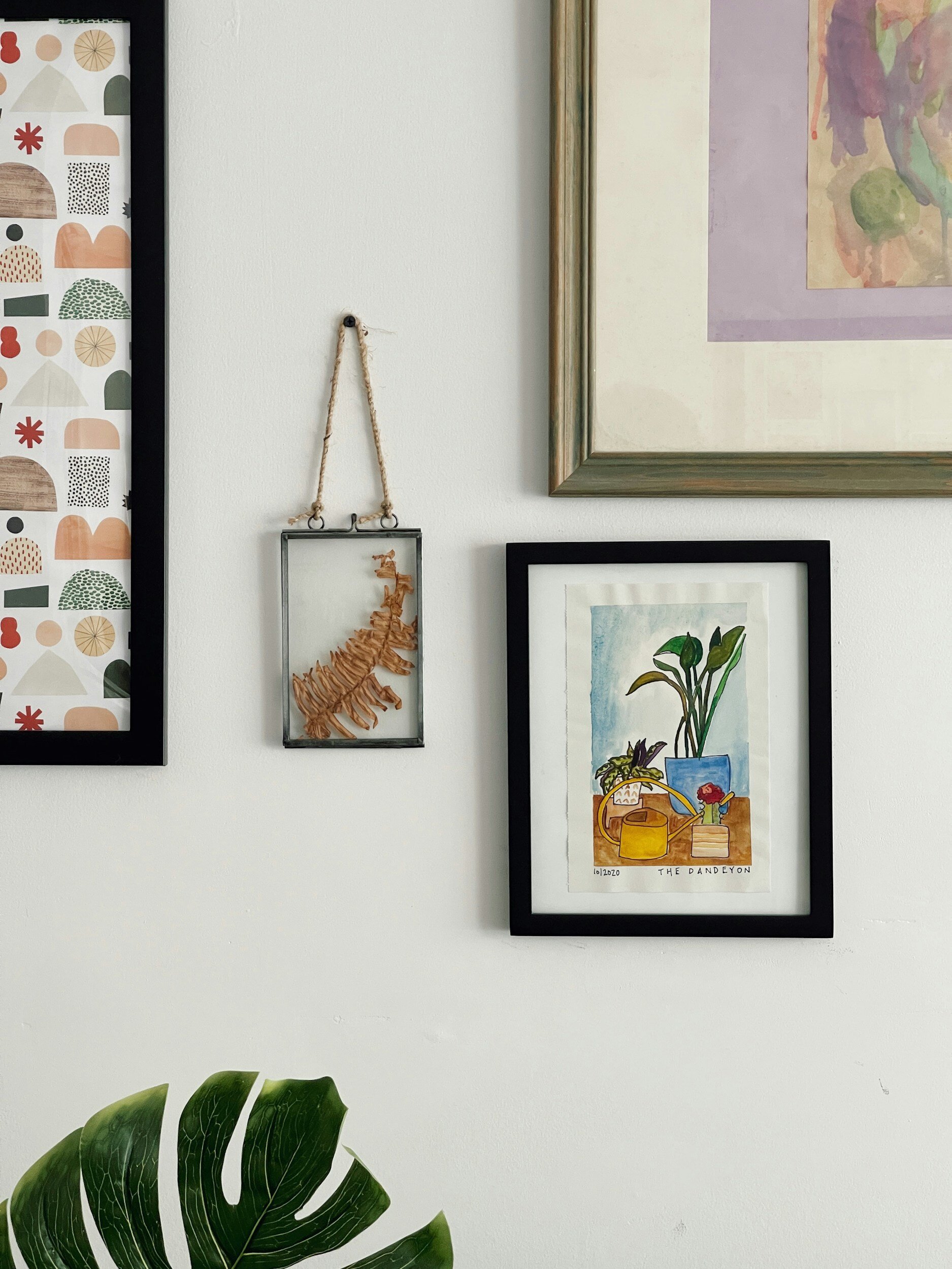
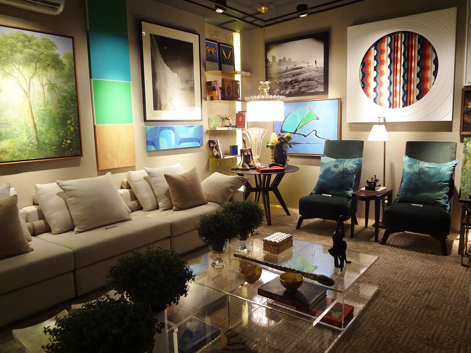
Gallery walls have become a popular trend in interior design, offering a creative and personalized way to decorate your home. Whether you're looking to showcase a collection of art prints, photographs, or other cherished items, a gallery wall can add depth, interest, and personality to any room. Here's everything you need to know about creating your own stunning gallery wall!

The first step in creating a gallery wall is to select the wall where you want to display your artwork. This could be a focal point in your living room, a hallway, or even a staircase. Once you've chosen the wall, it's time to gather your artwork. This could include framed prints, photographs, paintings, or even objects like mirrors, clocks, or decorative plates.

When selecting artwork for your gallery wall, consider the overall theme or aesthetic you want to achieve. You can choose pieces that complement each other in terms of color, style, or subject matter, or you can mix and match for a more eclectic look. The key is to create a cohesive arrangement that feels balanced and visually appealing.

Before hanging your artwork, it's a good idea to lay out your gallery wall on the floor first. This will allow you to experiment with different arrangements until you find one that works best for your space. Once you're happy with the layout, you can start hanging your artwork on the wall.

When hanging your artwork, consider using a variety of frame sizes and styles to add visual interest. You can also play with the spacing between frames to create a dynamic and engaging arrangement.

In addition to framed artwork, you can also incorporate other elements into your gallery wall, such as wall decals, wall stickers, or even three-dimensional objects like shelves or planters. These elements can add texture and depth to your gallery wall, making it even more visually striking.

Overall, gallery walls offer a versatile and creative way to showcase your personal style and interests. Whether you're creating a gallery wall in your living room, bedroom, or any other space, the key is to have fun and experiment with different arrangements until you find one that feels just right!

The Simplicity of Scandinavian Design

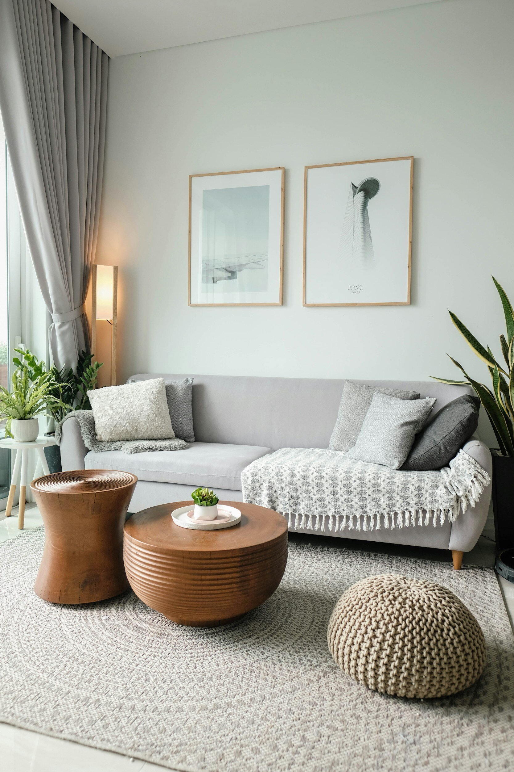
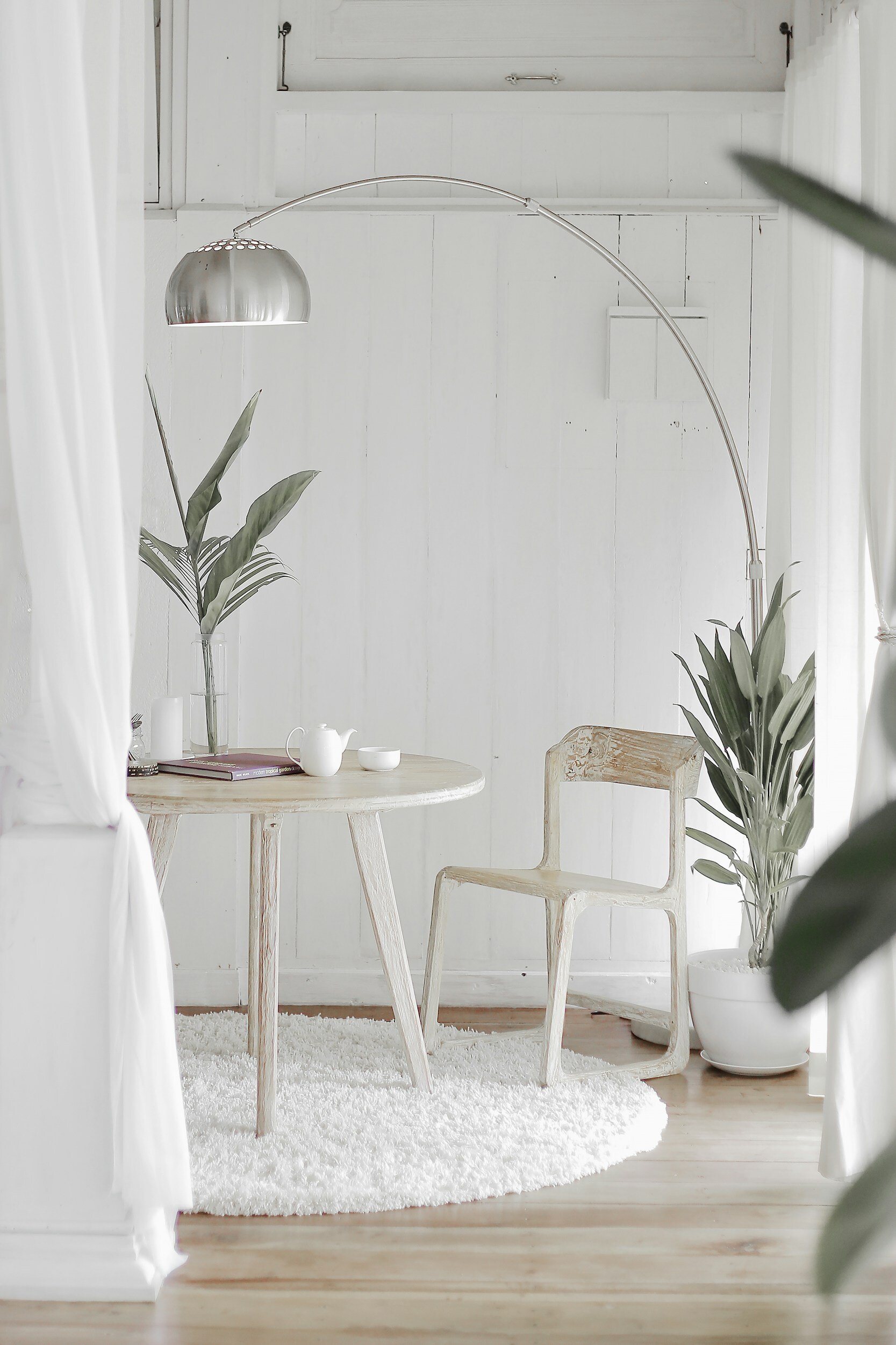
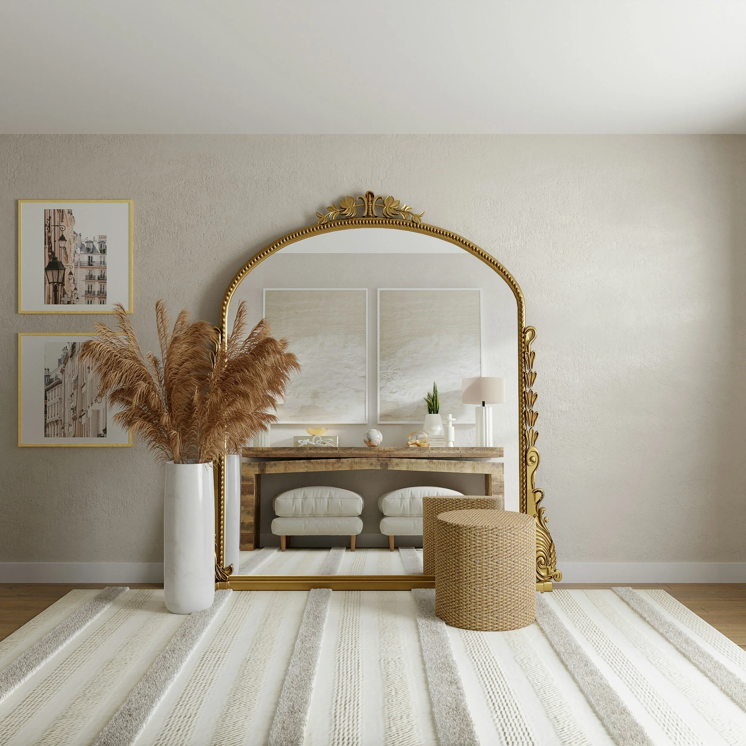
Scandinavian design has long been revered for its simplicity, functionality, and beauty. Originating in the Nordic countries of Denmark, Norway, Sweden, Finland, and Iceland, this design aesthetic emerged in the early 20th century and has since become a global phenomenon. Characterized by clean lines, minimalist forms, and a focus on natural materials, Scandinavian design is renowned for its timeless appeal and effortless blend of form and function!

One of the key principles of Scandinavian design is the emphasis on functionality. Furniture and home accessories are designed to be practical, with an emphasis on usability and comfort. This focus on functionality is evident in the design of iconic pieces such as the Egg Chair by Arne Jacobsen and the Paimio Chair by Alvar Aalto, both of which are celebrated for their innovative design and ergonomic features.

Another hallmark of Scandinavian design is its use of natural materials. Wood, in particular, is a popular choice, with light woods such as beech, birch, and pine being favored for their warmth and durability. These natural materials are often combined with soft, muted colors such as whites, grays, and earth tones, creating a calming and harmonious aesthetic.

In addition to its focus on functionality and natural materials, Scandinavian design is also known for its emphasis on light. Large windows, skylights, and light-colored walls are common features of Scandinavian homes, allowing natural light to flood the space and create a bright and airy atmosphere. This use of light not only enhances the visual appeal of the space but also has a positive impact on mood and well-being.

Overall, Scandinavian design is a testament to the beauty of simplicity and the power of thoughtful design. With its emphasis on functionality, natural materials, and light, this design aesthetic continues to inspire designers and homeowners around the world, proving that good design is truly timeless.

Cozy Up! How to Warm Up Your Interior for Winter

candle-2400240_960_720.jpg
winter-1971088_960_720.jpg

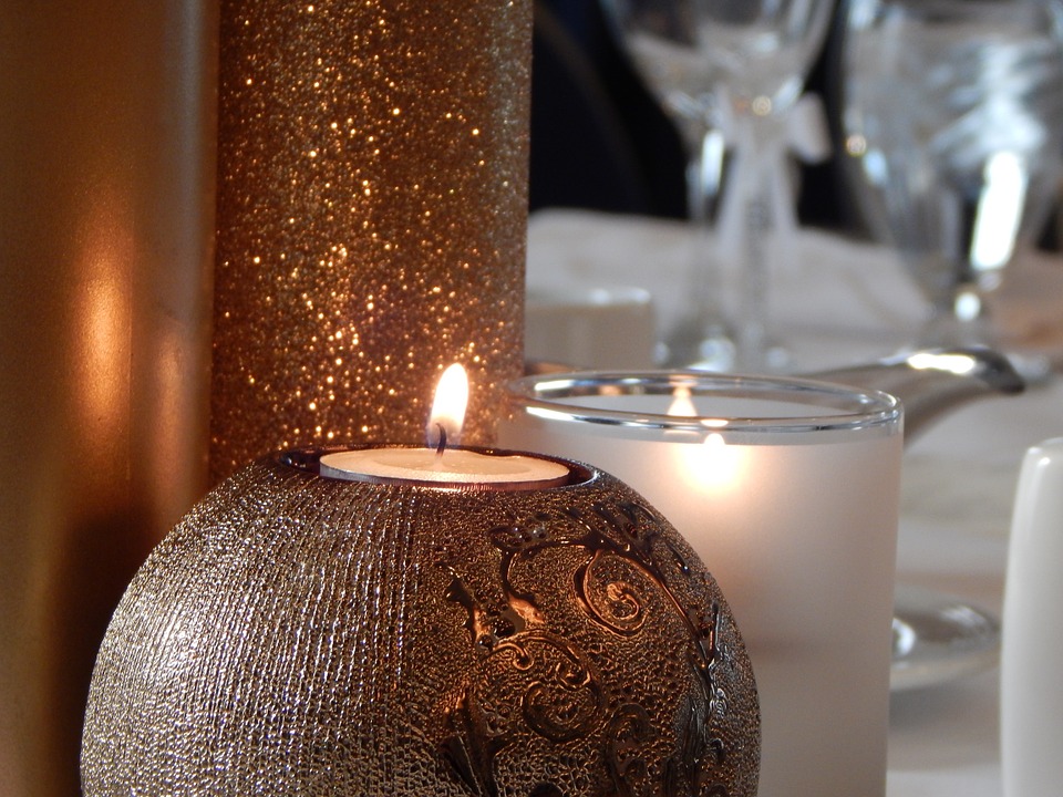
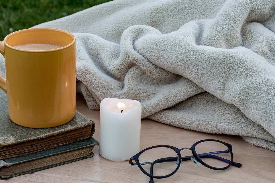
It's that time of year- when nesting begins; you start lighting candles and fires and curling up in plush blankets. It's the time of year when we want to snuggle up with a good book and celebrate being away from the elements. 

Here are some ways in which you can make your space more cozy during the colder months. 

1. Candles and sparkle lighting. I always love to put white holiday lights on topiaries and drape them in otherwise darker places in my home. This gives your space a glow and sense of coziness.

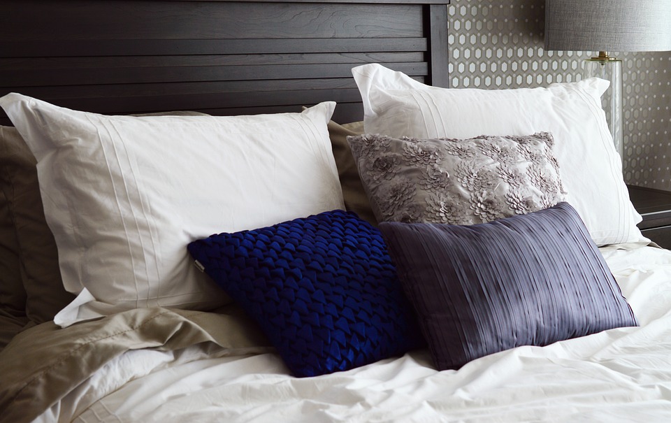
2. Blankets and Soft Fabrics. Drape your furnishings with plush throws and pillows. This creates both a visual warmth as well as an acoustic one within your space. It's always nice to have something to curl up with when relaxing.

3. 

Designing the Perfect Guest Retreat

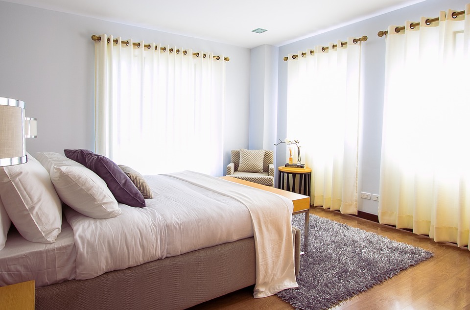
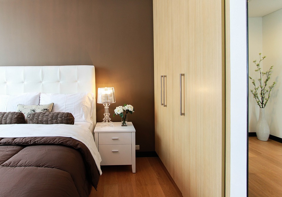
Your guest bedroom should be as inviting and comfortable as the other bedrooms in your home! There are so many details that you can add to ensure that your guests have a wonderful stay, such as plush furniture, boutique bedding and luxurious small touches.

Everything from wallpaper, draperies, and other soft details will make the room feel cozy and warm. 

books-2619265_960_720.jpg

It's in the small things when it comes to creating an environment your guests are sure to remember. These include placing a table lamp next to the bed with a glass for water. Fresh flowers are always a nice touch. Give your guest some fun reads about things that are local (local books and magazines are always a hit).  Always provide your guest with extra blankets. Many people sleep cooler than others and oftentimes guests will not want to as you for another blanket. Give them the option to cozy if if needed.

indoor-2650995_960_720.jpg

Having a side chair or a place to put their luggage is key. Guests shouldn't have to live out of their suitcase while on the floor. Make it easy for them to access their belongings. Providing your guests with a mirror is an added bonus. Since sometimes you may have a full house, it is key to have a place for them to get ready without having to go to the bathroom area.

I like to place a bottle of local wine and some snacks in my guest bedroom when I have visitors. It gives a nice touch and provides your guests with something to nosh on in the later hours. 


Dining in Elegance- A Before & After

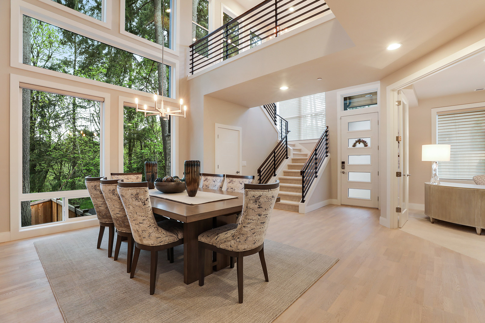
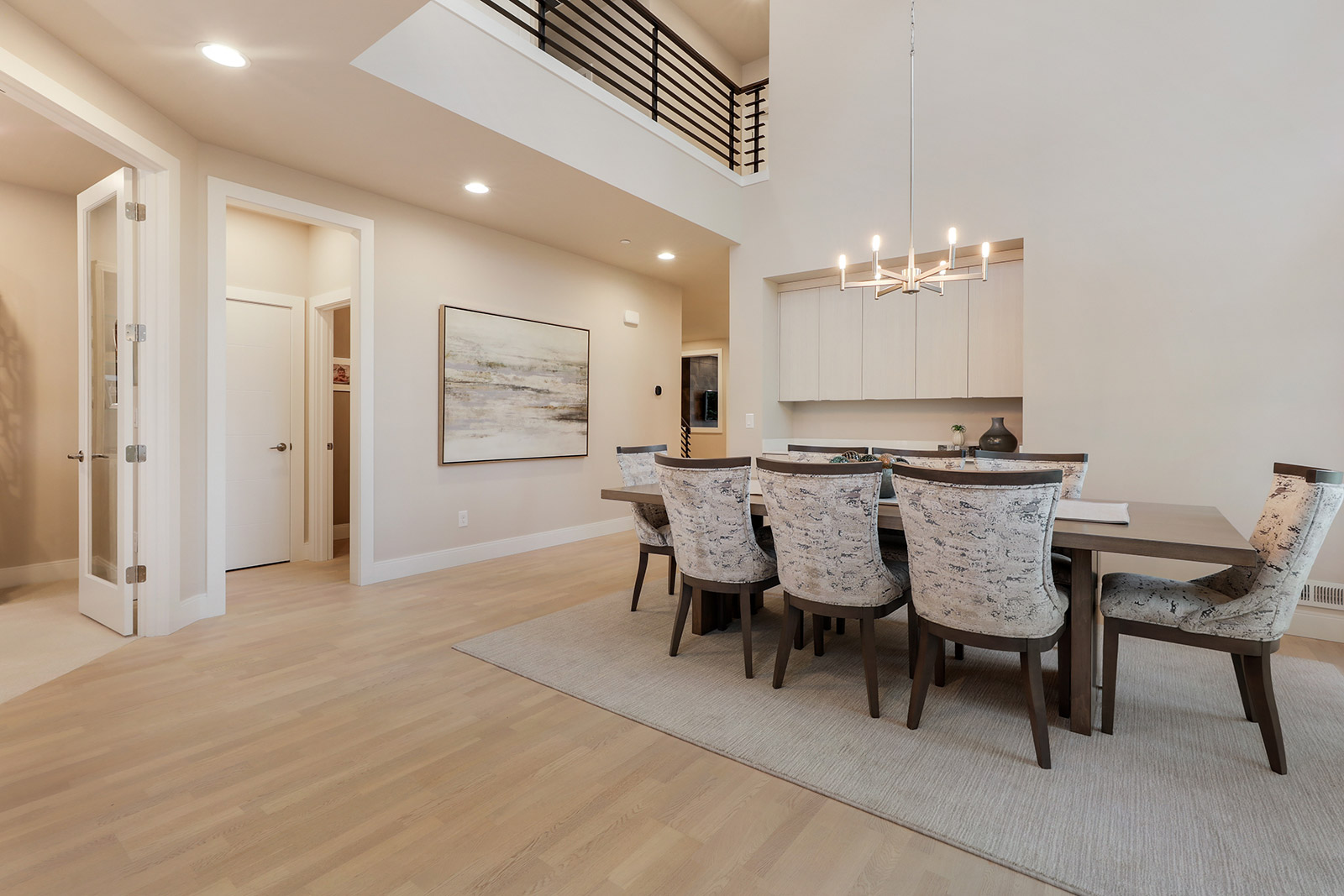
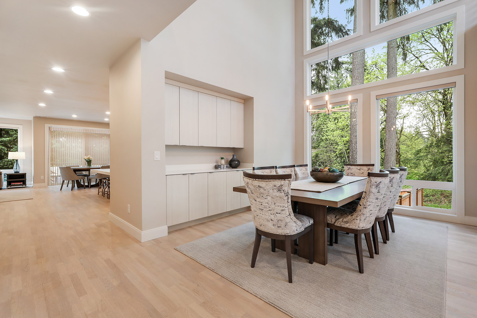
This home was completed in spring of 2018 and my client’s family decided it was their dream home so to create long term memories and it was in the perfect location since their 10 year old son didn’t have to change schools nor friends and they all love the clean modern aesthetic.  The couple has stressful careers and wanted a sanctuary to retreat to after a long day. They love to entertain and the eight and a half foot long custom Old Biscayne dining table can sit several friends and family comfortably. The Pindler modern chenille upholstery fabric is the star of the room and the wood Antrim custom area rug sets off the entire table and chairs!

Beautiful Spa Like Bath Remodel by Kathy!

My client wanted a tranquil bathroom and her master bath went thru a huge transformation just with the change of the paint color from a vibrant red to the Authentic Home Dove Grey.  The layout wasn’t functional for my client to bathe every night so I change the location of the toilet so that the shower and tub was the focal point upon entering the very small bathroom. The custom Furniture Guild vanity and crystal vanity light bar make this a unique and elegant small bathroom!


Kathy's Recent Project- Kitchen Before & After!

Original_img_0002.jpg

My client purchased this 100 year old Craftsman style home when she was raising her family and was excited to update and personalize it to reflect her personal style.

The initial undertaking was the flooring since it was original to the home and has some holes in it that couldn’t be repaired.  DuChateau luxury vinyl tile, LVT, was the final flooring choice since my client was considering renting out the house once her youngest was out of high school and LVT is very durable and waterproof.  The light grey color tones of the LVT works well with the Authentic Home Dove Grey paint color that is throughout the main floor, both bedrooms and bathrooms. The kitchen cabinet doors were resurfaced and quartz Grey Savoie countertops and backsplash and new Top Knobs hardware bring the space much needed lightness while adding a bit of a feminine touch. A new side counter top was added during the remodel for additional storage and to have the flexibility of sitting on bar stools.  The clean white modern table and clear acrylic chairs finish the space with a light and airy feel suitable for any gathering. And the new range and hood along with the farm house white porcelain sink make this a wonderful kitchen to create meals and entertain in.


Get Your Home Ready for Spring!

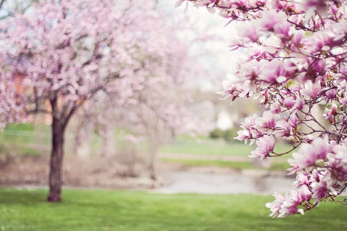
We have all been hold our breath waiting for the sunshine to come back, the birds to start singing cheery songs, and blossoms- yes, blossoms galore! But then the sun starts shining, and the seasons start changing, we start to notice that our homes may feel somewhat in need of extra love moving into the new months.

Here is How You Can Get Your Home Ready for Spring!

magnolia-trees-springtime-blossoms-spring-38910.jpeg

Bring the Outdoors In! By placing fresh, seasonal flowers throughout your space, you will come to find that your mood is uplifted, your home has an extra pop of color, and things just feel overall a bit more polished in your interior. There's really no such thing as too many fresh flowers! 

pexels-photo-413707.jpeg

Update Your Linens and Bedding.  There is nothing more refreshing than clean white towels, beautiful fresh sheets and bright, airy linens. You will find that putting your winter bedding away and replacing with fabrics reminiscent of Spring, you will be in the spirit!
pexels-photo-12679.jpeg

Set Up Your Outdoor Space. Now that you can enjoy the outdoors and take in the sunshine and fresh air, make your outdoor seating area the best it can be. We love to update old upholstery on outdoor furniture, implement bright colorful pillows, and add fresh potted plants. Viola- an outdoor oasis worthy of your favorite book.

pexels-photo-271815.jpeg

Clean those Closets! It is so easy to acquire extra clutter and unneeded items over the winter months as we are burrowed away from the harsh elements. Put those unused sweaters neatly away and get organized and ready to flaunt your bright, light, clean clothes.

pexels-photo-250288.jpeg

ELLE Decor: What's Trending for Fall 2017

What we're seeing a lot of for fall design trends consists of organic decor, eclectic old timey products, and vibrant color schemes. 2016's gray palettes are starting to fade away (no pun intended) as more saturated colors are being seen on the forefront.  According to ELLE Decor, warmer color palettes are becoming very popular.

Beautiful bright green and blue color schemes are making their comeback, and we're seeing boldly painted furnishings, wall colors and decor that really make a statement coming to fruition on the design front. One timeless way into which you can implement a timeless look is through collecting old novels and stacking them under your favorite decor pieces to create height and weight.

A fun way to jump into fall trends is by implementing old fashioned pieces into your space. We love scouring antique stores and rummage sales to find the perfect piece for a focal point. This old wall sconce is a gorgeous piece that would look beautiful in any room in the home. 

Warmer colored metallic pieces are all the rage in the design world this year. Bronzes, brass and golds are being seen in both designer commercial and residential spaces. You can implement this look through the use of throw pillows, accessories, and lighting. 

Brass is Back! Where We're Seeing It in the Design World

Remember when brass was considered dated, old and 80's-90's? Well, this is no longer the case. We thought we would never see this shiny metallic make its comeback, we were wrong, and it's made its comeback stronger than ever! We're seeing it applied to all surfaces, large and small in some of the most elegant ways.

Accessorizing with brass and gold colors truly makes an elegant statement against the current color palettes that are trending. While we remember seeing brass hardware against forest green and burgundy backdrops in the 90's, we are now seeing it paired in conjunction with beautiful blues, grays, and even orange hues.

It's not just shiny, polished metallics we are seeing on the forefront. Rustic metals reminiscent of earlier years. Beautiful lighting fixtures, photo frames and accessories with aged finishes make for an elegant timeless look and will never date themselves as time progresses.

Plumbing and cabinet hardware are definitely leaning towards the warmer metallic tones and we can see why. This gorgeous bathroom fixture truly makes a statement that is classic, sophisticated, and elegant.

2017 Pantone Color of the Year: Greenery

We can all say good bye to Rose Quartz and Serenity, because the Pantone Color Institute just announced their pick for the 2017 Color of the Year. It's fresh, it's organic and it's name is "Greenery."

image.jpg

While Rose Quartz and Serenity encouraged peacefulness, calm and relaxation, this earthy hue epitomizes movement and fresh starts.

As Pantone puts it:

"Greenery is a fresh and zesty yellow-green shade that evokes the first days of spring when nature's greens revive, restore and renew. Illustrative of flourishing foliage and the lushness of the great outdoors, the fortifying attributes of Greenery signals consumers to take a deep breath, oxygenate and reinvigorate."

Here are our favorite interiors showcasing this gorgeous hue: