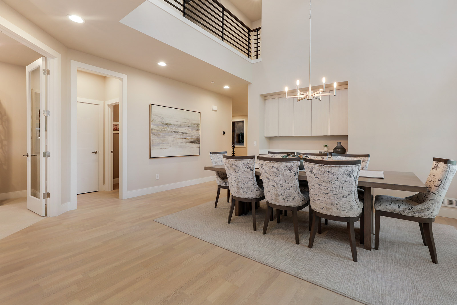
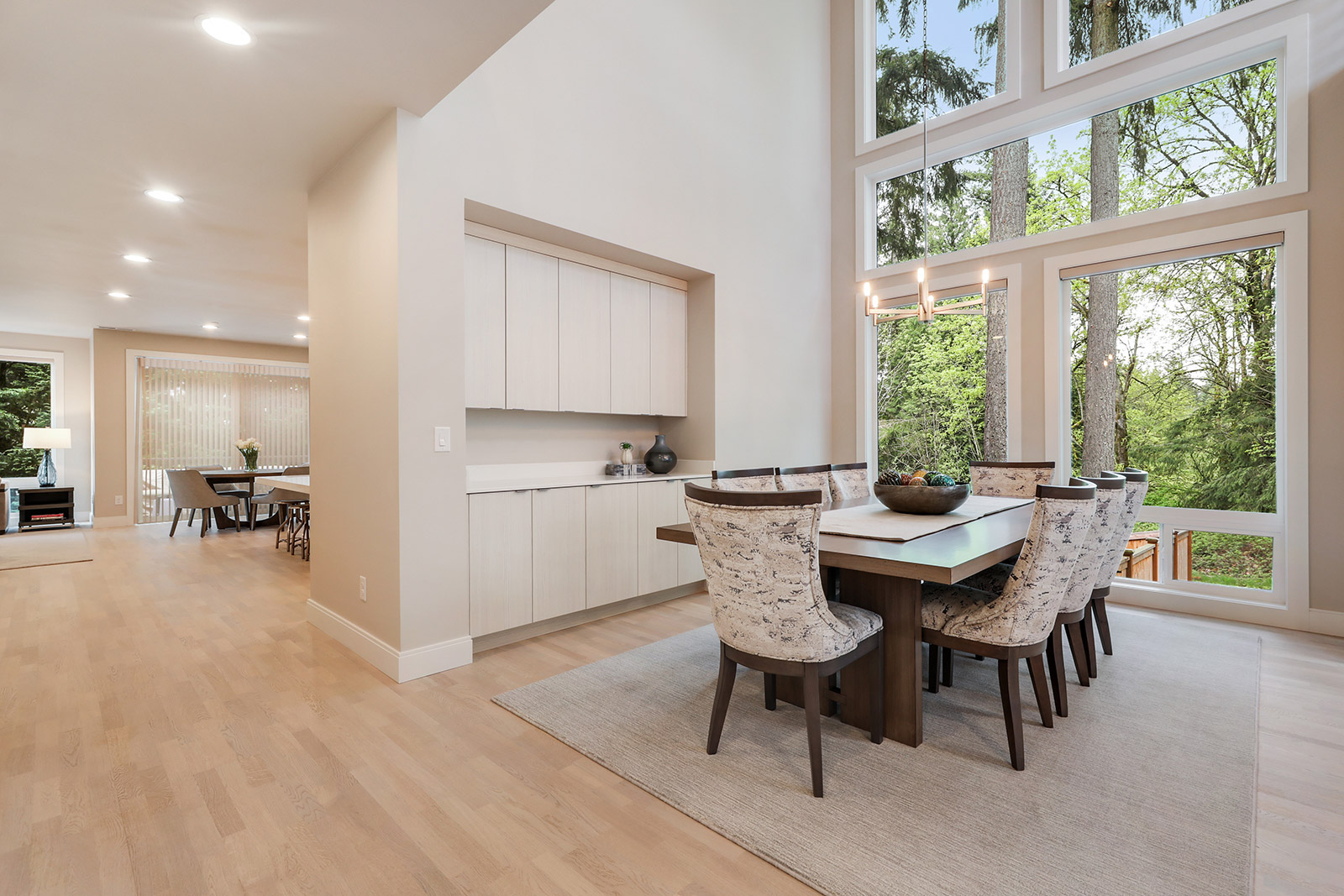
Understated Design - Get the Look

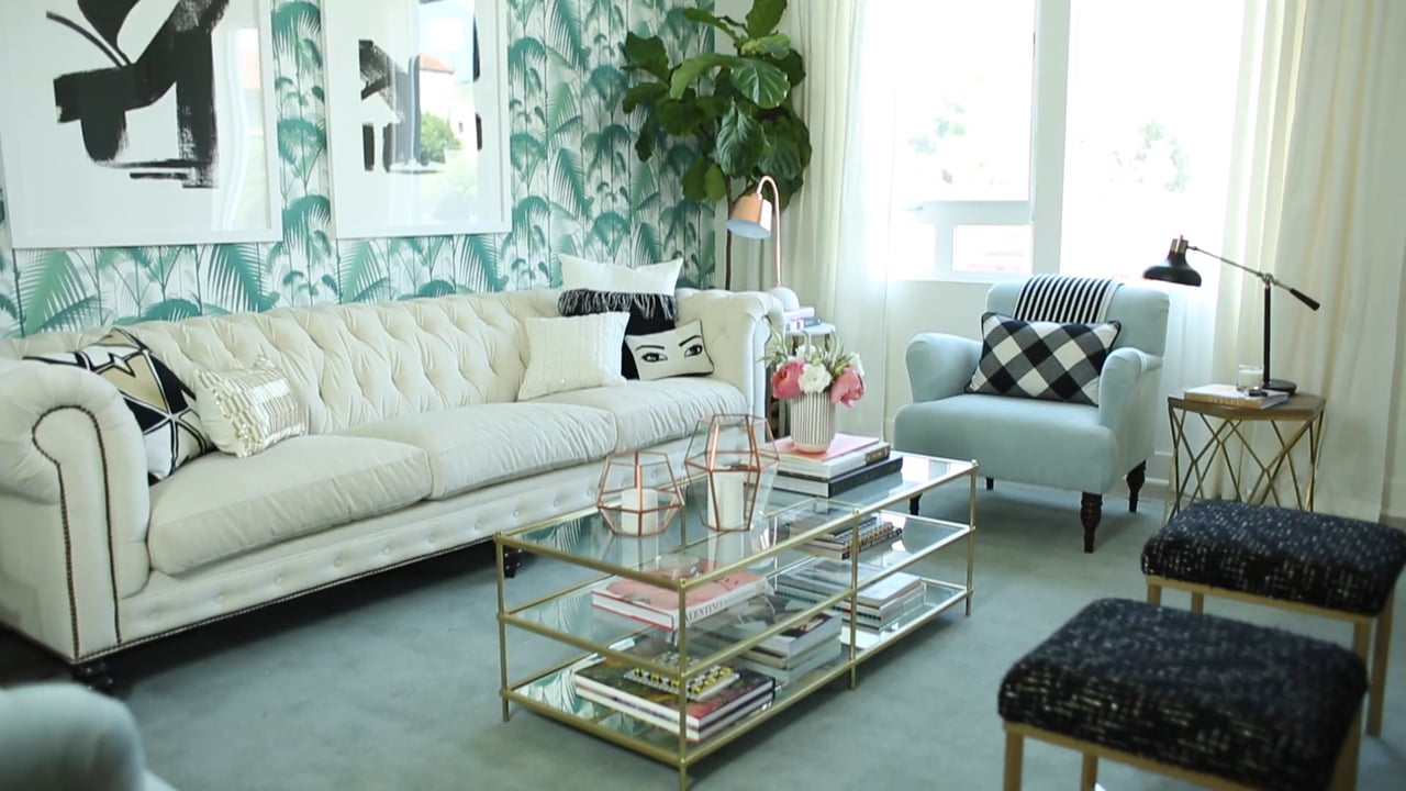
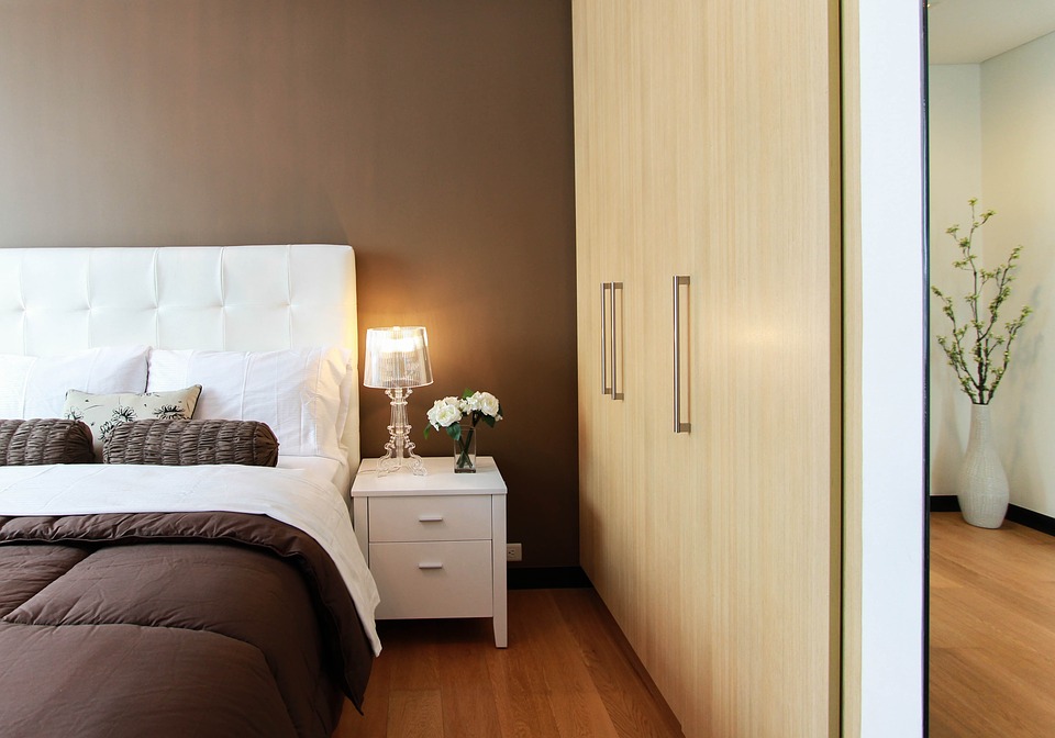
Have you ever walked into a space and found yourself in total “awe” by how its design was so simple, but sill had that intense wow factor? Understated design style is all the rage right now, and luckily, it’s easy to achieve. Here are the ways in which you can get the look without fuss.

Color Palette | Less is More
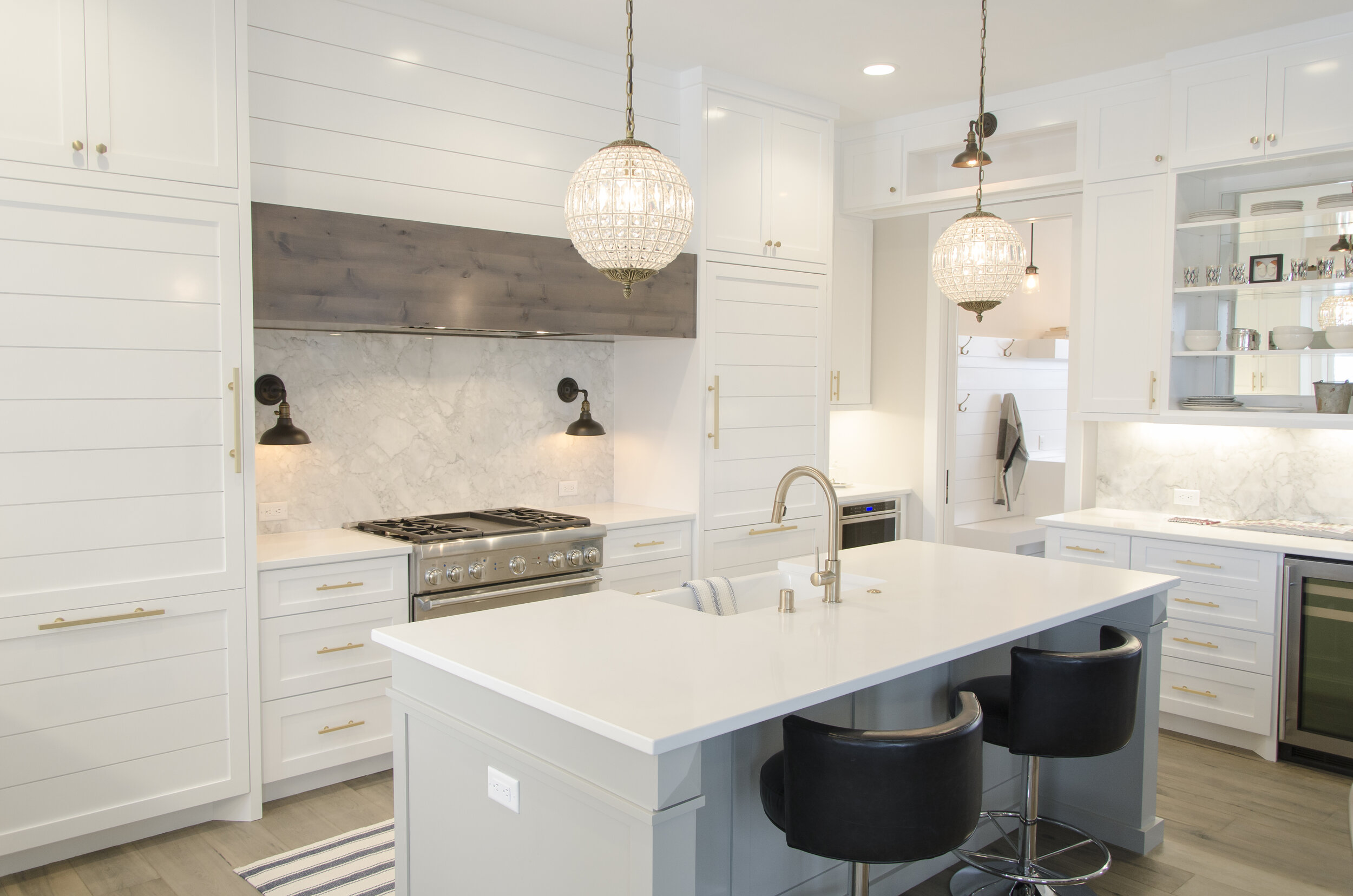
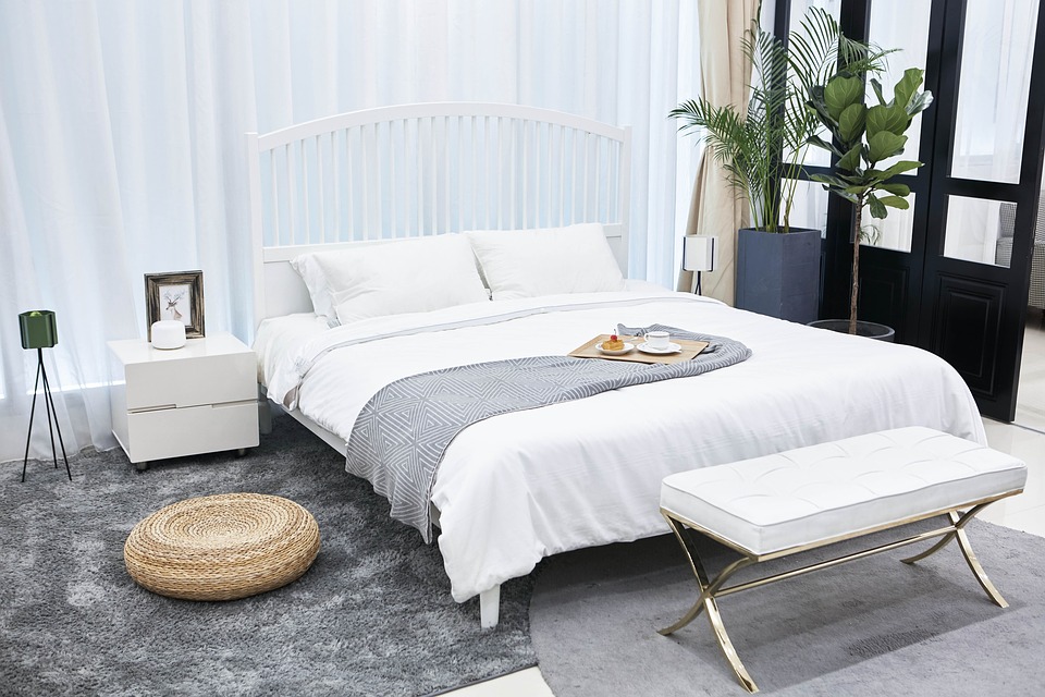
Simplistic design is all about textures and accessories, not so much about color. When scheming this kind of design, it is important to use color as an accent, not as the main theme. Neutrals with small pops of muted hues make for the perfect understated look in a space.

Accessories | It’s All in the Details

When it comes to simplistic design that makes a pop, it really does come down to the small details. From hardware to fixtures, to flooring and furnishings, a well thought-through interior with little to no clutter is what makes it so statement-worthy. Put a little extra time and money into these things, and less into visual clutter, and you will end up with a gorgeous outcome.

Architectural Details

Some of the most influential factors to a simplistic space are the architectural details. It is oftentimes you will see that a home’s beautiful structure can be buried by the distraction of furnishings, color palettes, or just plan visual noise (clutter). If you live in a home with beautiful wood beams, high ceilings, millwork, or other, you may want to consider allowing the beauty of the home itself to shine by implementing simplistic design.

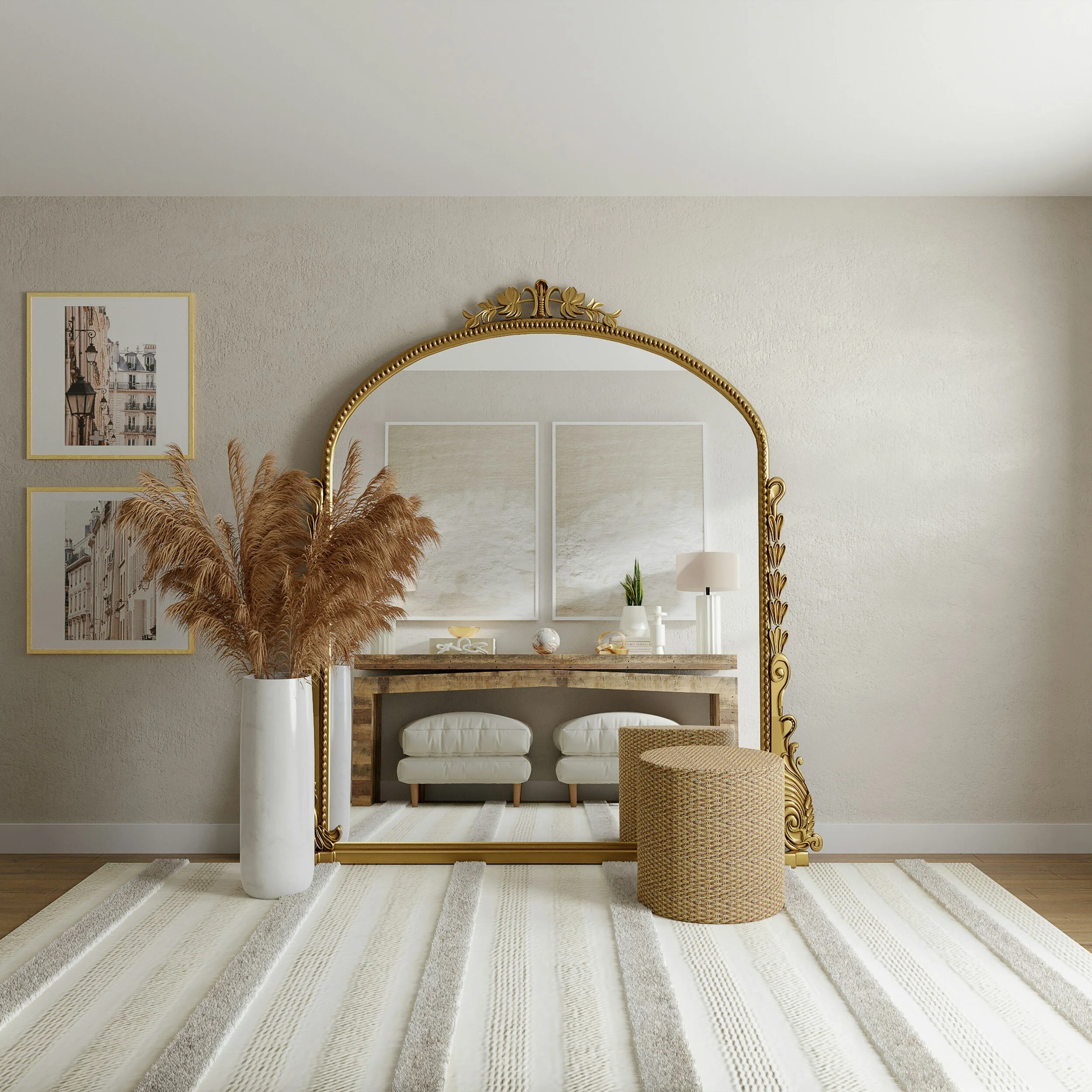
2020 Pantone Color of the Year | Classic Blue!

This year’s Color of the Year chosen by Pantone is as classic as it gets, no pun intended! Classic Blue is timeless hue that looks great in all styles of spaces and pairs well with many colors. Let’s get inspired by this chipper shade and see some interiors that will knock our socks off.

chair-3705529_960_720.jpg

Classic blue, reminiscent of coastal themes, gives interiors a classic, traditional, clean, fresh vibe that is sure to withstand time. A beautiful way to implement this color is through accents, and accent walls. If your space is primarily white or gray, Classic Blue accessories or furnishings are sure to pop and give your space that extra “wow” factor.

swordfish-3542787_1280.jpg

There is nothing more timeless than blue and white beach umbrellas. You can bring this Riviera look into your space with pops of Classic Blue and white accessories.

sunbeds-2669784_1280.jpg

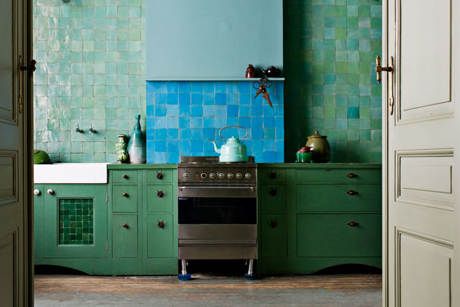
Though this interior is not “Classic Blue”, so-to-speak, there are many various shades of blue that are also trending now, similar to this muted, slightly teal blue interior. Blue paired with whites and grays are as classic as it gets when it comes to color matching.

pexels-photo-3201763.jpeg

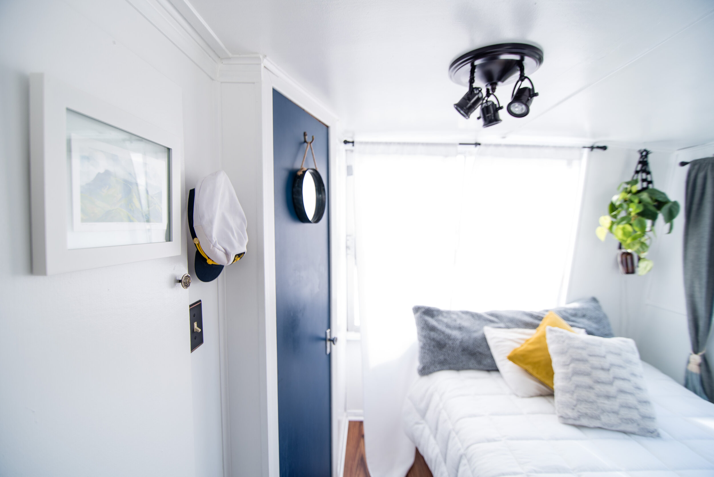
Did you know that adding blue to your interior can lower your stress levels? Studies have shown that cooler tones implemented into your space can create a calming effect, easing your mind and quieting the everyday “noise” we are all exposed to. A simple blue accent like this door can truly pop while bringing in a freshness and a sense of serenity.

Winter Flower Arrangements

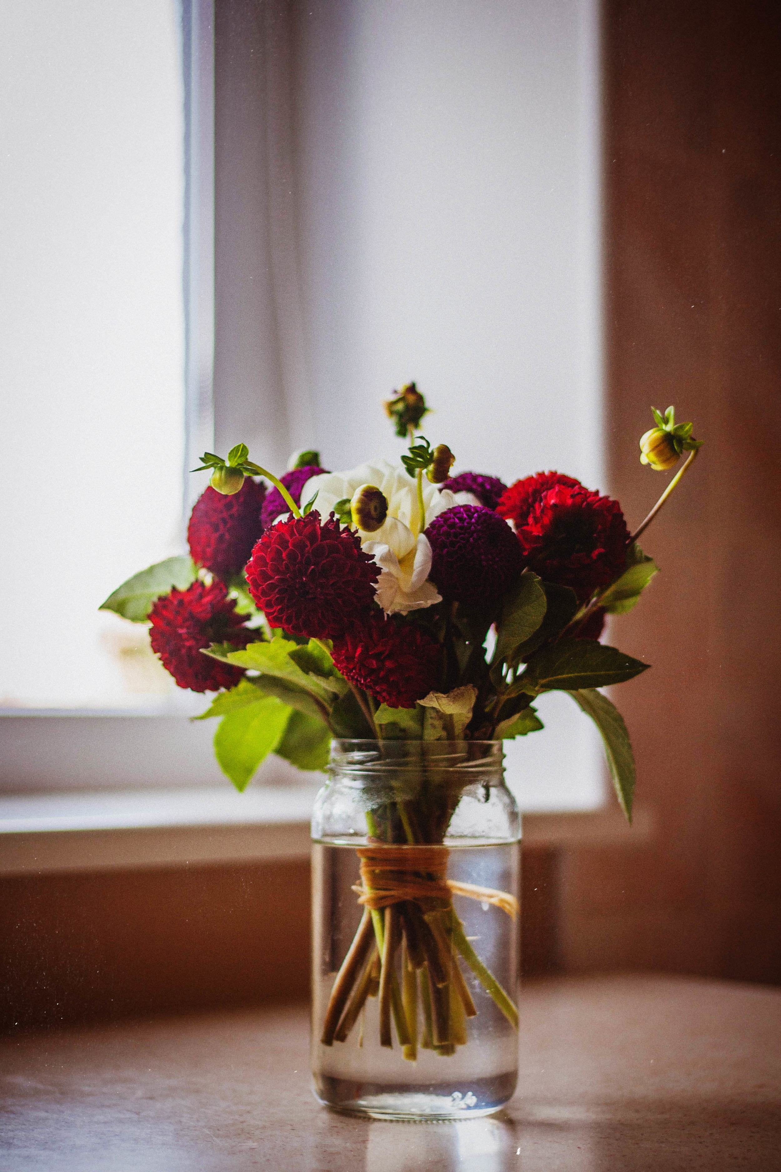
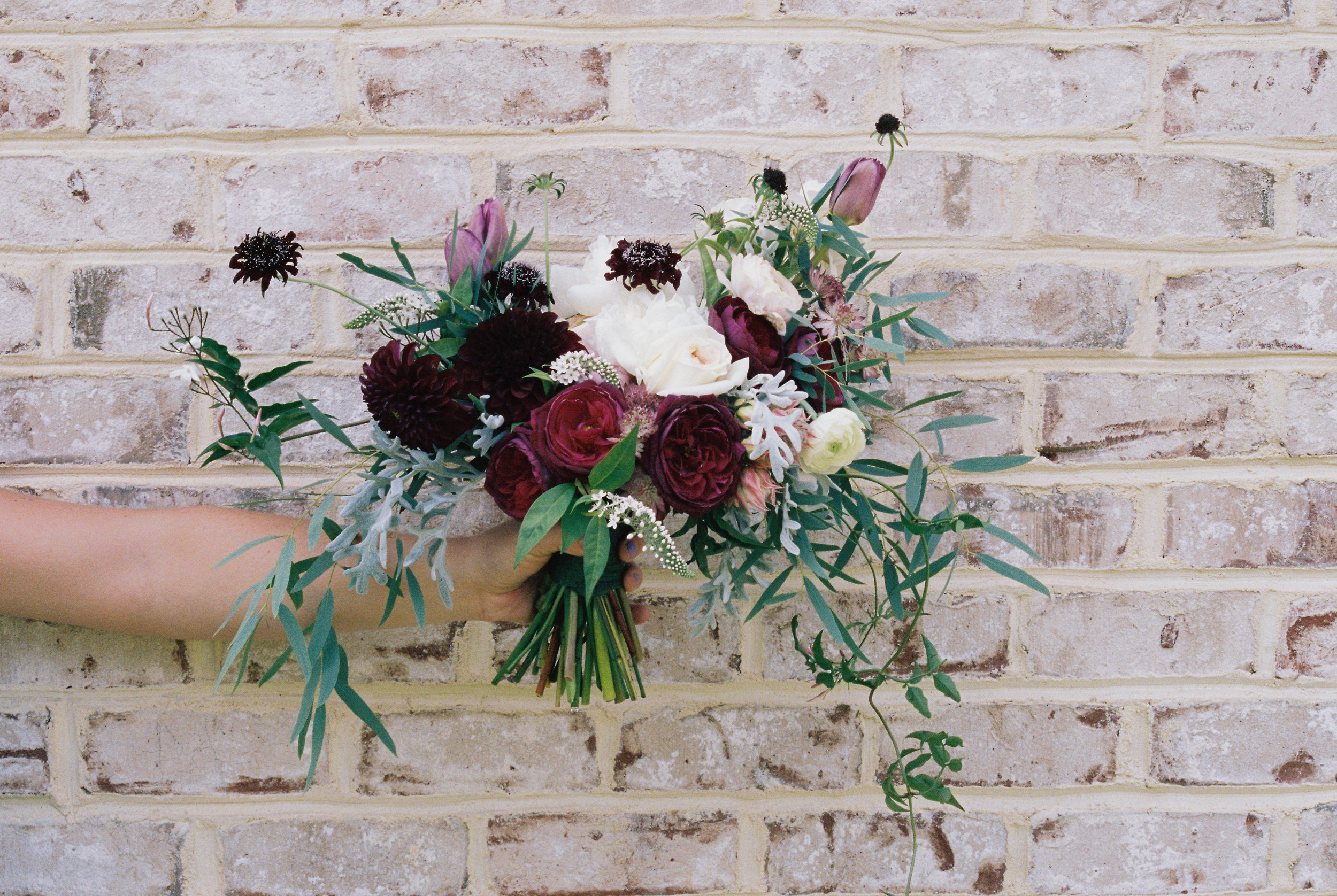
There is nothing more beautiful during the colder months than a fresh bouquet of flowers to brighten up even the darkest days. We have been seeing many trends with foliage throughout the years, but the trick is to keep your floral expressions timeless, lively, and bold. We have chosen our favorite flower arrangement inspirations- many of which are sophisticated beyond your typical poinsettias and holly. Here they are! Click to scroll.

Cozy Up! How to Warm Up Your Interior for Winter

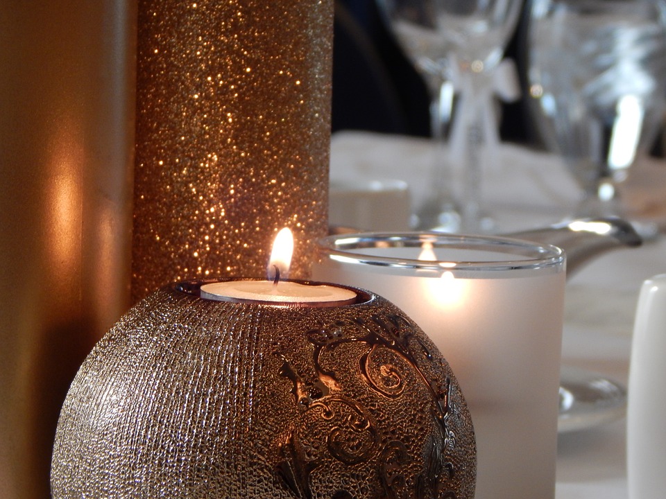
candle-2400240_960_720.jpg
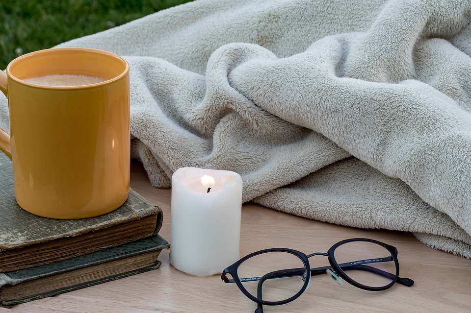
winter-1971088_960_720.jpg

It's that time of year- when nesting begins; you start lighting candles and fires and curling up in plush blankets. It's the time of year when we want to snuggle up with a good book and celebrate being away from the elements. 

Here are some ways in which you can make your space more cozy during the colder months. 

1. Candles and sparkle lighting. I always love to put white holiday lights on topiaries and drape them in otherwise darker places in my home. This gives your space a glow and sense of coziness.

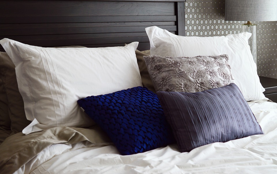
2. Blankets and Soft Fabrics. Drape your furnishings with plush throws and pillows. This creates both a visual warmth as well as an acoustic one within your space. It's always nice to have something to curl up with when relaxing.

3. 

Teal is Real: Our Favorite Interiors

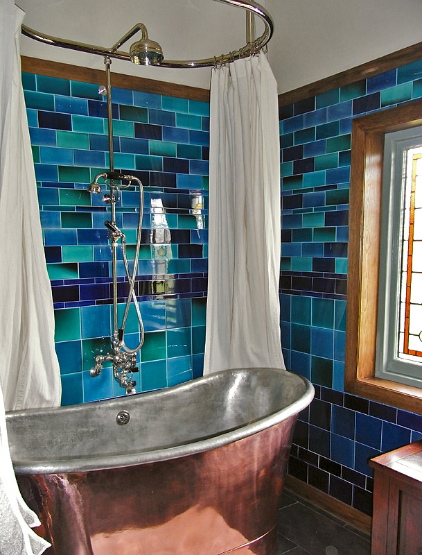
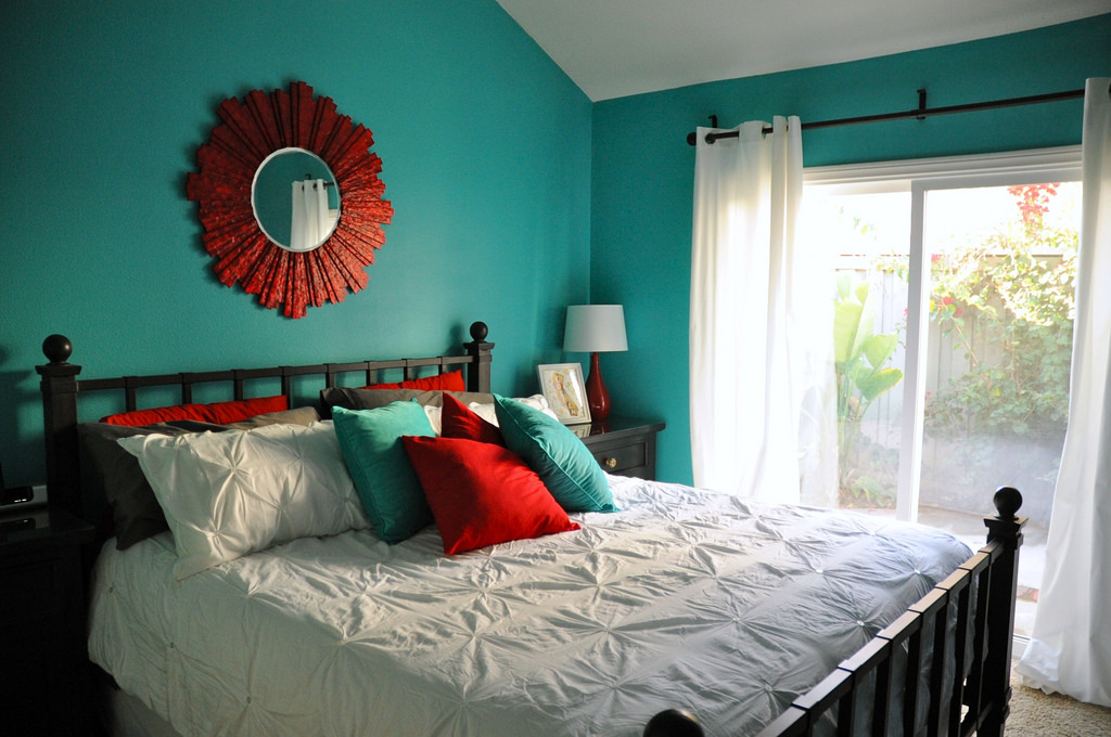
Teal has been making its way through the Interior Design community for many years, but it seems to be debuting especially during the warmer months! There is a reason this gorgeous hue is so popular in Interior Design, and here are some of our favorite interiors featuring it.

Floral Prints | Timeless & Classic

With Fall just around the corner, we’re getting ready for the arrival of all things floral and leaf printed! Coming into the cold winter months, the best way to bring new life and energy into your life is with the addition of some fresh and fun prints. Floral prints bring the light and vitality from the outdoors into your home and truly refresh your overall interior ambiance. If the thought of prints makes you fearful of mismatching or overcrowding your space, fear not, because we’ve got the perfect advice as to ensure tasteful and classy print match ups. Every room in your house can truly benefit from the bold colors and patterns of a botanical prints. Whether you want to dress up a contemporary or traditional color scheme, there’s always a fun floral print to liven up your space.

Looking for a way to brighten rooms in more ways than one? A floral printed lamp adds light while also livening up your interior with prints that add fun, whimsy, and interest.

Another option for statement pieces that bring the flowers indoors is a floral patterned piece of decor. Small intricate pieces will add vibrancy to all interiors. Revive a bland shelf or table with a fresh floral urn. If your wall space is looking particularly bland, a fresh painting or floral wallpaper will do the trick! Add a fun floral rug or start small with floral printed pillows, and a new floral addition is the perfect way to bring your home into the cozy fall season.

Get Cozy this Fall!

Can you believe it’s fall? Neither can we. Seattle had a very mild summer! As it starts to get dark earlier, the weather takes on a certain chill, and we start to nest, it’s always nice to make our living space a little more cozy to prepare for the winter months ahead. Here are some ways in which you can make your space feel warmer, more inviting, and just plain comfortable.

It seems like an obvious solution to the colder weather, but it’s definitely time to bring out those extra throw blankets and place them throughout your space. There are so many gorgeous options out there now- we are loving the blankets with a lot of warmth and texture.

RS5191_JuneJuly2-046-Edit-Landing-Page.jpg

Add some sparkle to your interior with small lights and candles. This is one of the simplest, most impactful way to make your space feel warmer, more welcoming, and just downright cozy. For extra oomph, use a wax warmer with your favorite fall scent to complete the vibe.

Low lighting can do wonders for a space. Invest in fun, dim lamps and put them throughout your space. It is common for most people to forget to use their accent lighting as opposed to their overhead lighting. However, studies have shown that the use of ambient lighting can decrease stress levels and increase seratonin levels.

The Perfect Entertaining Kitchen Space

My client’s custom built a stunning contemporary home on the beautiful coast of the Puget Sound in West Seattle after living in the area for over the past two decades.  They both always wanted to live on the water and finally moved into their two building compound after a two a half year construction. The architect design4r the home to take advantage of the water views and the home has over forty windows so to experience every aspect of each day.

They love to entertain so the main floor has a large kitchen and living room area with access out to a water front balcony.  I wanted to keep the coloring of all the furnishings in the spaces neutral yet with some interest and to not detract from the beautiful scenery.  My clients travel a great deal and their artwork and sculptures also were part of the overall design of the spaces.  The custom bar stools by Trica and dining table and chairs by Old Biscayne Designs provide enough sitting for all of their gatherings. 

KITCHEN BEFORE

Designing the Perfect Guest Retreat

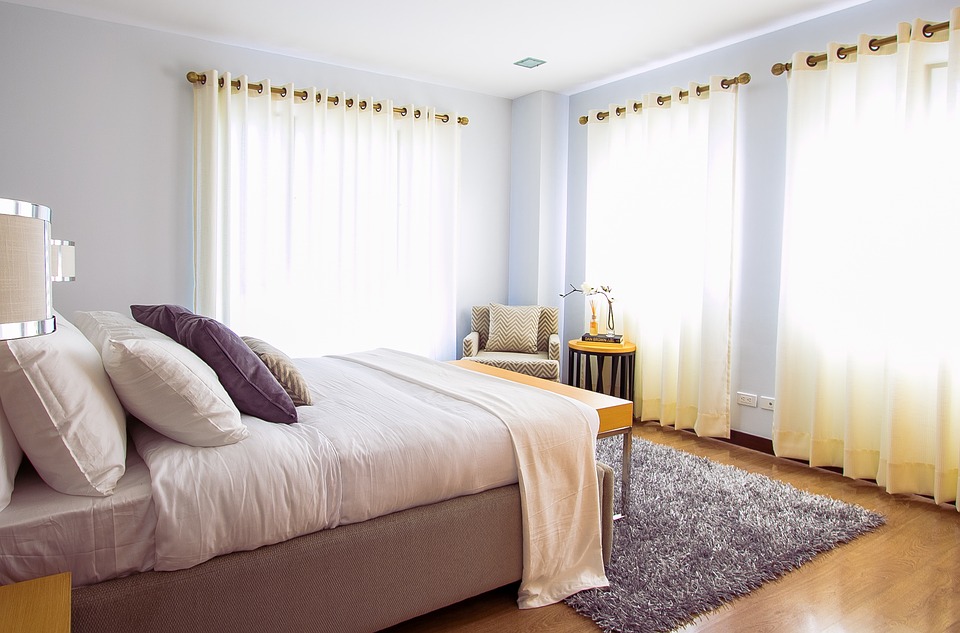
Your guest bedroom should be as inviting and comfortable as the other bedrooms in your home! There are so many details that you can add to ensure that your guests have a wonderful stay, such as plush furniture, boutique bedding and luxurious small touches.

Everything from wallpaper, draperies, and other soft details will make the room feel cozy and warm. 

books-2619265_960_720.jpg

It's in the small things when it comes to creating an environment your guests are sure to remember. These include placing a table lamp next to the bed with a glass for water. Fresh flowers are always a nice touch. Give your guest some fun reads about things that are local (local books and magazines are always a hit).  Always provide your guest with extra blankets. Many people sleep cooler than others and oftentimes guests will not want to as you for another blanket. Give them the option to cozy if if needed.

indoor-2650995_960_720.jpg

Having a side chair or a place to put their luggage is key. Guests shouldn't have to live out of their suitcase while on the floor. Make it easy for them to access their belongings. Providing your guests with a mirror is an added bonus. Since sometimes you may have a full house, it is key to have a place for them to get ready without having to go to the bathroom area.

I like to place a bottle of local wine and some snacks in my guest bedroom when I have visitors. It gives a nice touch and provides your guests with something to nosh on in the later hours. 


Master Bath Retreat

The original master bathroom was narrow and simply needed to be updated.  There was a small bedroom next to the bathroom which my clients wanted to make into a main floor laundry room so we extended the new master bathroom a few feet into the bedroom.  The double vanity is now on the opposite wall of the new laundry room and a corner shower allows for easy access.  The toilet room was moved to the front of the bath and is now a separate space.  The Terrazzo floor tile by Pental is a current design element that also ties to the period of the house.  The Strasser cabinets and new lighting provide an up to date feel for this modern bathroom.  I created a custom paint color for the walls and Champagne on Ice was used on all the ceilings and trim throughout the house.

Contemporary Living Room

My client’s custom built a stunning contemporary home on the beautiful coast of the Puget Sound in West Seattle after living in the area for over the past two decades.  They both always wanted to live on the water and finally moved into their two building compound after a two a half year construction. The architect designed the home to take advantage of the water views and the home has over forty windows so to experience every aspect of each day.

Living Room View After.jpg

They love to entertain so the main floor has a large kitchen and living room area with access out to a water front balcony.  I wanted to keep the coloring of all the furnishings in the spaces neutral yet with some interest and to not detract from the beautiful scenery.  My clients travel a great deal and their artwork and sculptures also were part of the overall design of the spaces.  The custom bar stools by Trica and dining table and chairs by Old Biscayne Designs provide enough sitting for all of their gatherings. 

The main focal point of the living room is the black slate fireplace which is directly opposite the dining and kitchen areas.  The custom Vanguard sofa with a tweed Pindler fabric has a sweeping view of the Puget Sound while the two Charleston Forge sitting chairs are centered off the fireplace.  A custom day bed was design for both sitting and lounging while viewing all of the daily sea life.  All of the wool custom area rugs are by Antrim.

Living Room Stairs After.jpg

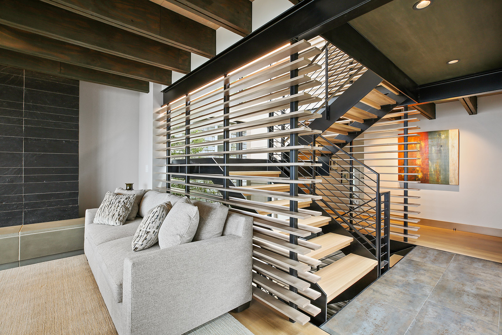
The entry of the home is dramatic with the steel staircase and wood slat walls that were designed on all three levels of the house.

Entry After.jpg

BEFORE

Living Room Before

Living Room Before

Kitchen Before

Kitchen Before

Entry Before

Entry Before

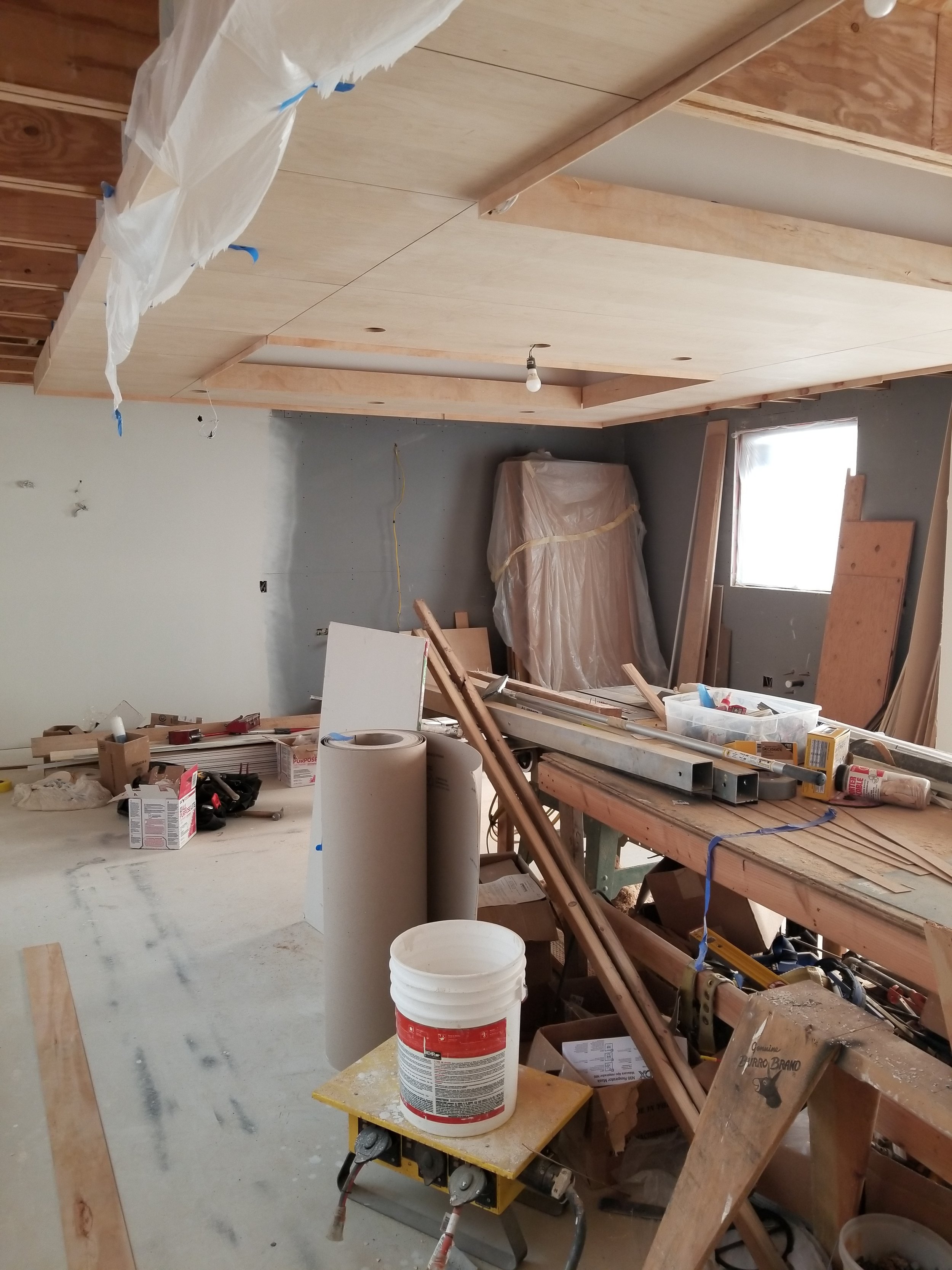
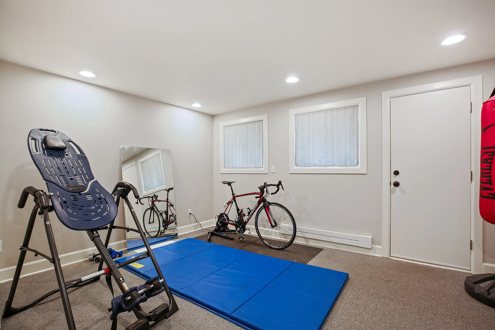
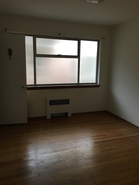
Workout Room Meets Craft Room

One of the biggest transformations in the home was the creation of two separate rooms that was once a large laundry and storage room.  My clients wanted a separate workout room and a craft room large enough for additional storage and my clients stain glass supplies. The custom cabinets are by Organized Spaces and both new rooms are used daily and add a lot of valve to the home.  The wall color is Greystone and the ceiling is Champagne on Ice.


BEFORES & AFTERS

Living Room with Stunning Views

The original living room was stark and all white and my clients wanted a warm and inviting feel from the front door that looks directly into the living room.  The fireplace surround and hearth was retiled with a warm natural stone and a new custom mantel now provides the space for decorative items. New window coverings add to the warmth of the space and provide coverage for all the new furnishings during hot summer days.  The new large sectional, cocktail table, area rug and sitting chair provide ample space for my clients to entertain and enjoy the beautiful view. I created a custom paint wall color and used Champagne on Ice for the ceiling and trim.


Sparkling Clean Laundry Room

On the main floor adjacent to the master bathroom was a small bedroom.  My clients, who are both in their sixties, wanted to have a main floor laundry instead of going to the basement to do laundry.  The small bedroom was created into the new laundry room. The custom cabinets are by Organized Spaces and the wall paint color is a custom color I created called Powder Green Light and the ceiling is Champagne on Ice.


Zen Guest Bath

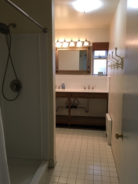
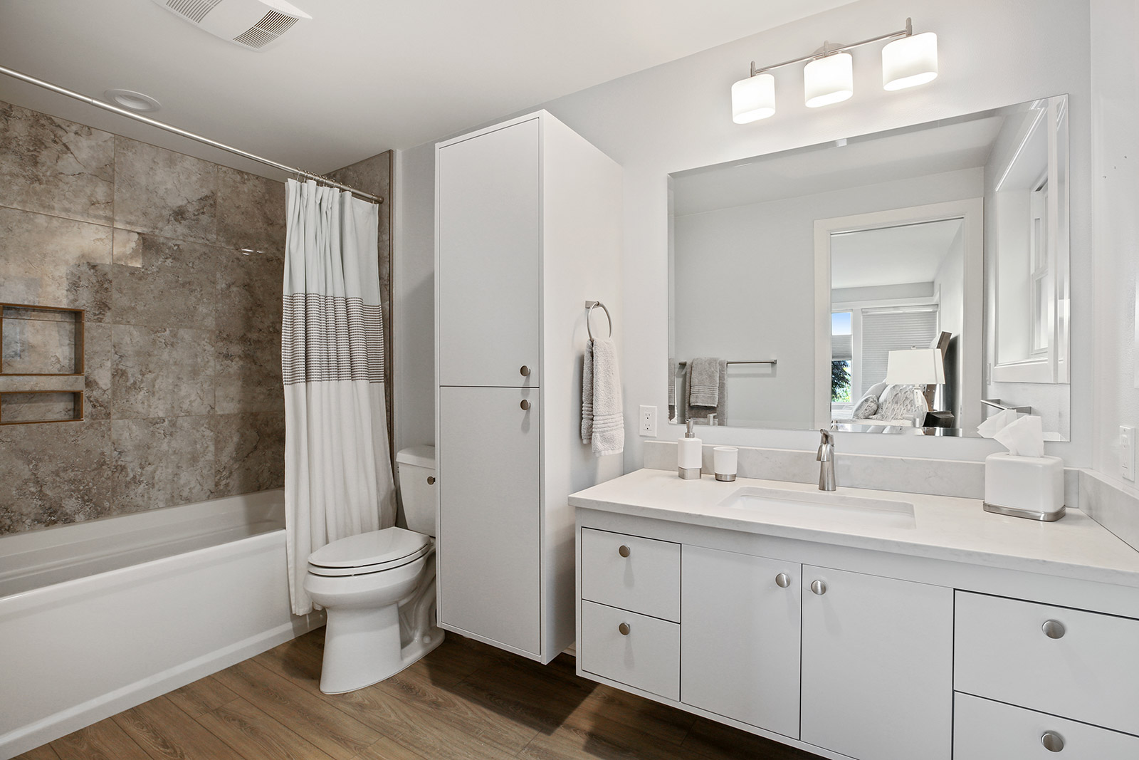
The original main floor guest bathroom had a door leading into the adjacent bedroom which took up a lot of valuable space in the small bathroom.  The door was removed so that a full vanity could take up the entire window wall. The shower was enlarged by removing a hallway closet and the pink shower tile was updated with 12” x 24” size tiles in a neutral off white color and installed vertically to create a larger feel.  The wall paint color is Glacier and the ceiling is Champagne on Ice.  The guest bedroom now has modern en-suite bathroom.  

BEFORES & AFTERS


Basement Bathroom Refresh!

The basement guest bathroom is just off the guest bedroom and the original space was dark and cold. We kept the plumbing in the same locations and simply updated the tile, Strasser cabinetry and lighting to create a warm and inviting bathroom. Floor plank tiles were used on the floor to create a rustic feel. The wall paint color is Dove Grey and the ceiling is Champagne on Ice.

Bright and Airy Kitchen Remodel

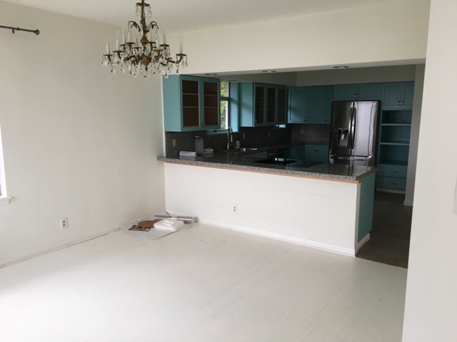
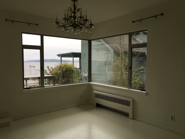
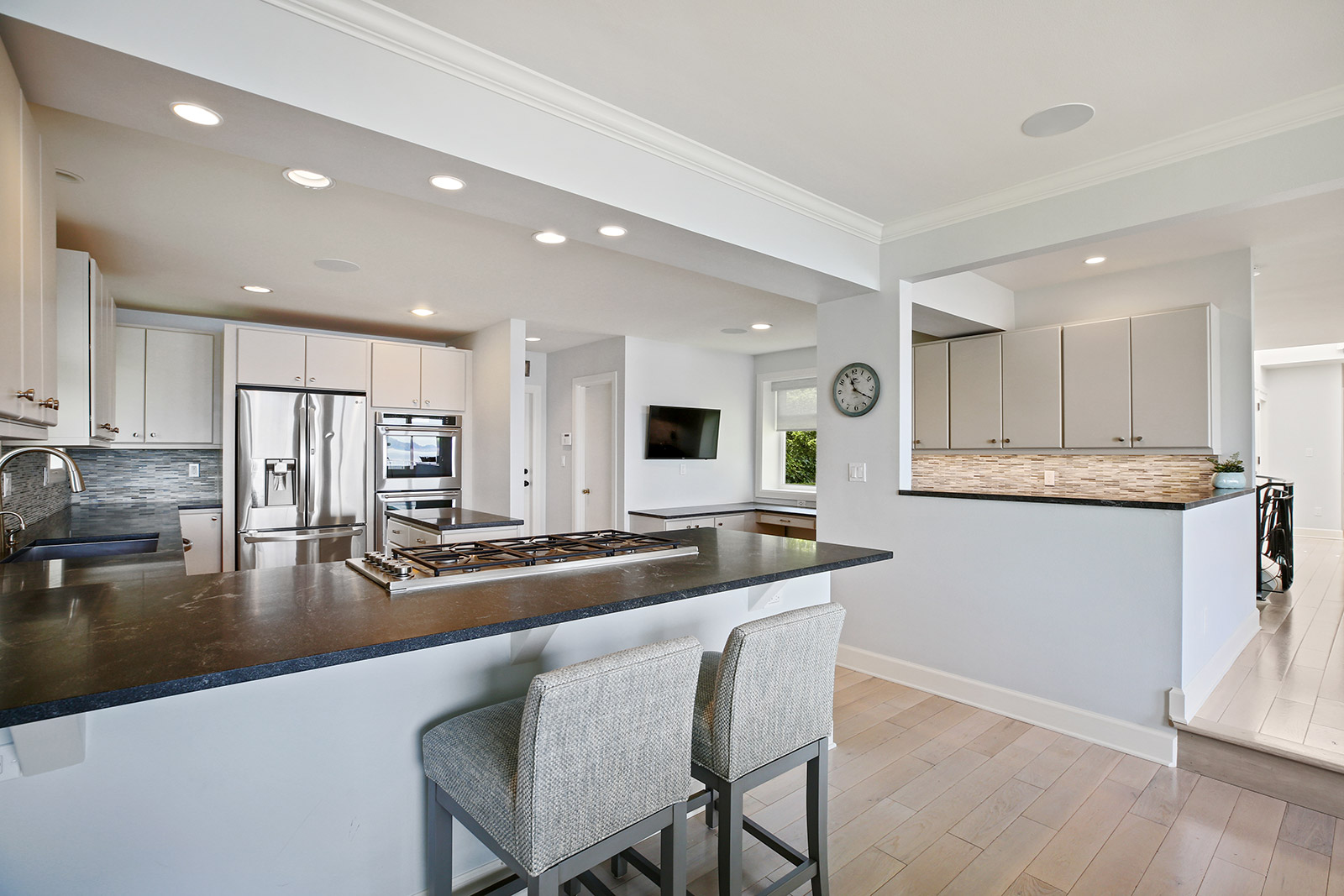
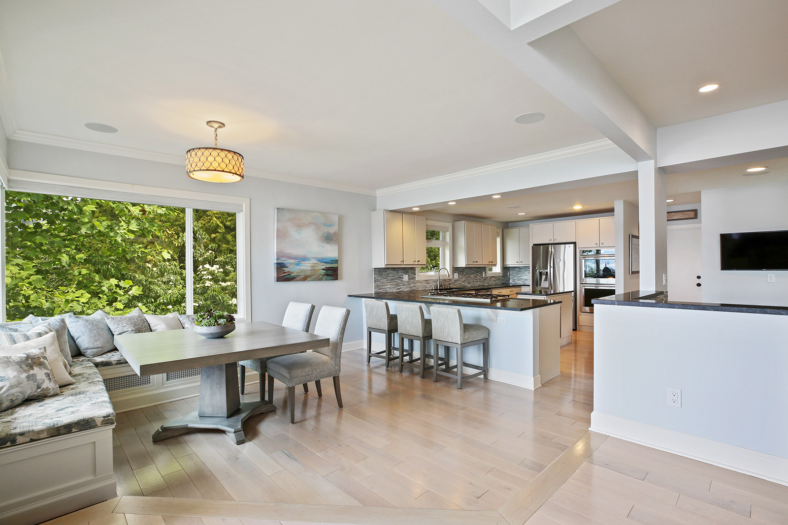
The original kitchen had blue painted cabinets and simply needed a refresh.  New cabinets and appliances were installed and a wider peninsula island was created for the cooktop placed and to have ample room for bar stools across from it.  The back splash mosaic tile, a new center island and new lighting make this a modern kitchen. Adjacent to the cook area is now a built in desk space and extra storage.  The custom window seats were made to fit in the corner dining area and now this comfortable space is where the family starts the day. I created a custom paint color for the walls and Champagne on Ice was used on all the ceilings and trim throughout the house.

BEFORES & AFTERS


The Perfect Family Room

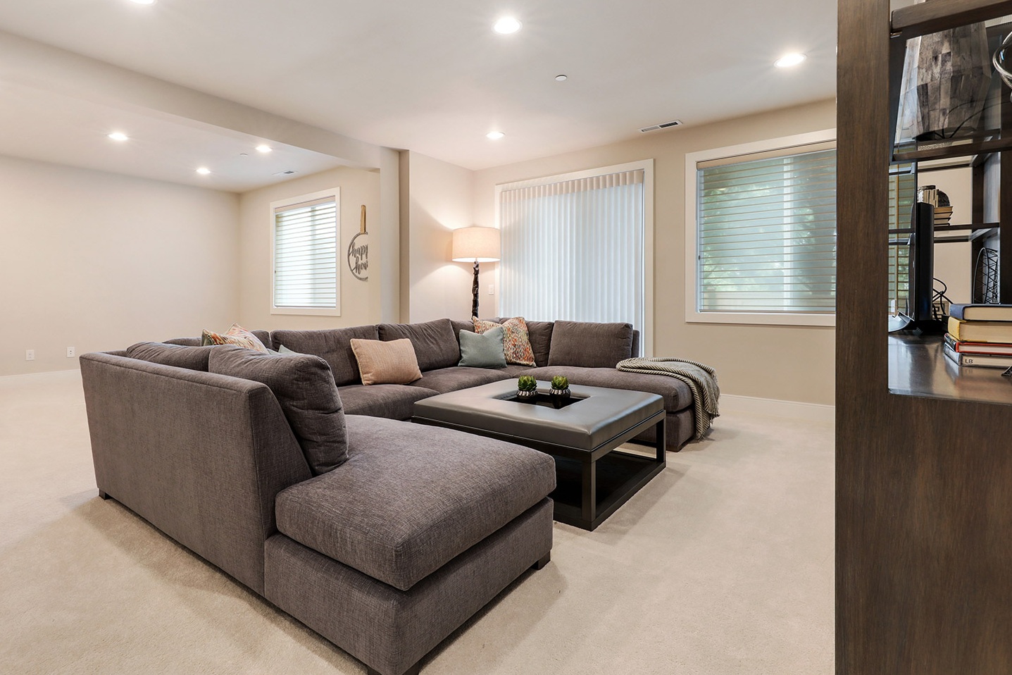
This family loves to be together while watching TV and the custom J. Redmond sectional was designed to sit all their friends and family and the Maxwell upholstery fabric was selected for its clean ability and durability for any accidental spills and stains.  The custom upholstered ottoman with a wood center top is the perfect solution for the center of the sectional. And the custom TV cabinet by Old Biscayne anchors the wall and has amble storage below. The one of a kind shell lamp by Currey & Co. sets the tone for all the movie watching evenings.

Dining in Elegance- A Before & After

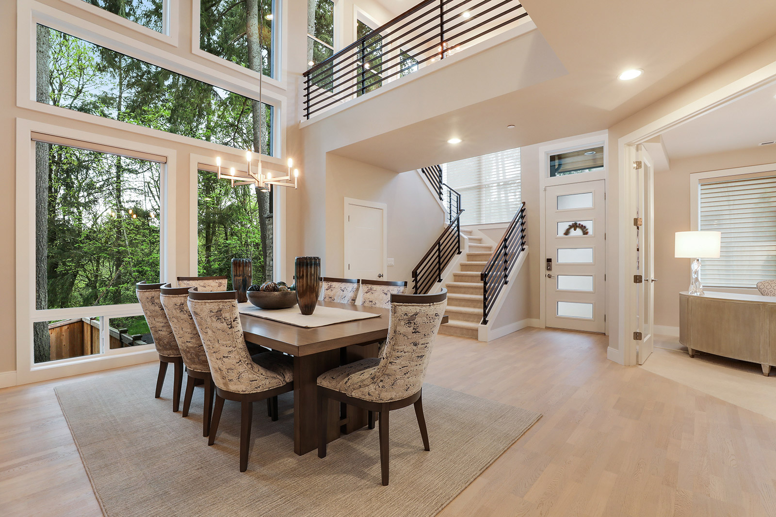
This home was completed in spring of 2018 and my client’s family decided it was their dream home so to create long term memories and it was in the perfect location since their 10 year old son didn’t have to change schools nor friends and they all love the clean modern aesthetic.  The couple has stressful careers and wanted a sanctuary to retreat to after a long day. They love to entertain and the eight and a half foot long custom Old Biscayne dining table can sit several friends and family comfortably. The Pindler modern chenille upholstery fabric is the star of the room and the wood Antrim custom area rug sets off the entire table and chairs!

Zen Bathroom Remodel by Kathy Banak

My clients two teenage son’s bathroom went through a transformation with the addition of a walk in shower and vanity cabinet instead of a pedestal sink.  The Stasser vanity in a light grey color has plenty of storage for both boy’s with the addition of a medicine mirror and ample lighting with the Quoizel light bar. The Authentic Home Greystone Light paint color definitely enhances the lightness and brings a modern touch to this small bathroom!